Been a little sidewise lately, what with birthdays and some away time… but mostly with a new project involving compositions of geometric shapes, with limited color palettes and mono printed and solid papers.
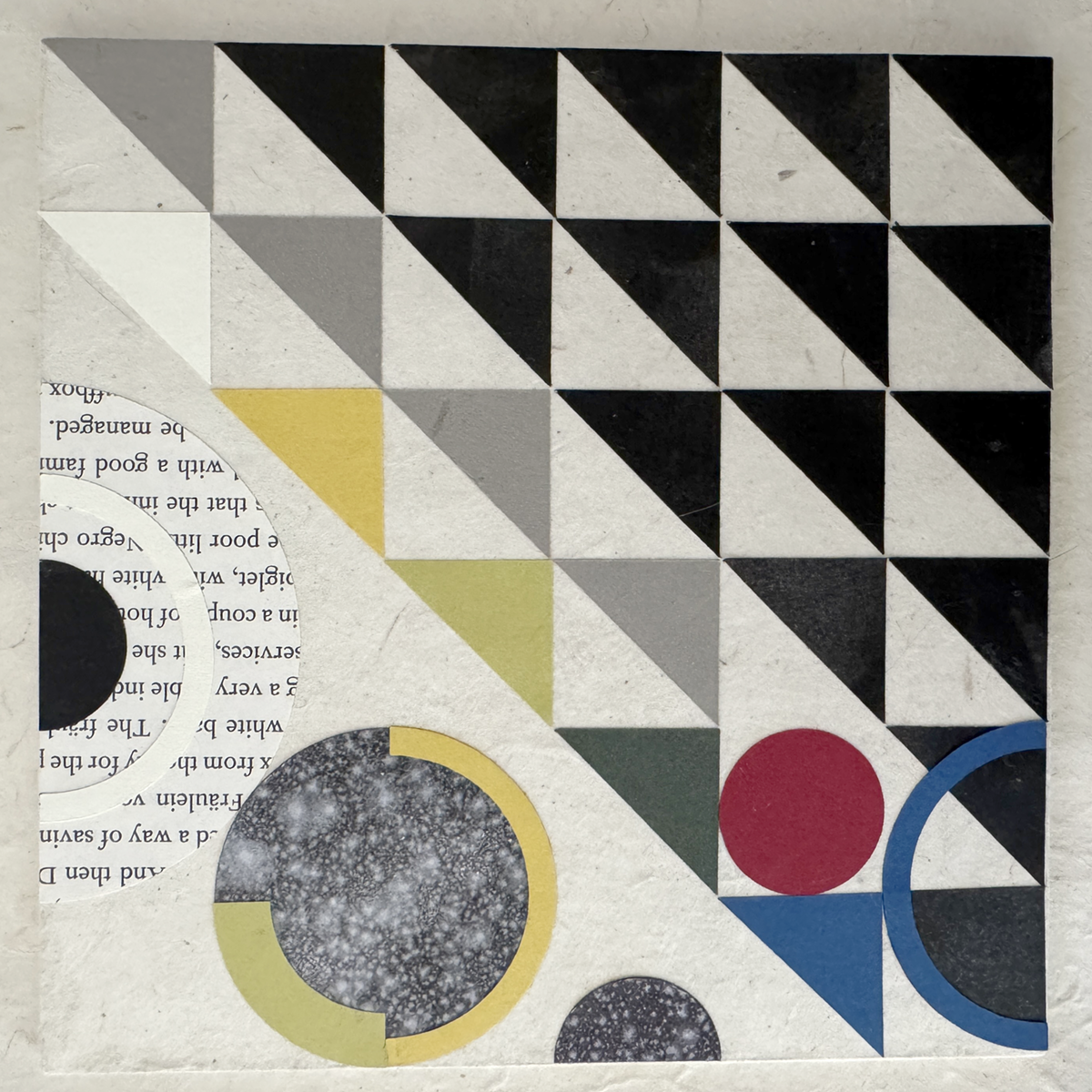

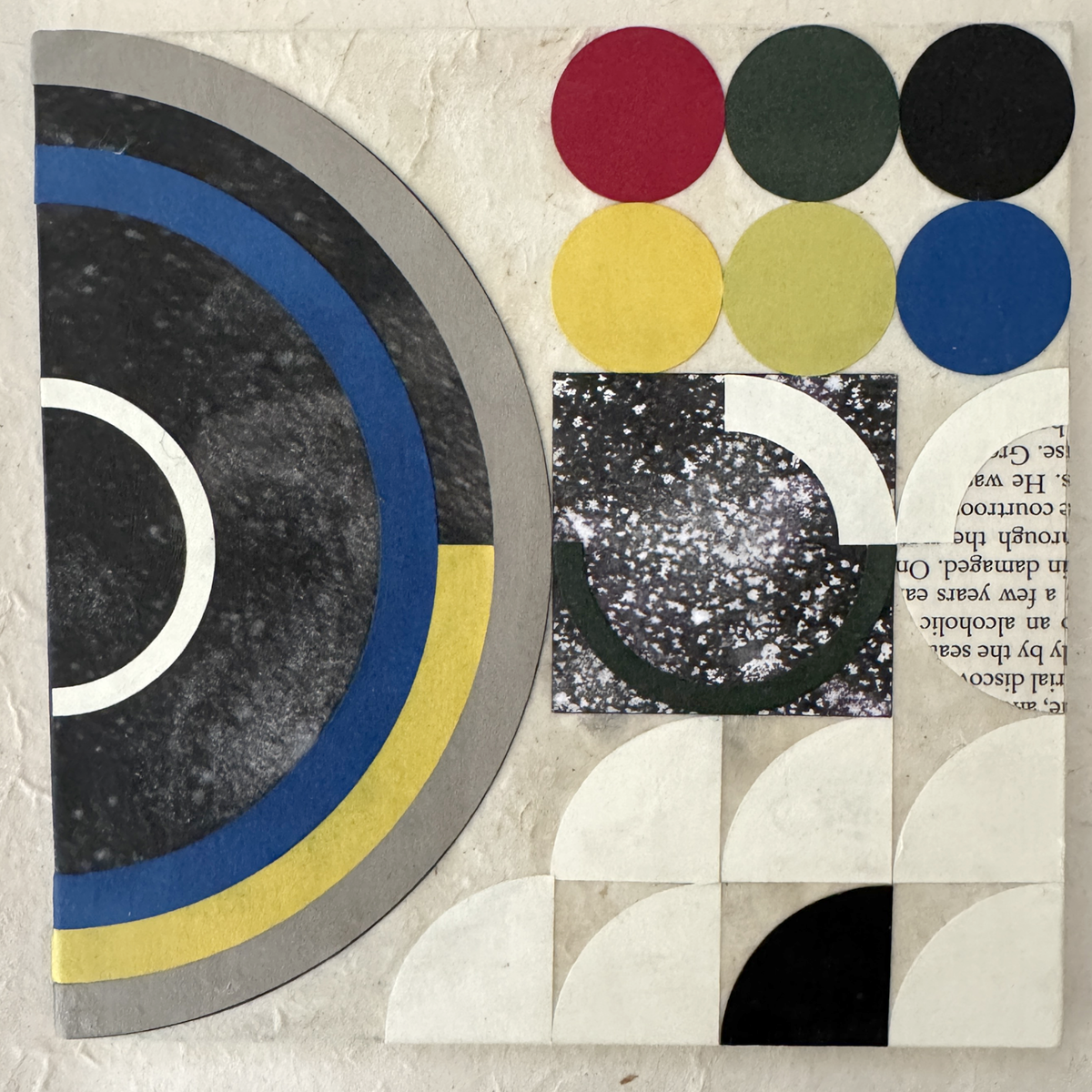
These babes are like the third iteration (thus far) of materials, colors and component shapes. Sourcing non-bleeding papers of suitable quality, weight and hue was/is an ongoing process (looking at you, royal blue, and previously, lokta crimson). Still working out best practices for the hand assembly, adhesive finesse and crisp tidy edges.
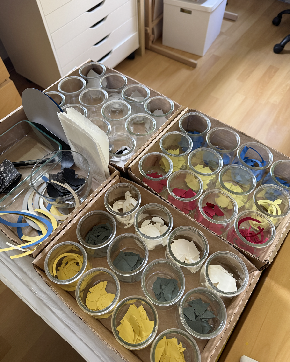
This is part of my color shapes system, with two other flats of the primary mono printed mixed blacks not shown. (And because I’m pulling prints on 28 lb. printer paper, I get to ink the white edges of each shape with a black PITT pen :)
I’m enjoying myself tremendously. All my graphic design training and experience gets to play, and I’m paying homage to some of my original influences: Bauhaus philosophies and practice, International Typographic Design (Cleanliness. Readability. Objectivity.) and, of course, beautiful, satisfying geometry.

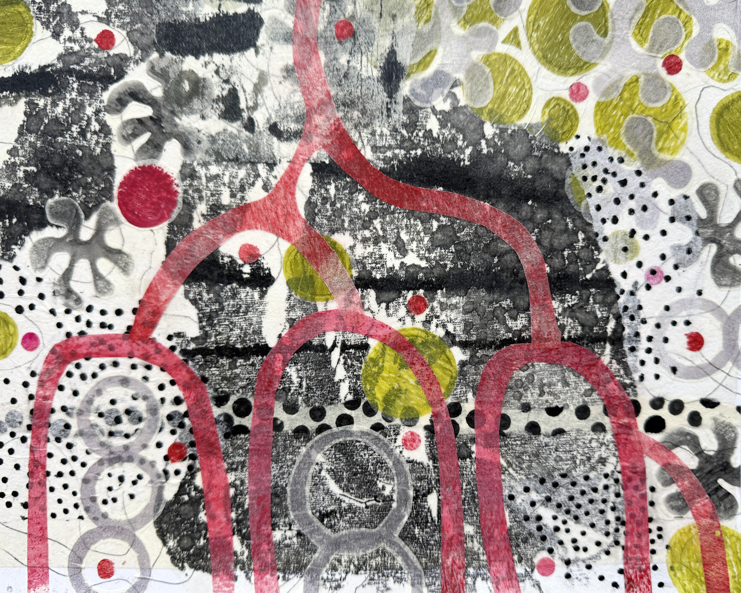
Maxine’s face reminds me of the half-circles in your Proto.001 (wh. I like very much, by the way!). I’m sure there’s an “organic into abstract” theme in there somewhere …