
This is the piece I showed at the Art Guild Annual Members Exhibit. Glimmering Girl. Found metal objects, hand-stitched cotton thread, mono printed torn and cut paper collage, 8 x 10 inches

Here’s a closeup peek at the piece I’m working on now. The patinas and colors are so luscious. I’ve been collecting the found bits for years, and the process of messing around assembling them into beings is enjoyable. Something wants to emerge.

In the monthly discussion group I attend, we decided to exchange Artist Trading Cards. Fun to make, pulling out all the old scrap materials, and working small and fast.
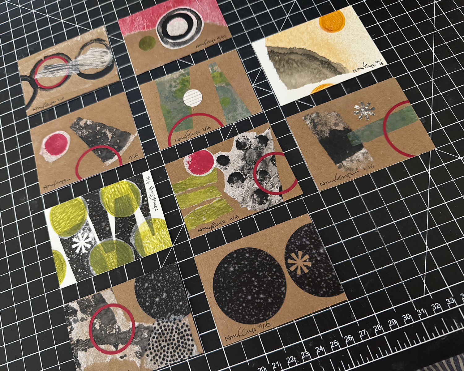
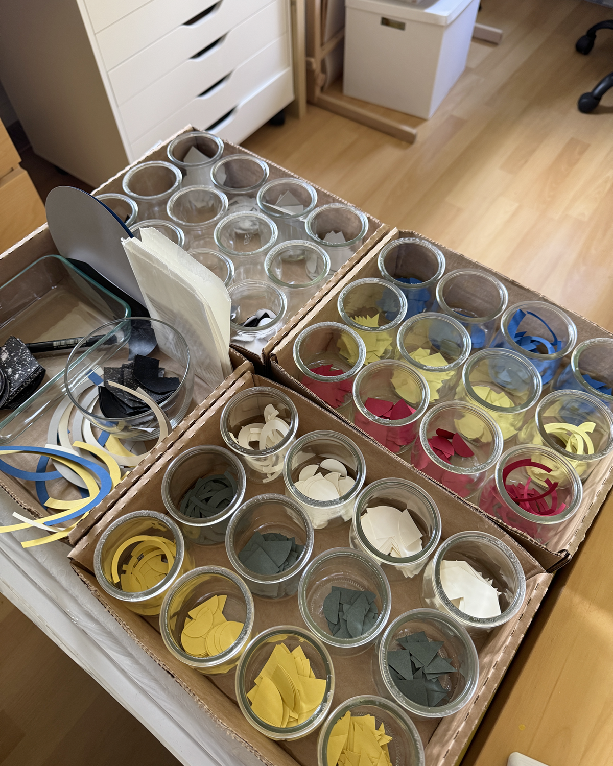
So fun that I decided to do the backs as well. And afterwards, I was moved to tidy up and get rid of so many bits and pieces and better organize what remains.


Not gonna lie, fifty 6×6-inch panels is a lot of eventual individual artworks to make in as many days. Priming and sanding them all was a good way to ease into the enormity.
I eventually got into a kind of rhythm of creation, with a set of steps and best practices. Iteration is a great way to really explore the geometric relationships with color and balance. (Amusing, too, as I rejected placements that looked like butts or boobs, although the occasional egg yolk or eyeball were okay.) Every single panel was a surprise, and interesting to see through to its completion. Somewhere after panel 25 or so, I gained trust in the process and my ability. Flow state increased in onset and duration.
Periodically, I’d lay out the work to date on some inadequate surface and just look, to see what I could see, and use the insight or finding on the next piece.
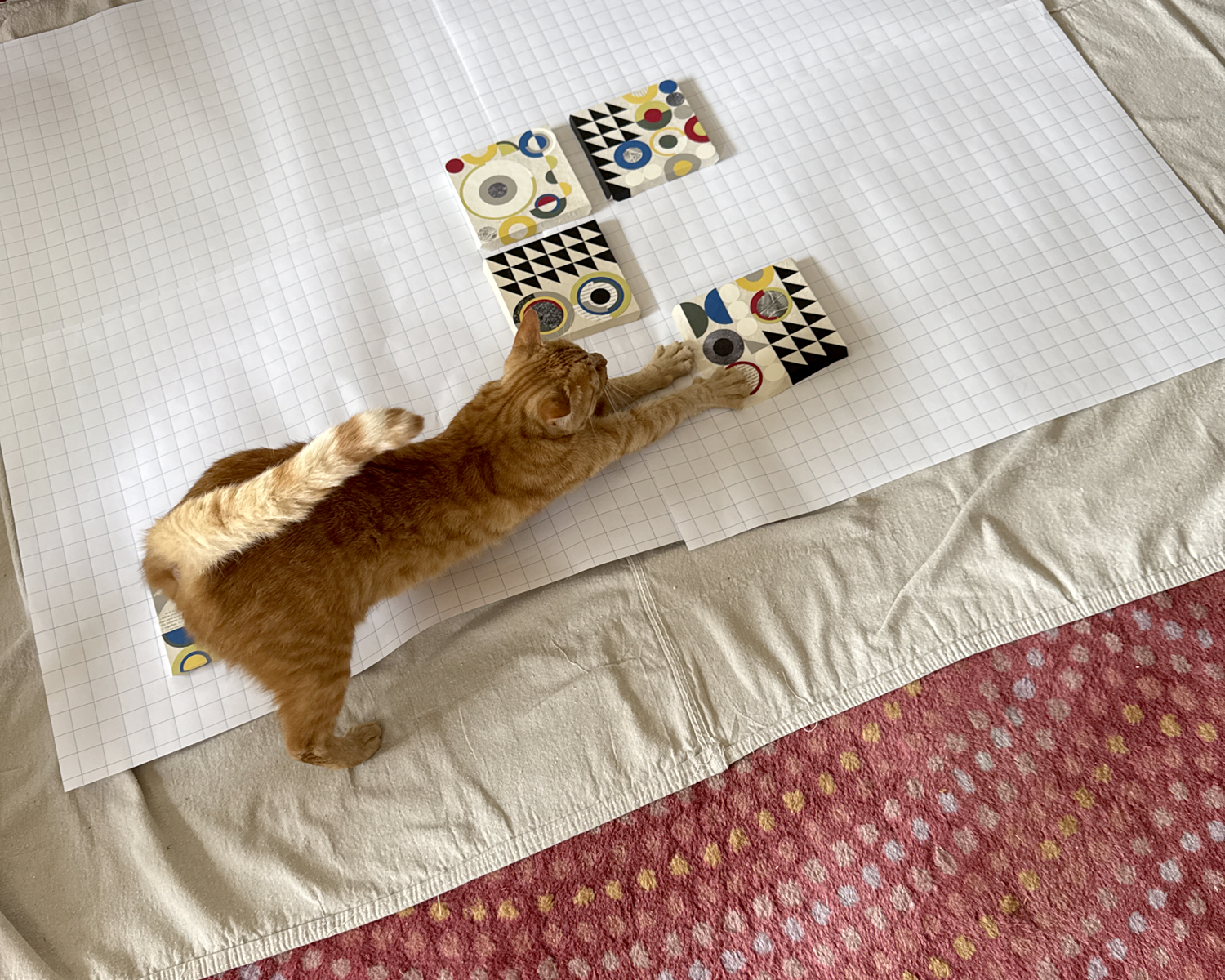

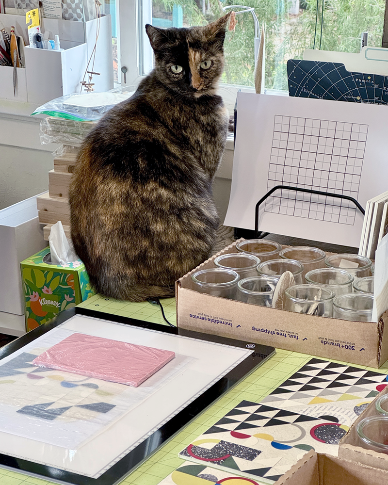
Tater has a large flat box on the ell of my desk in which he lounges and naps, etc., while I work. In the process of sorting and packaging the finished panels for transport to the gallery, I took his large box and replaced it with a smaller one — just temporarily! — and he was not at all having it.
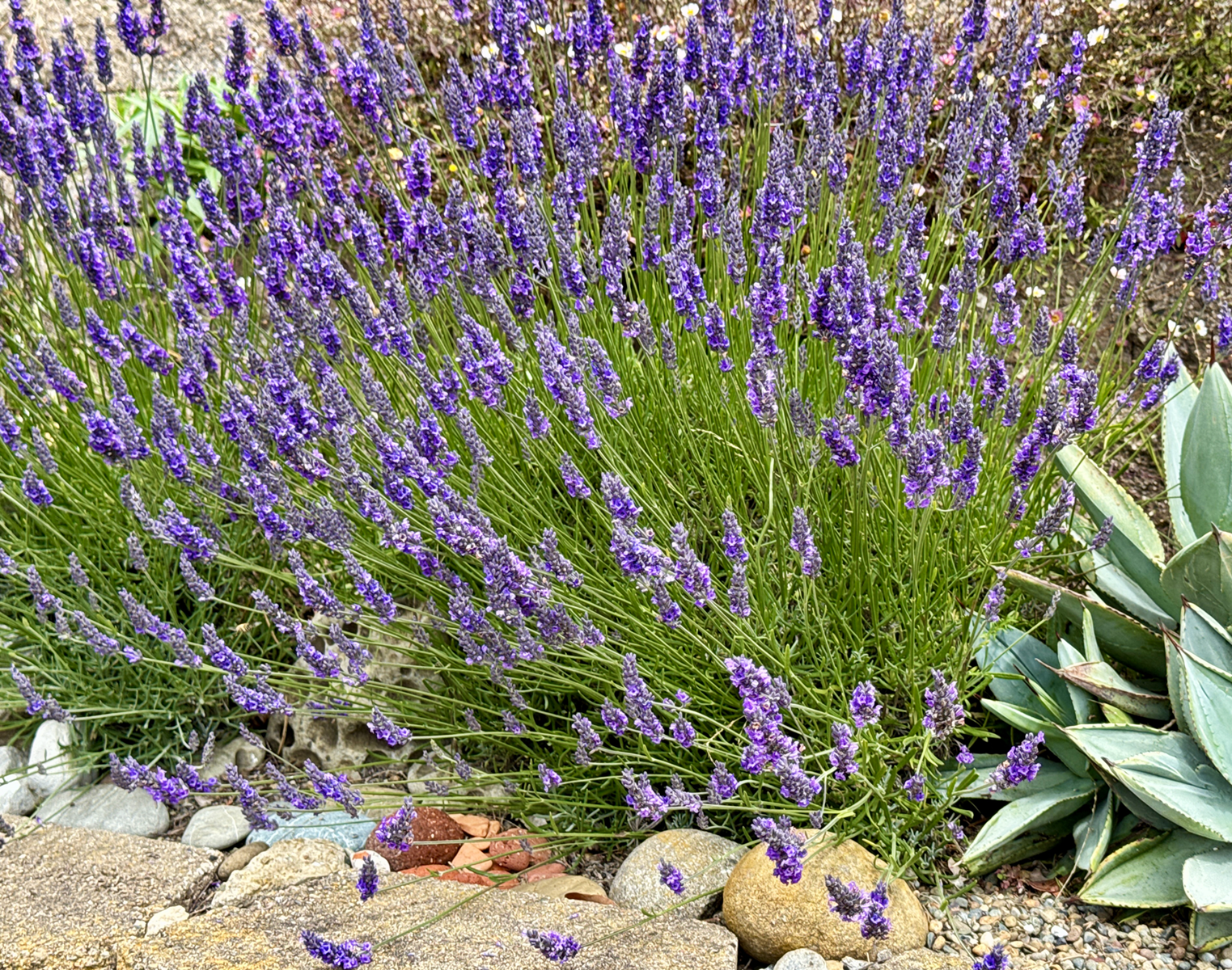
Lastly! The lavender is abloom here in foggy, mizzling Pacifica. There are about 20 bees of various species on the job, on this plant alone, and the scent is divine. I sit on the retaining wall and just breathe.

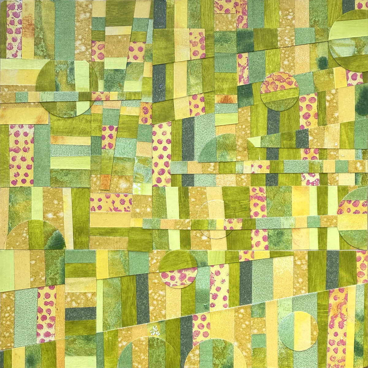
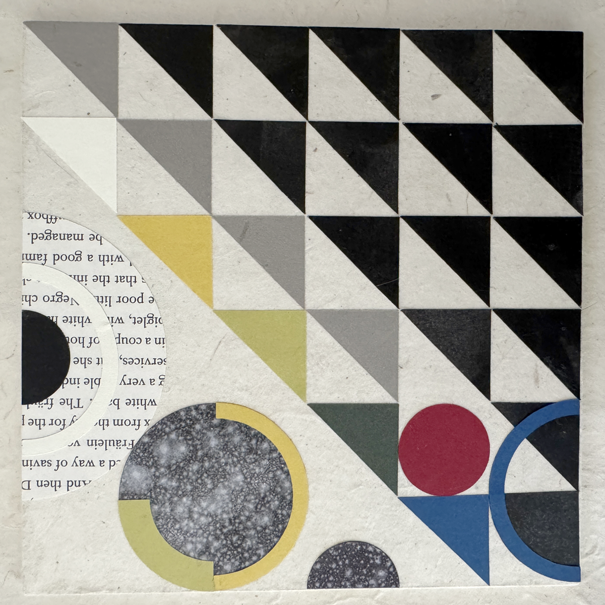
Earlier this month I was delighted/surprised to be accepted to the 17th Annual Sanchez Art Center 50|50 Show, in which 50 artists complete 50 small works in 50 days. (I’ll just let that sink in a bit. It’s both a lot and a little at the same time.)
In the weeks leading up to the call for entries, I worked on ideas for proof of concept — Can I do fifty of this? Is it sufficiently interesting and compelling? Will I wish I was never born? I finally arrived at an exploration of abstract geometric collage — well suited to the size and scale of the project and of deep historical and personal significance. Working through a dozen or so test pieces, I refined my materials and techniques until I heard that still, small voice announcing, “Yes, this is good. You can do this.”

Then, I had to write the dread Artist’s Statement — a standard part of any entry process — and one of the most challenging things I’ve ever had to do. I made it excruciating, but! I persevered. Here’s what I arrived at (in fear and loathing) as the submission deadline was approaching:
“Constructed with awareness, but not with calculation, led by high intuition, and brought to harmony and rhythm.”
— Piet Mondrian, 1916
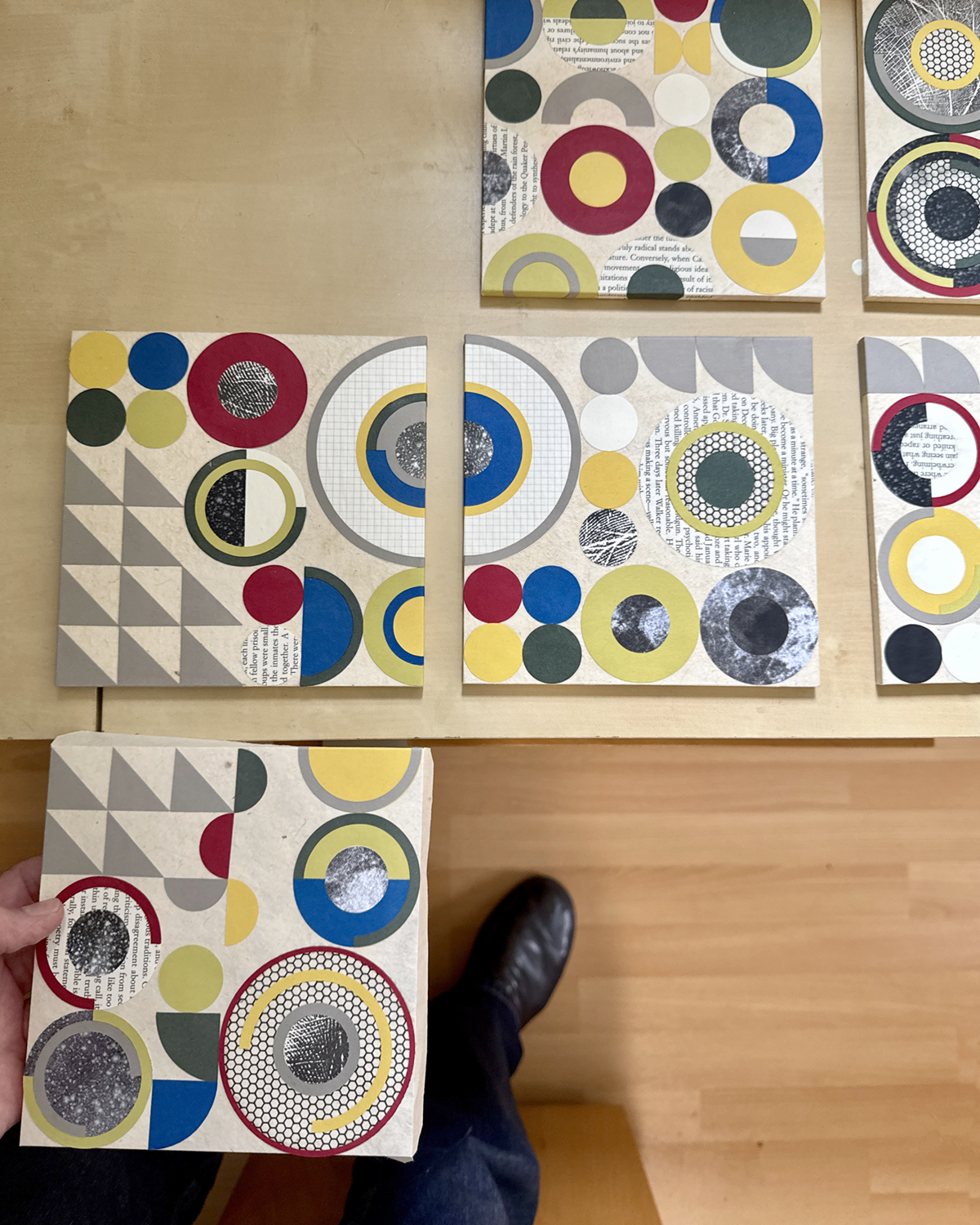
Awareness, intuition, harmony, rhythm… How many ways can circles, squares and triangles be assembled to create compositions that flow, balance and fit in the space allowed?
In these collage works, cut papers — color, mono printed and found — are manipulated and arranged to create balanced, rhythmic patterns and correspondences that please and satisfy our curious pattern-seeking sensibilities.
In exploring abstract geometric collage, evidence of the — my! — maker’s hand is evident in tiny misalignments; they are forgiven and unintentionally lend an animation to the work. When multiple compositions are hung together, new patterns emerge. Possibilities remain endless.
Once I got over myself and that hurdle, I realized two things: first, artist statements are not carved in stone for all eternity and can and should be revised at will, at any time. Second, I’m pretty sure most people are not as mean, judgmental or paralyzing as my inner critic. And so, merrily, we rolled along.


Wish me luck, inspiration and endurance, friends! These panels are (thus far) fun and satisfying to build! They make your eyes dance (in a good way)! The show opens Friday, 05 September, and runs through Sunday, 05 October. If you’re in the SF Bay Area, do consider stopping by the Sanchez Art Center to enjoy this exhibition of 50 artists’ works!
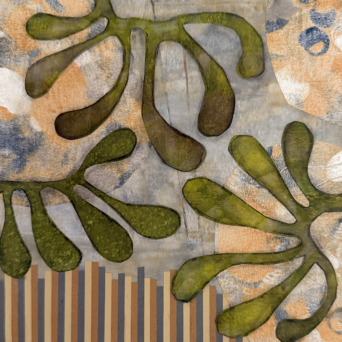
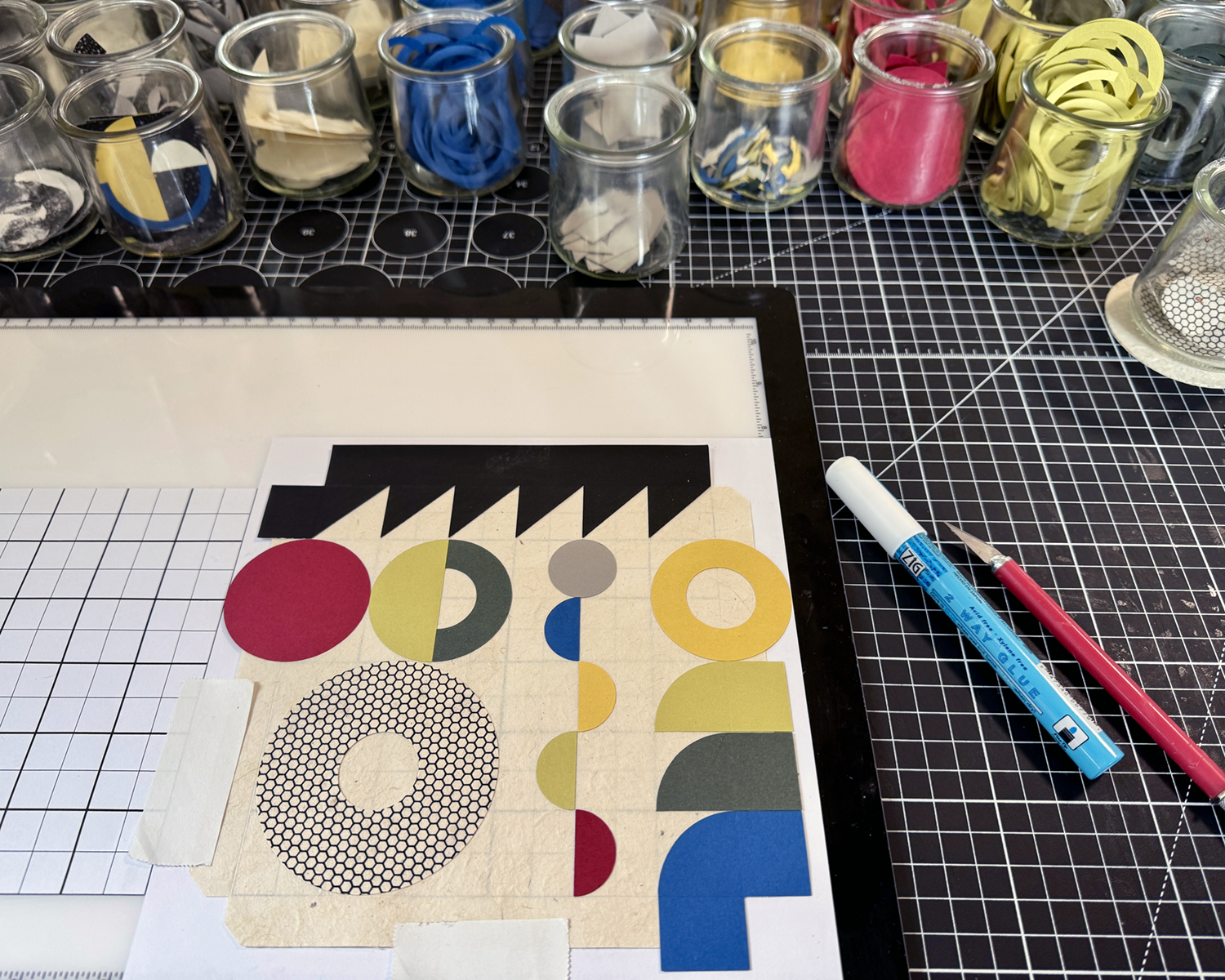
Been a little sidewise lately, what with birthdays and some away time… but mostly with a new project involving compositions of geometric shapes, with limited color palettes and mono printed and solid papers.

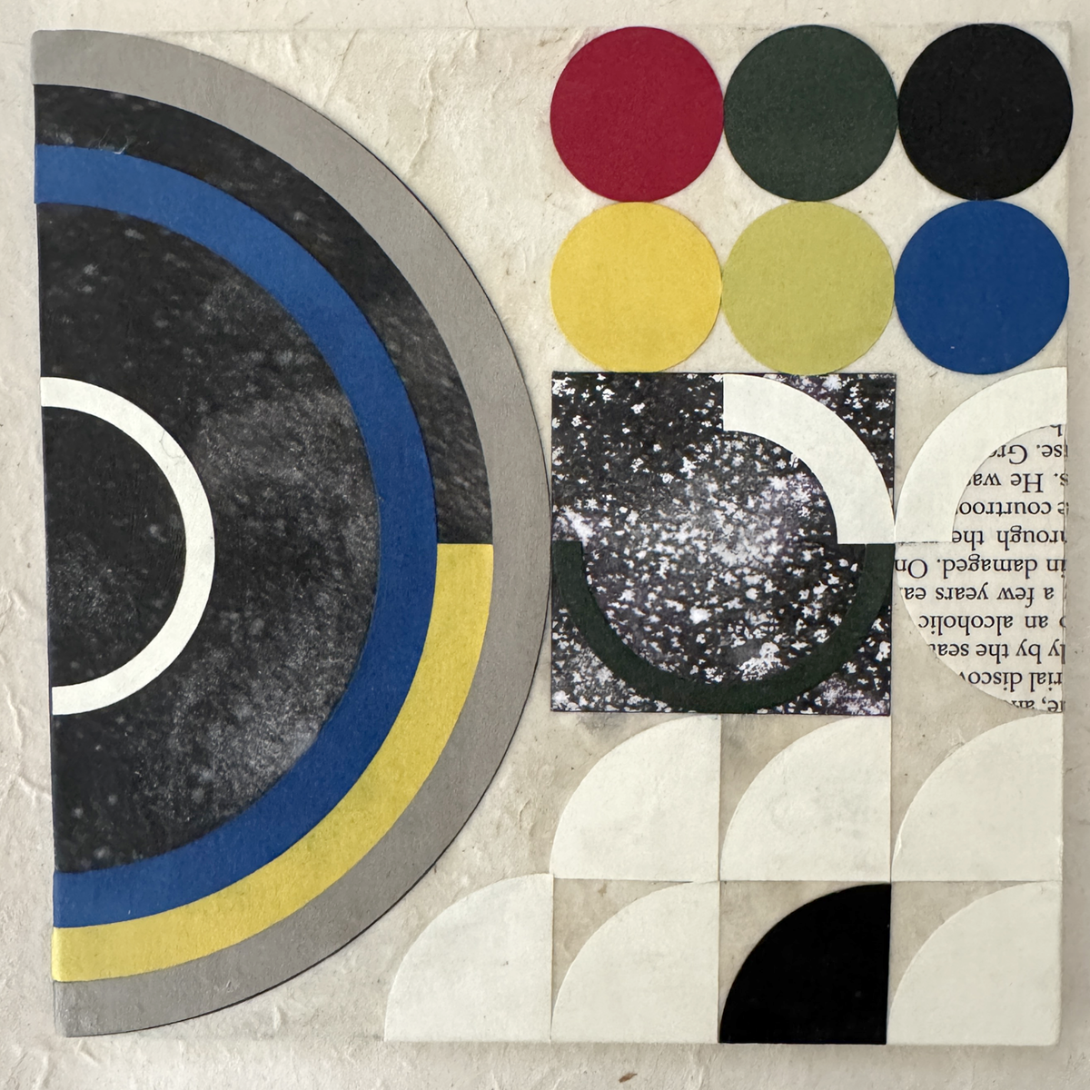
These babes are like the third iteration (thus far) of materials, colors and component shapes. Sourcing non-bleeding papers of suitable quality, weight and hue was/is an ongoing process (looking at you, royal blue, and previously, lokta crimson). Still working out best practices for the hand assembly, adhesive finesse and crisp tidy edges.
This is part of my color shapes system, with two other flats of the primary mono printed mixed blacks not shown. (And because I’m pulling prints on 28 lb. printer paper, I get to ink the white edges of each shape with a black PITT pen :)
I’m enjoying myself tremendously. All my graphic design training and experience gets to play, and I’m paying homage to some of my original influences: Bauhaus philosophies and practice, International Typographic Design (Cleanliness. Readability. Objectivity.) and, of course, beautiful, satisfying geometry.

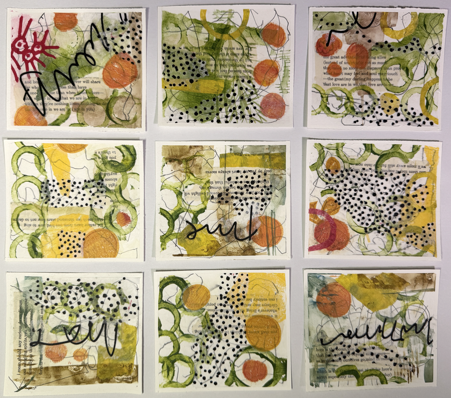
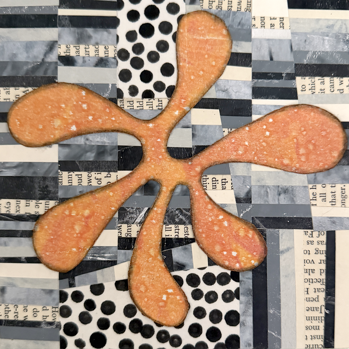
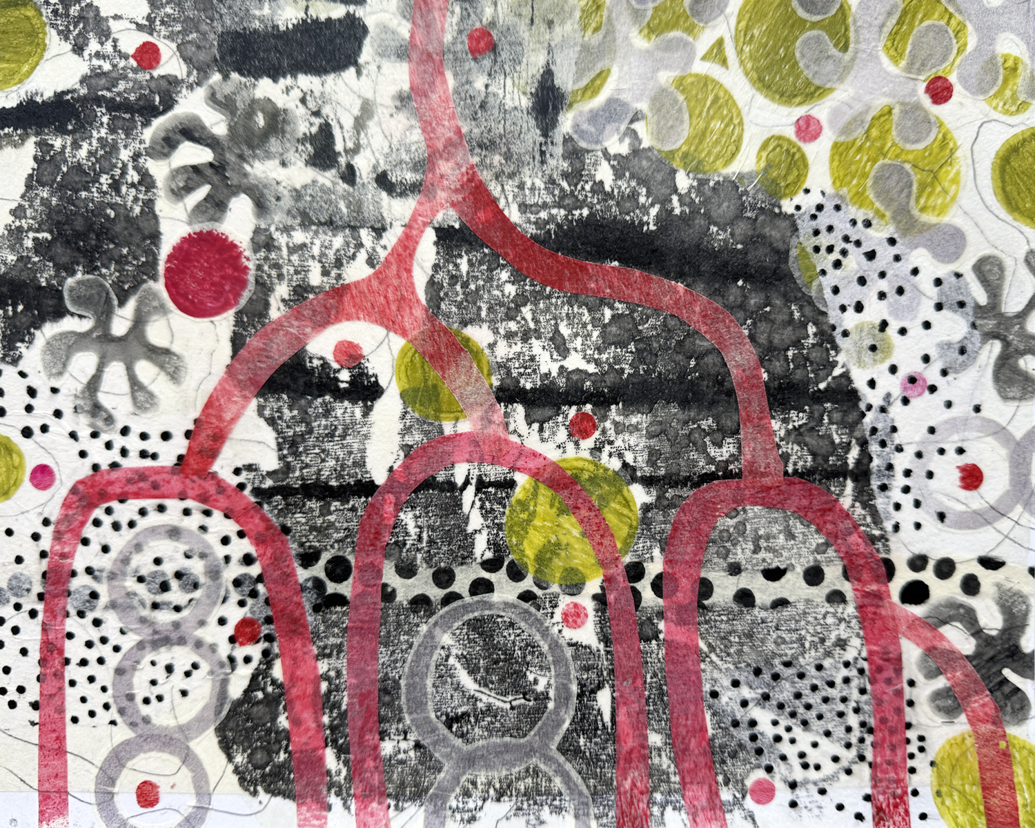
I’ve been enjoying a really good, fun class from Fibre Arts Take Two featuring multi media artist Eva Kalien. Her approach to art making is thoughtful, eccentric, and encouraging — and the concept of working on several pieces simultaneously, to iterate quickly and freely, is a game changer!
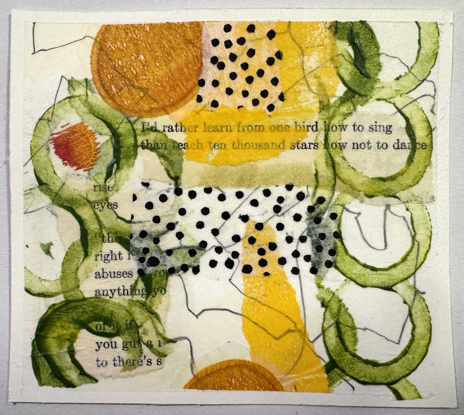
Here’s a closeup of one of a series studies. Eva likes to use printed text in her process (for many reasons) and I chose to follow… with my high school copy of ee cummings’ poetry. (Yes, I tore up a beloved book I’ve been carrying around for many years.) Although the text may not be legible, I know it’s there, a foundational layer of meaning and message, and it’s strangely powerful. She also suggests to “stop before you’re done”, another concept of surprising benefit.
In other news, I’ve ordered an early birthday present — a special thing I’ve been considering for some time: a build it yourself printing press from Provisional Press. Check it out! So very exciting, and I’ll keep you apprised. (It also means I’m going to have to clean off (and defend!) a work bench in the garage for it to live on… no small task.)
He also likes to rearrange the furniture, and crop the “living” roof :/
A short story in pictures.


Mostly, my family and I are OK. My charming husband has been working from home — as I have been for the last 14 years — and given the wee square footage of our house, it’s been remarkably harmonious and kind. We’ve weathered the death of my younger brother, after a long illness, without being able to gather and grieve his passing, and most recently, the furloughs and layoffs of half of my husband’s corporate master company.
The awareness that many others are experiencing far worse experience and circumstance is never far from my heart and my mind. How could it be otherwise? We are all in this together. (And for all of you who have reason to say fuck you with two middle fingers to this trite truism, I hear you.)
However.

Ruby and Maddie are learning to wash dishes. Without me.

Scarlett maintains her unrepentant insistence on knowing interior spaces.


Um, nothing much new in that propensity.

My birthday was in early March, and I splurged on new deck furniture from Tidewater Workshop. Of course our planned new front deck construction is delayed until who knows when, but I built and painted all the new pieces with the leftovers from the wave gate project, and am sealing them as the weather allows. Above are three of the rectangular side tables.

The recent April full moon coincided with my mother’s birthday and mild weather. What a wonderful reason to sit outside late and watch the night sky.

I’ve been keeping busy with multiple projects and diversions. This 1:12 scale Bandai kit was so very satisfying to build.

What with shelter in place and all, my walks are constrained to our hilly mid-century suburban neighborhood, and I’m keen on … finding more interesting things to notice than whatever, or sweating, or not dying from a heart attack. (My neighborhood *is* really hilly.) So today it was flowers, and this one won: Cerinthe major ‘Purpurascens’ honeywort. I use the iNaturalist app to help me identify that with which I am unfamiliar.
If only there was one for our time.

I bought two of Kris Comapas’s Estate Chair kits because I wanted to use more of this thrift store dress fabric, which I love.


It’s a rather large scale print for miniature upholstery, as well as being a very fine and lightweight fabric, but did I mention how happy it makes me feel?

Kris includes good instructions and cord to make fabric-covered piping in her kits, but I generally prefer a twisted cord made from 3 strands of embroidery floss.

Here you can see my associate K-2SO inspecting the floss piping with his massively articulated fingers. (I love him, too.)
I find attaching tiny piping gracefully onto miniature upholstery to be a tedious task, so I’m putting it off until I feel more… um, articulated dextrous. And patient.

The Leadlights design studio also has a new chair. Makes it look way more office-y, don’t you think? I’m really pleased with the level of quality and detail in this chair. (Ack! This photo also reminds me I want to finish tricking out the desk accessories, and to trim that orange bookmark on the last-minute-made sketchbook!)
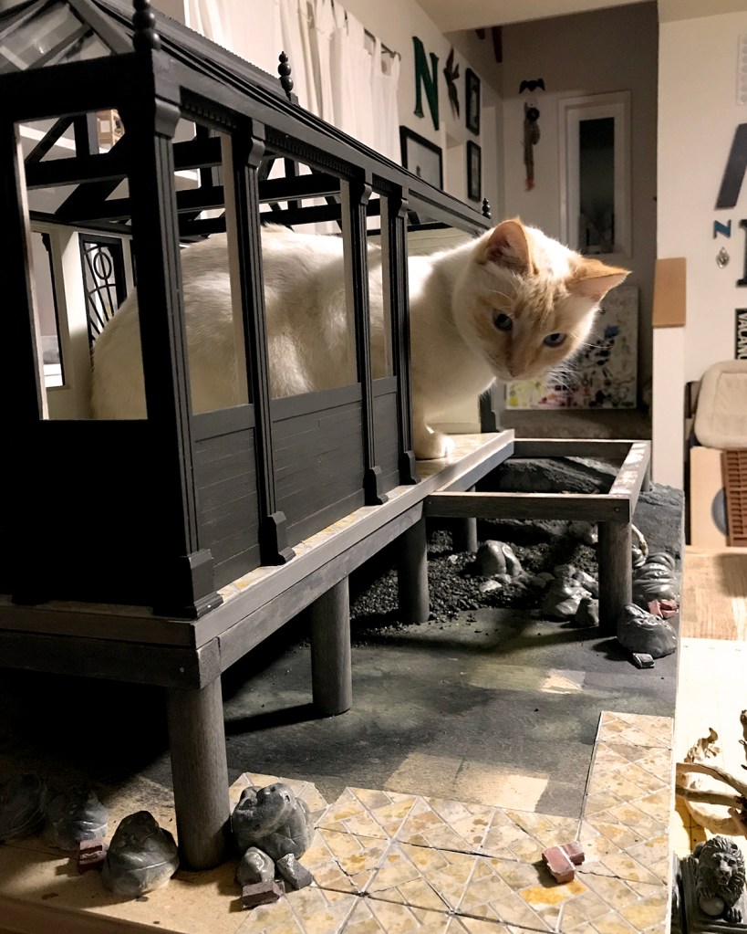
Work continues on the Sea House Conservatory build, with a sea level rise remediation support pier in place.

Geologic rock and boulder construction is underway. My preferred material — think I’ve tried just about all of them — is Model Magic air dry clay, made by Crayola. It is lightweight, inexpensive, readily available, pleasant and responsive to sculpt, accepts all kinds of pigments well, and dries with virtually no shrinking.


With this last batch of rocks, I experimented with adding black acrylic paint or India ink to the white clay before sculpting. One batch had fine black gravel mixed in. The paint or ink initially made the compound stickier to work with, but it was nice to start with a pre-tinted base. These have green and gray washes spritzed on. When dry (takes a day or two depending on size and relative humidity) with a fine brush I painted the surf erosion holes and granite veins with white acrylic, diluted 1:1 with water.

As I was ordering new clay, I learned Model Magic also comes in black, gray, and “Earthtone, Bisque and Terra Cotta”. So stoked to use these colors on the next exploratory rock and boulder sets.

The finished rocks are slicked with a satin multi-purpose sealer, as they’re meant to look wet. The final Conservatory project base will have about an inch of water in tidal flow. (I’m excited about that, too, as I’ve never worked with a “water feature” before :)

Deck planks are installed, and I’ve finally arrived at a stair design that makes sense and blends into the overall structure.
Yesterday I was at Chrissy Field in the Presidio, and took a bunch of pier photos for genuine detail ideas. It was a perfect winter’s day, cool, clear and sunny, with very little breeze.


Glorious.

I thought it might be interesting to review building highlights of the Sea House Leadlights studio office, from start through submission. (Can’t really say “completion” because things never stay done ‘round here.) There are links back to original posts — if any were made — with more details. I wasn’t very bloggy :)
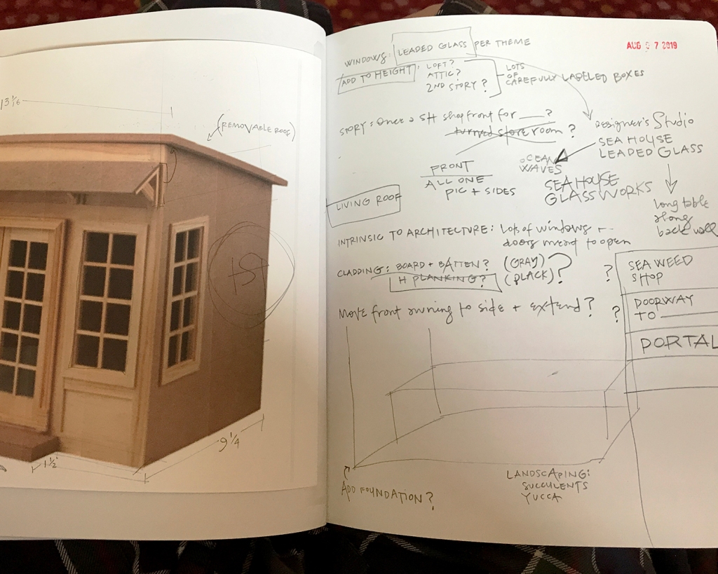
I spend a lot of pages thinking, sketching, dreaming, considering and working out dimensions and story.

The first floor idea, though fun to design, paint and assemble, did not work well in the space. So it goes.

Height was added to the starter kit with parts from a second. I like to retain recognizable elements of the kit, so the roof angle and footprint, as well as door and lower window placement remained unchanged.

I glued cold press 140 lb. watercolor paper to the walls for texture before painting, and added a whitewashed aged brick back wall in the loft.


I opted to make the front façade removable as well as the roof… this makes it so much easier to photograph the interior.

I cut the built-in benches from 1/16-inch basswood on the Cricut Maker. These were glued together and supported with 1/8-inch dividers.


I thought and sketched about the window designs for some time. The Pavilion is bubble-themed; the Conservatory celestial… for the Leadlights design studio I went Egyptian Deco. Mostly sort of.


The upper window is a stylized scarab. Very.
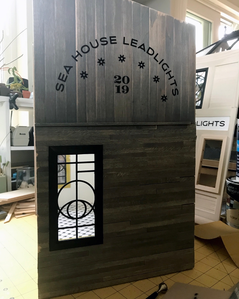
The “leading” designs for the windows are cut from lead black cardstock, glued front and back to the plexi, then framed in black on the exterior (and tree frog on the interior). I like to see wood grain, so I use a 1:1 ratio of acrylic paint and staining medium.

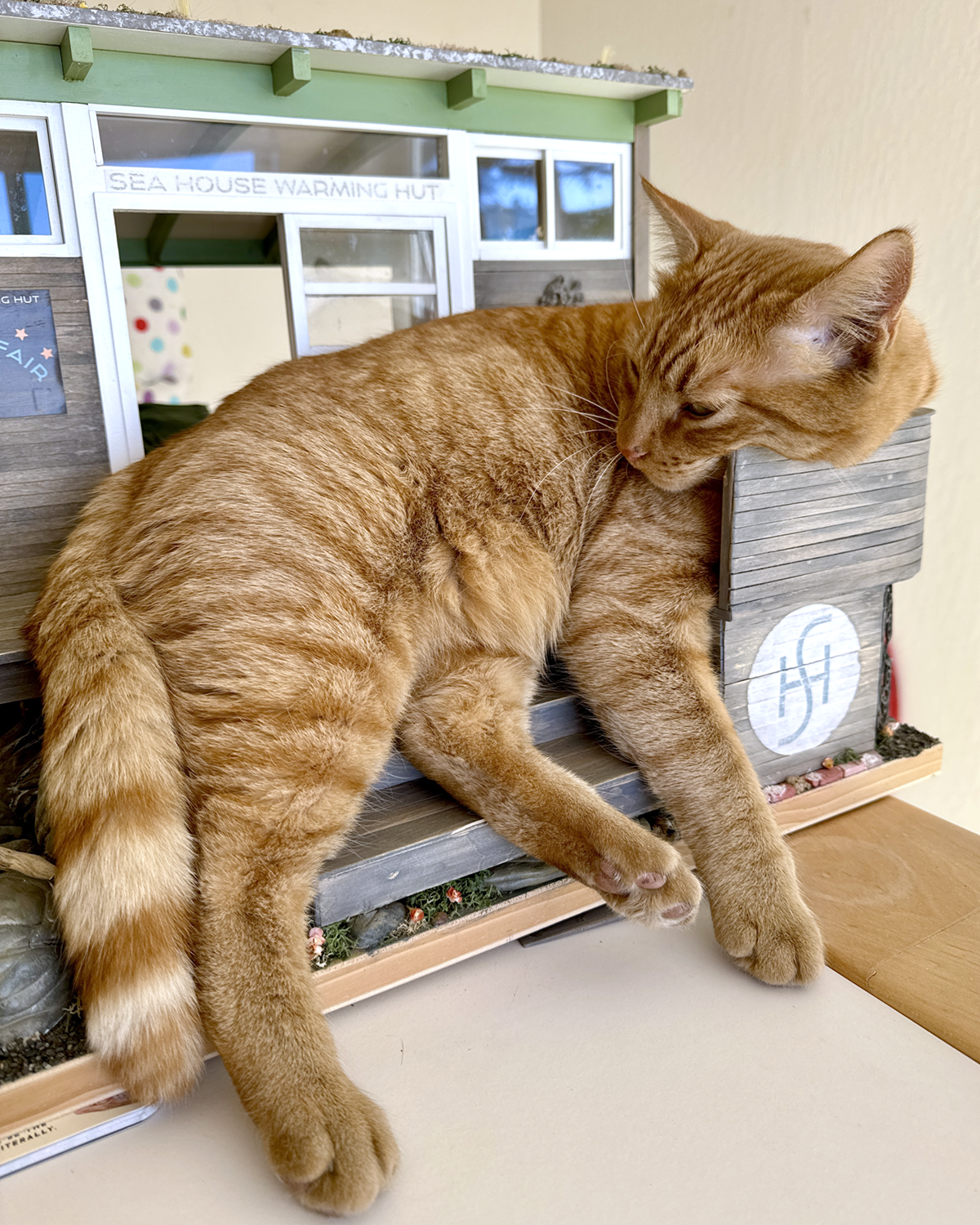
If one looks straight on, the window frames the bricked loft wall and the old Sea House logo. With sacred scarab wings.

I — or rather the Cricut Maker — cut the signage from matte black vinyl. The stars in the design are meant to resemble anchor plates used to reinforce old buildings. I love them.
In this backlit photo, the vinyl letters appear to float off the side of the building. It’s not quite so unnatural-looking in person, but knocking back the synthetic smoothness is on my eternal learn-to-do list, to find ways to tone down the material. (Transferring wee letters and figures is a fiddly, fussy business, especially onto an uneven surface, and I am not eager.)

Here’s a roof’s-eye look at the progressing build. The holes are drilled for the LED light fixtures that will illuminate the work space below. (The wiring to be concealed beneath a custom rug and other stuff stored in the loft.) A narrow shelf beneath the scarab window on the removable front might support batteries if I ever add lighting to the front. Floor tiles gleam softly with scuff-resistant utility. Leather window seats beckon.
To be continued…
