

This is the piece I showed at the Art Guild Annual Members Exhibit. Glimmering Girl. Found metal objects, hand-stitched cotton thread, mono printed torn and cut paper collage, 8 x 10 inches

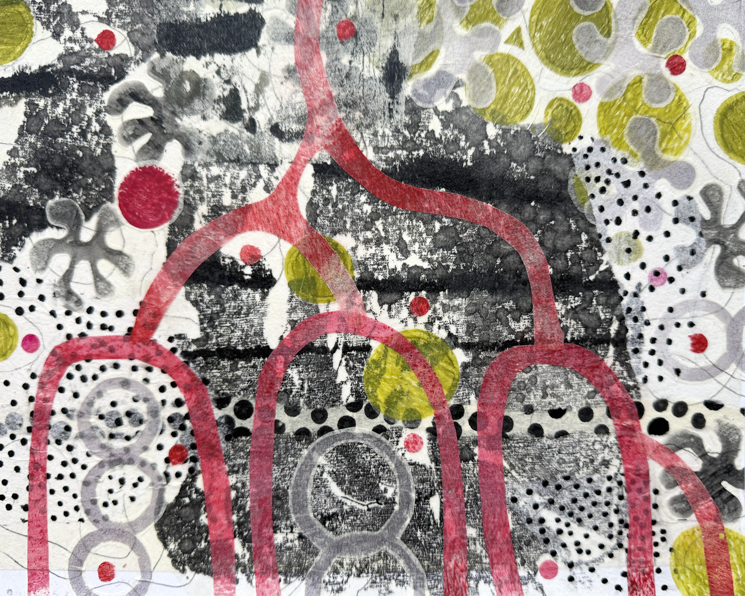
Here’s a closeup peek at the piece I’m working on now. The patinas and colors are so luscious. I’ve been collecting the found bits for years, and the process of messing around assembling them into beings is enjoyable. Something wants to emerge.

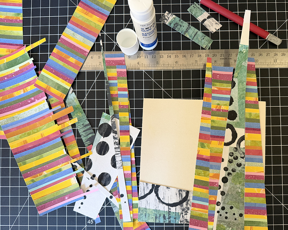
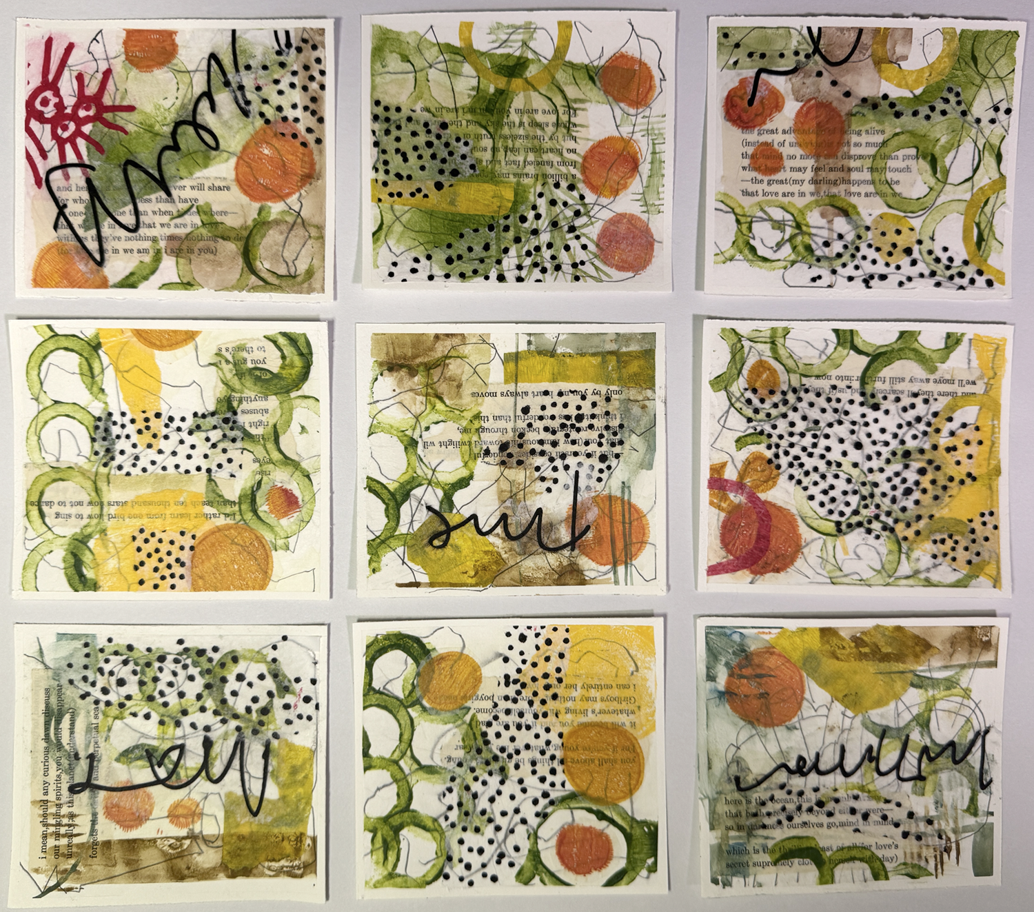
In the monthly discussion group I attend, we decided to exchange Artist Trading Cards. Fun to make, pulling out all the old scrap materials, and working small and fast.
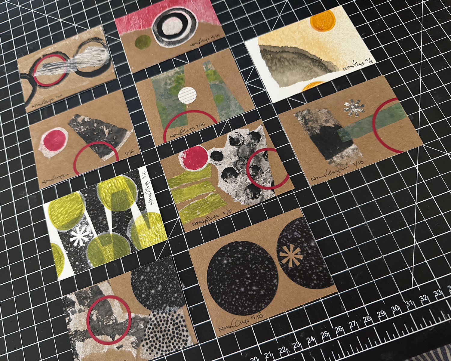
So fun that I decided to do the backs as well. And afterwards, I was moved to tidy up and get rid of so many bits and pieces and better organize what remains.

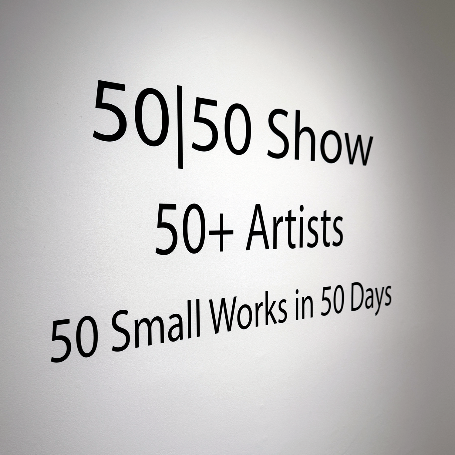
50+ artists, each producing 50 small works (6×6 inches) in 50 days
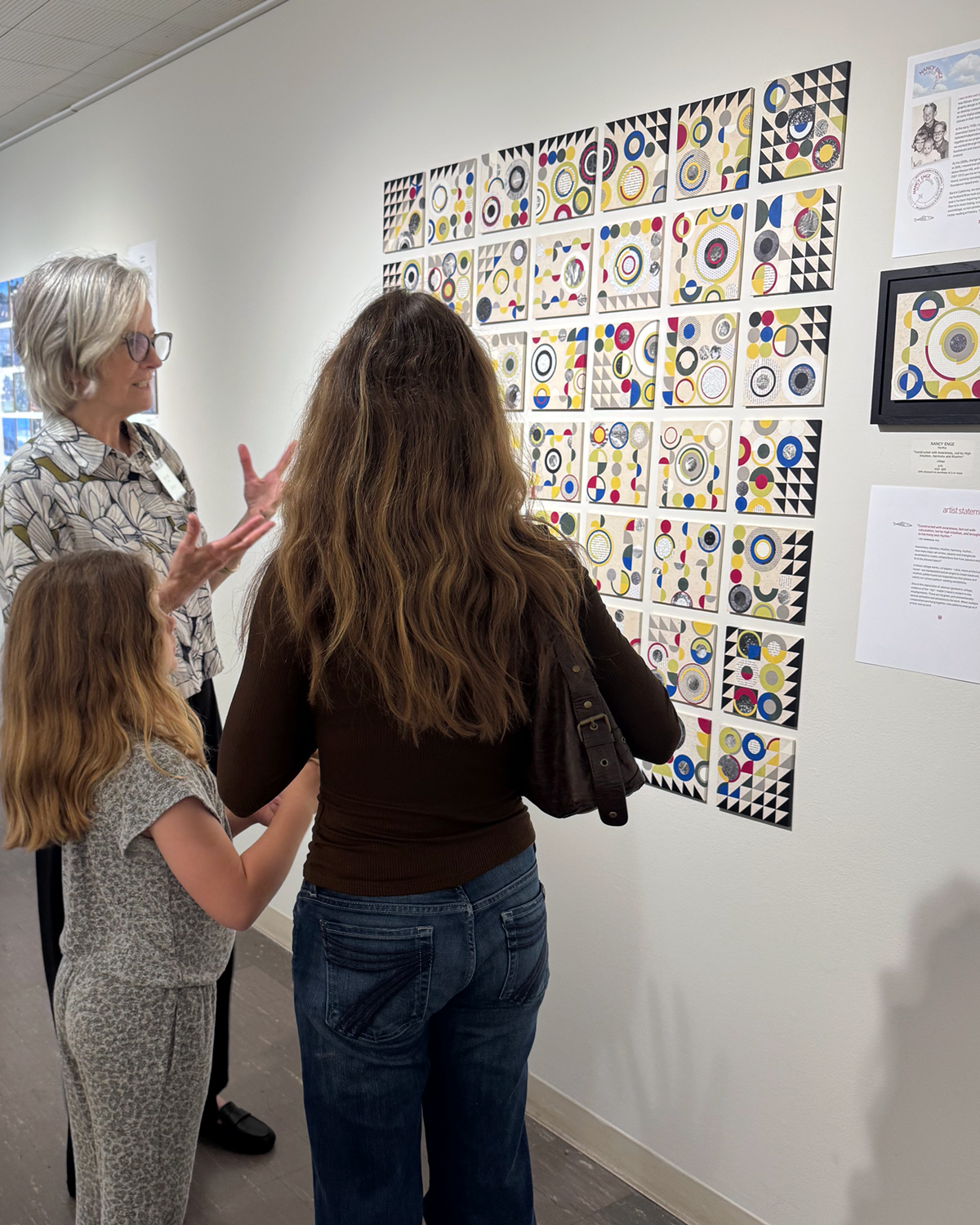
I’m still processing the experience, unfolding in successive waves. So much goodness and delight. The show runs for a month, and I’m signed up for weekly gallery sitting shifts, which means getting to study/enjoy all the works in depth, and meet and talk with artists and gallery goers (and assist them with their purchases). If you’re in the SF Bay Area, come by! (Sanchez Art Center welcomes visitors at no charge; galleries are open Friday, Saturday, and Sunday from 1–5 pm, through October 5. )

Not gonna lie, fifty 6×6-inch panels is a lot of eventual individual artworks to make in as many days. Priming and sanding them all was a good way to ease into the enormity.
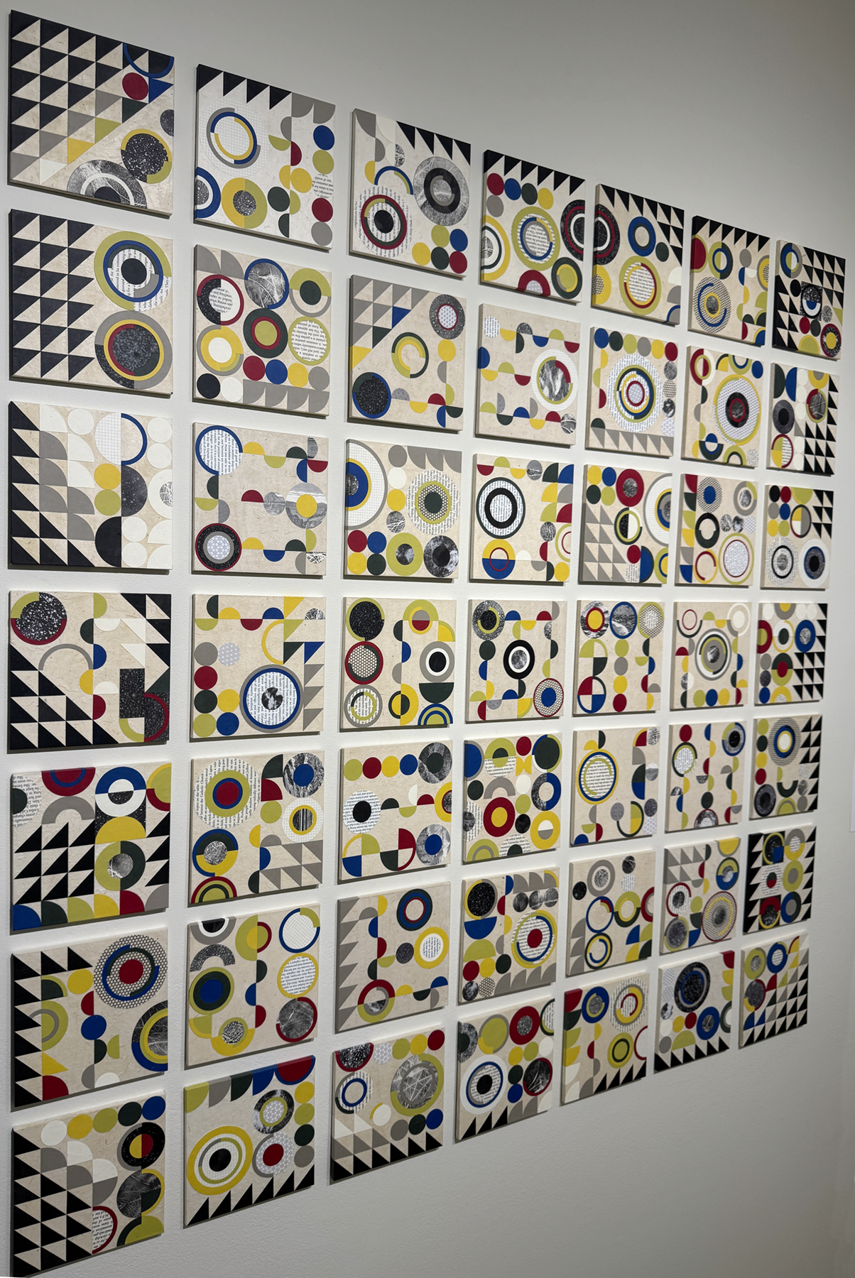
I eventually got into a kind of rhythm of creation, with a set of steps and best practices. Iteration is a great way to really explore the geometric relationships with color and balance. (Amusing, too, as I rejected placements that looked like butts or boobs, although the occasional egg yolk or eyeball were okay.) Every single panel was a surprise, and interesting to see through to its completion. Somewhere after panel 25 or so, I gained trust in the process and my ability. Flow state increased in onset and duration.
Periodically, I’d lay out the work to date on some inadequate surface and just look, to see what I could see, and use the insight or finding on the next piece.
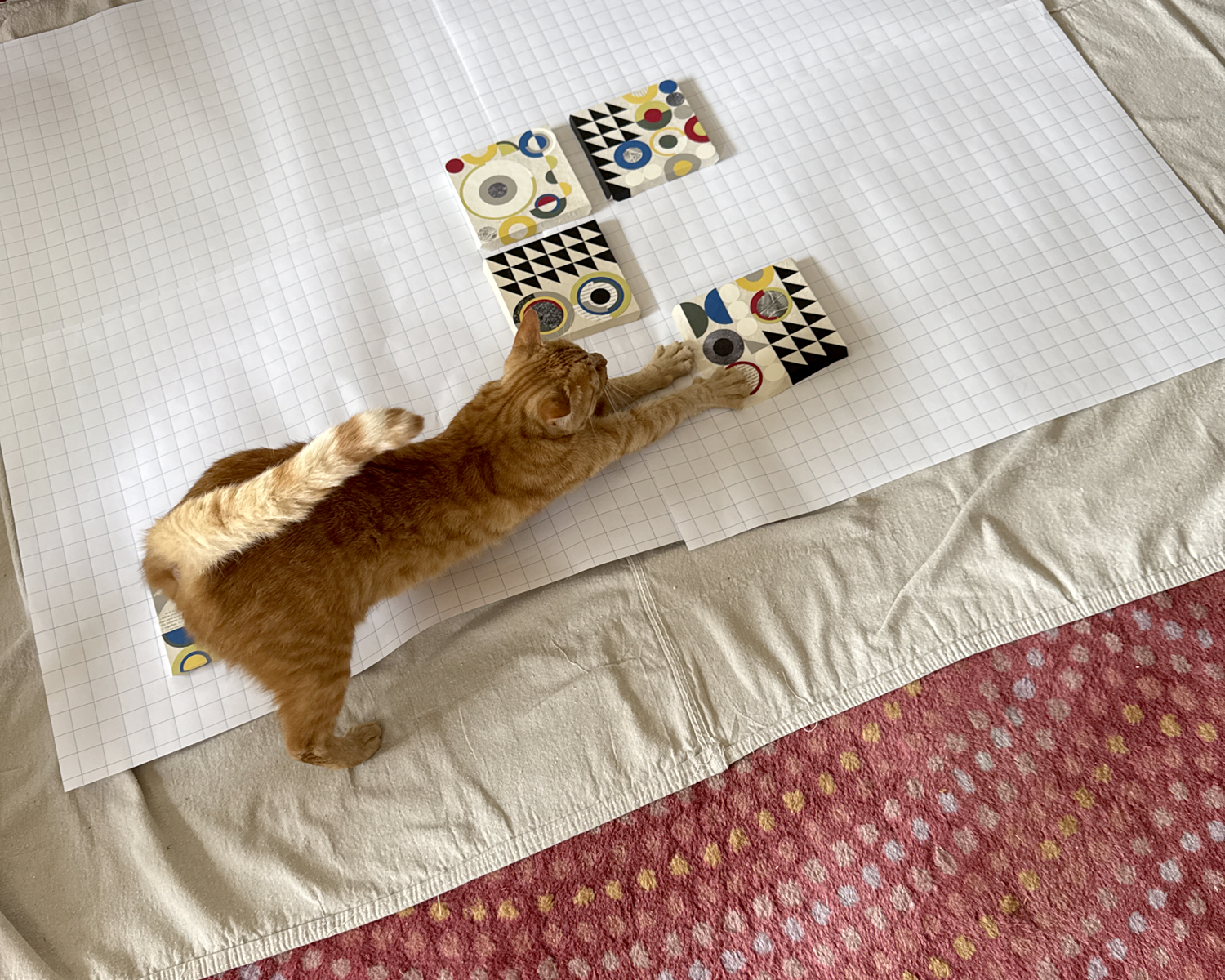

Tater has a large flat box on the ell of my desk in which he lounges and naps, etc., while I work. In the process of sorting and packaging the finished panels for transport to the gallery, I took his large box and replaced it with a smaller one — just temporarily! — and he was not at all having it.
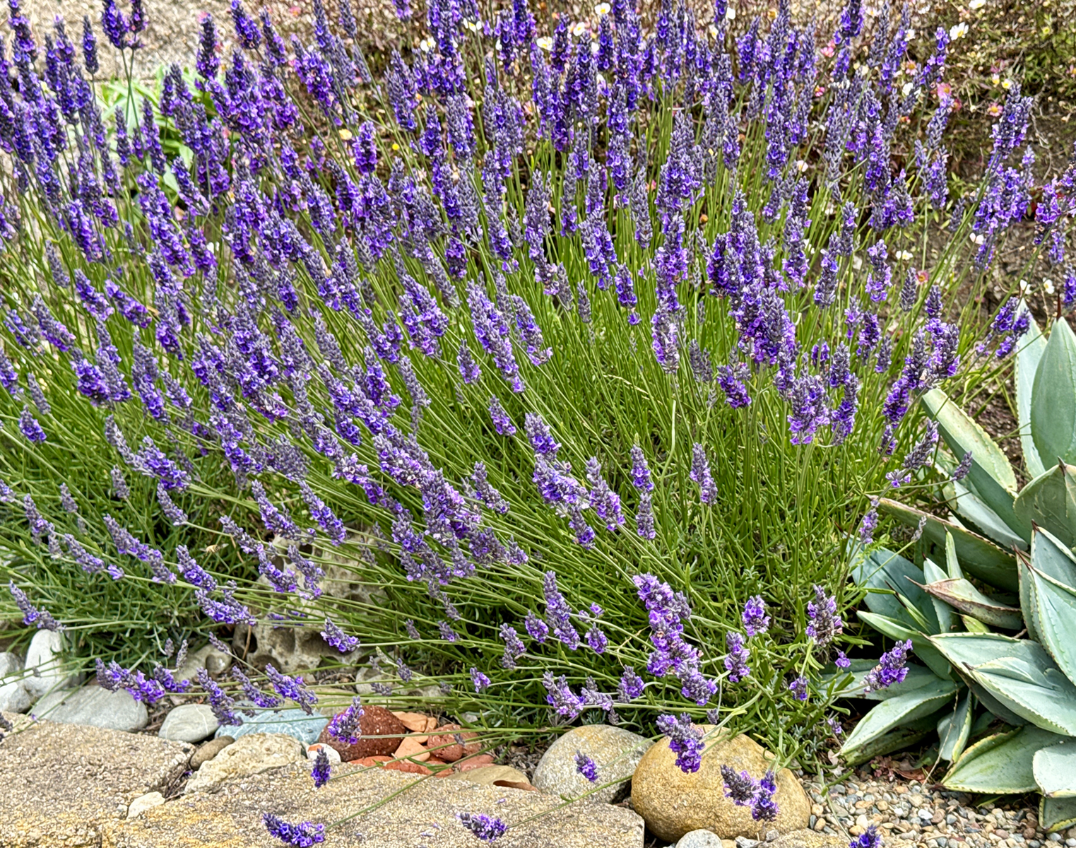
Lastly! The lavender is abloom here in foggy, mizzling Pacifica. There are about 20 bees of various species on the job, on this plant alone, and the scent is divine. I sit on the retaining wall and just breathe.

Earlier this month I was delighted/surprised to be accepted to the 17th Annual Sanchez Art Center 50|50 Show, in which 50 artists complete 50 small works in 50 days. (I’ll just let that sink in a bit. It’s both a lot and a little at the same time.)
In the weeks leading up to the call for entries, I worked on ideas for proof of concept — Can I do fifty of this? Is it sufficiently interesting and compelling? Will I wish I was never born? I finally arrived at an exploration of abstract geometric collage — well suited to the size and scale of the project and of deep historical and personal significance. Working through a dozen or so test pieces, I refined my materials and techniques until I heard that still, small voice announcing, “Yes, this is good. You can do this.”

Then, I had to write the dread Artist’s Statement — a standard part of any entry process — and one of the most challenging things I’ve ever had to do. I made it excruciating, but! I persevered. Here’s what I arrived at (in fear and loathing) as the submission deadline was approaching:
“Constructed with awareness, but not with calculation, led by high intuition, and brought to harmony and rhythm.”
— Piet Mondrian, 1916
Awareness, intuition, harmony, rhythm… How many ways can circles, squares and triangles be assembled to create compositions that flow, balance and fit in the space allowed?
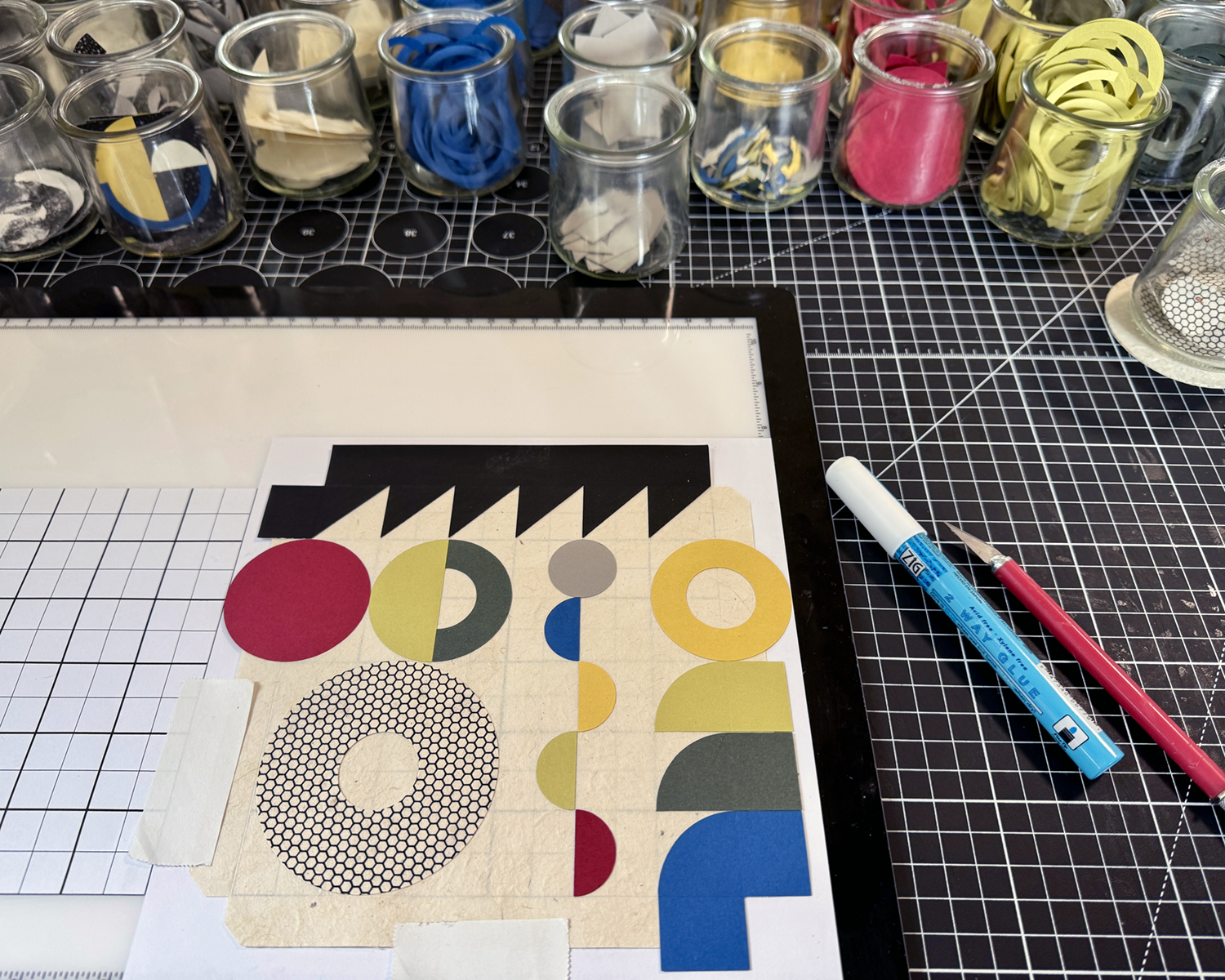
In these collage works, cut papers — color, mono printed and found — are manipulated and arranged to create balanced, rhythmic patterns and correspondences that please and satisfy our curious pattern-seeking sensibilities.
In exploring abstract geometric collage, evidence of the — my! — maker’s hand is evident in tiny misalignments; they are forgiven and unintentionally lend an animation to the work. When multiple compositions are hung together, new patterns emerge. Possibilities remain endless.
Once I got over myself and that hurdle, I realized two things: first, artist statements are not carved in stone for all eternity and can and should be revised at will, at any time. Second, I’m pretty sure most people are not as mean, judgmental or paralyzing as my inner critic. And so, merrily, we rolled along.


Wish me luck, inspiration and endurance, friends! These panels are (thus far) fun and satisfying to build! They make your eyes dance (in a good way)! The show opens Friday, 05 September, and runs through Sunday, 05 October. If you’re in the SF Bay Area, do consider stopping by the Sanchez Art Center to enjoy this exhibition of 50 artists’ works!
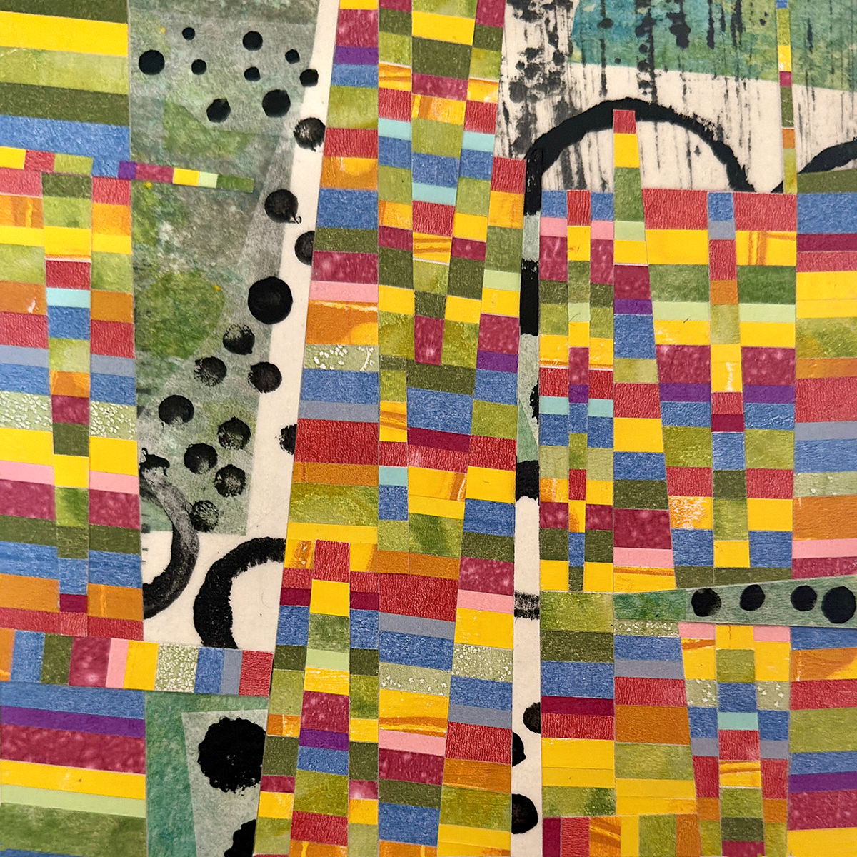
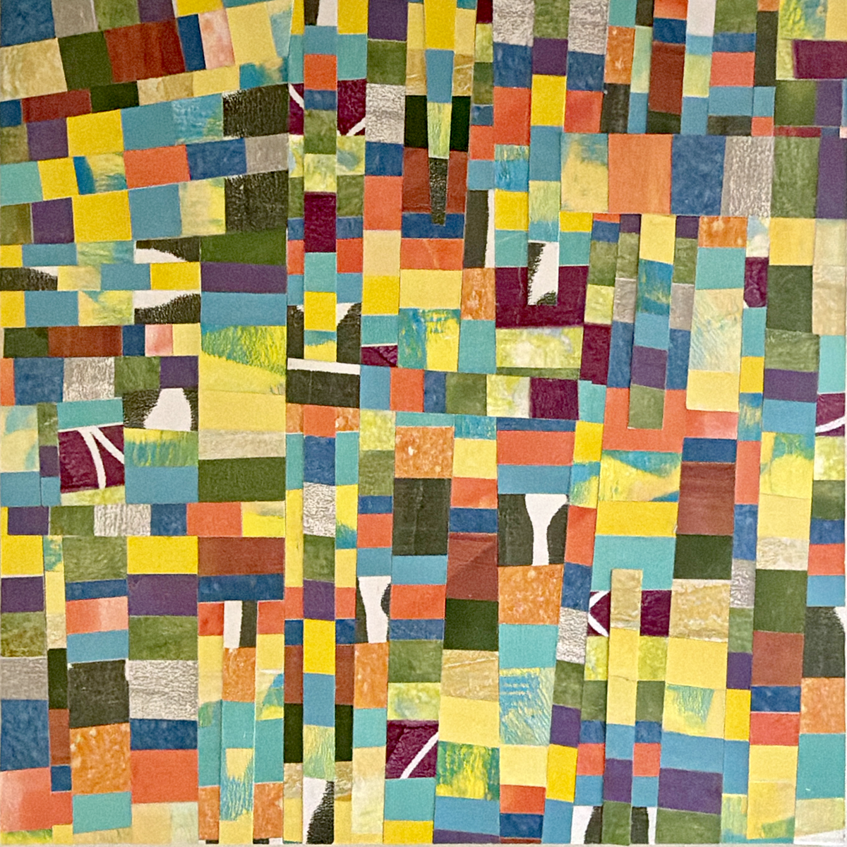
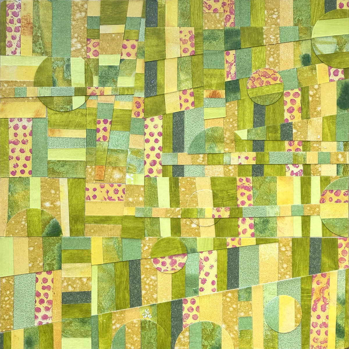
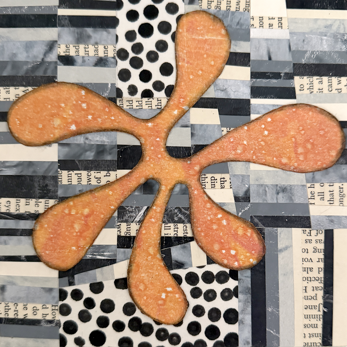
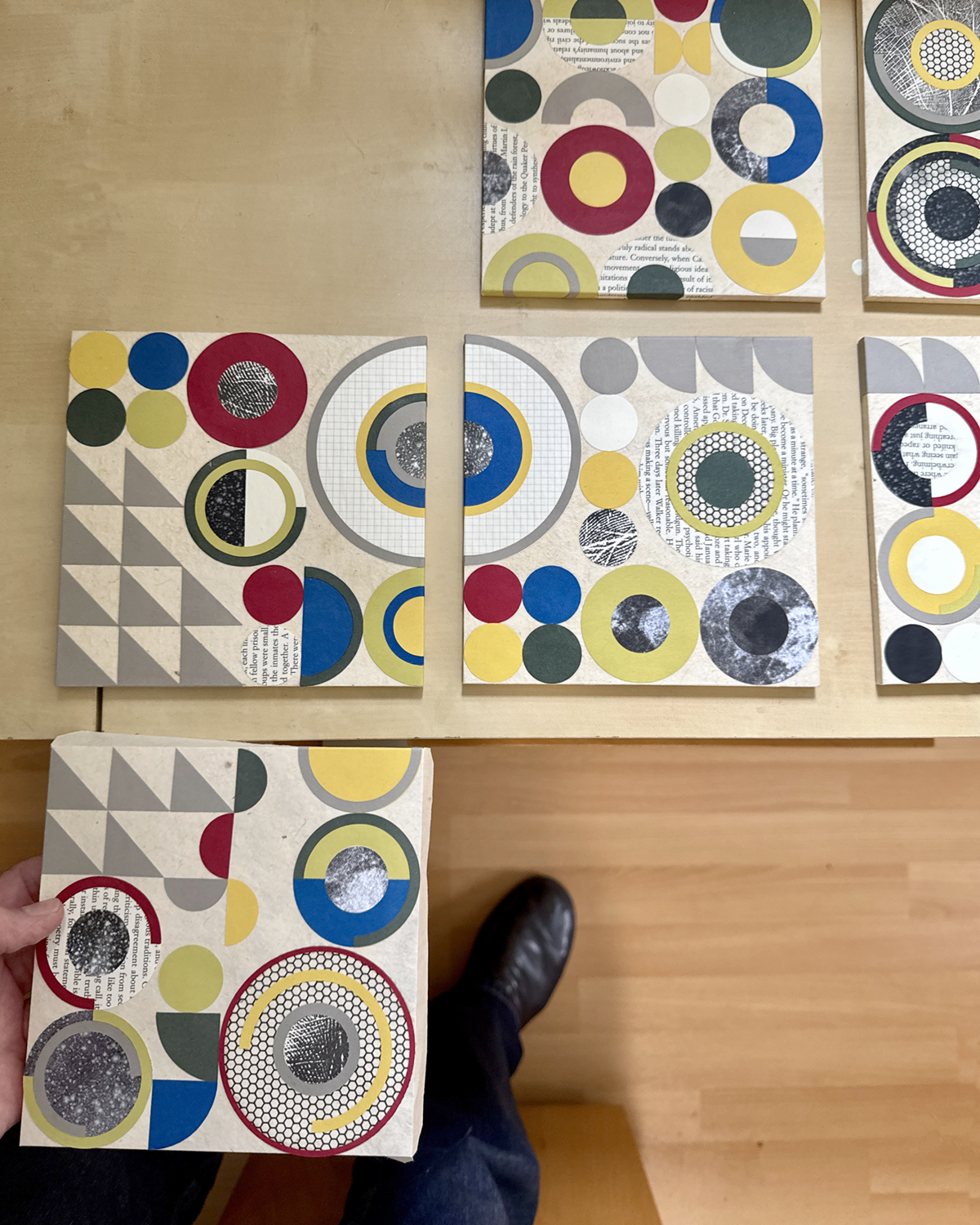
Been a little sidewise lately, what with birthdays and some away time… but mostly with a new project involving compositions of geometric shapes, with limited color palettes and mono printed and solid papers.
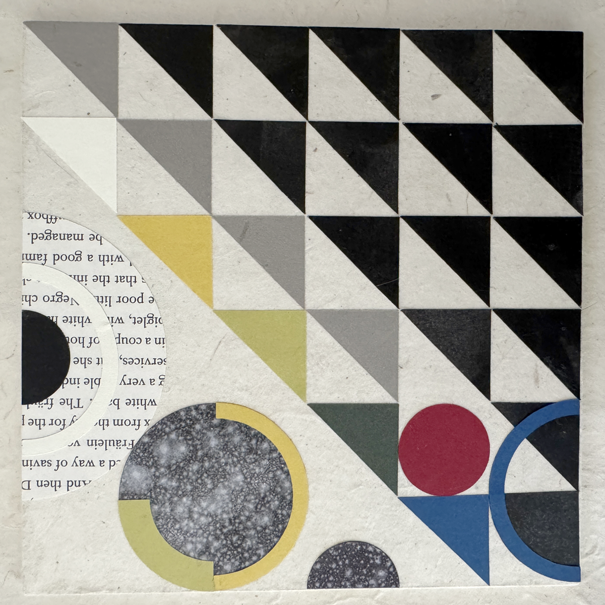

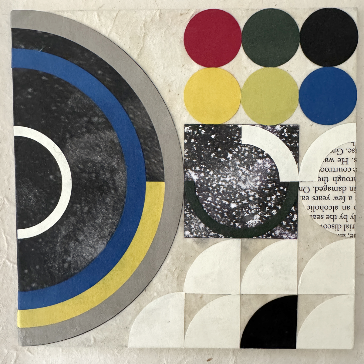
These babes are like the third iteration (thus far) of materials, colors and component shapes. Sourcing non-bleeding papers of suitable quality, weight and hue was/is an ongoing process (looking at you, royal blue, and previously, lokta crimson). Still working out best practices for the hand assembly, adhesive finesse and crisp tidy edges.
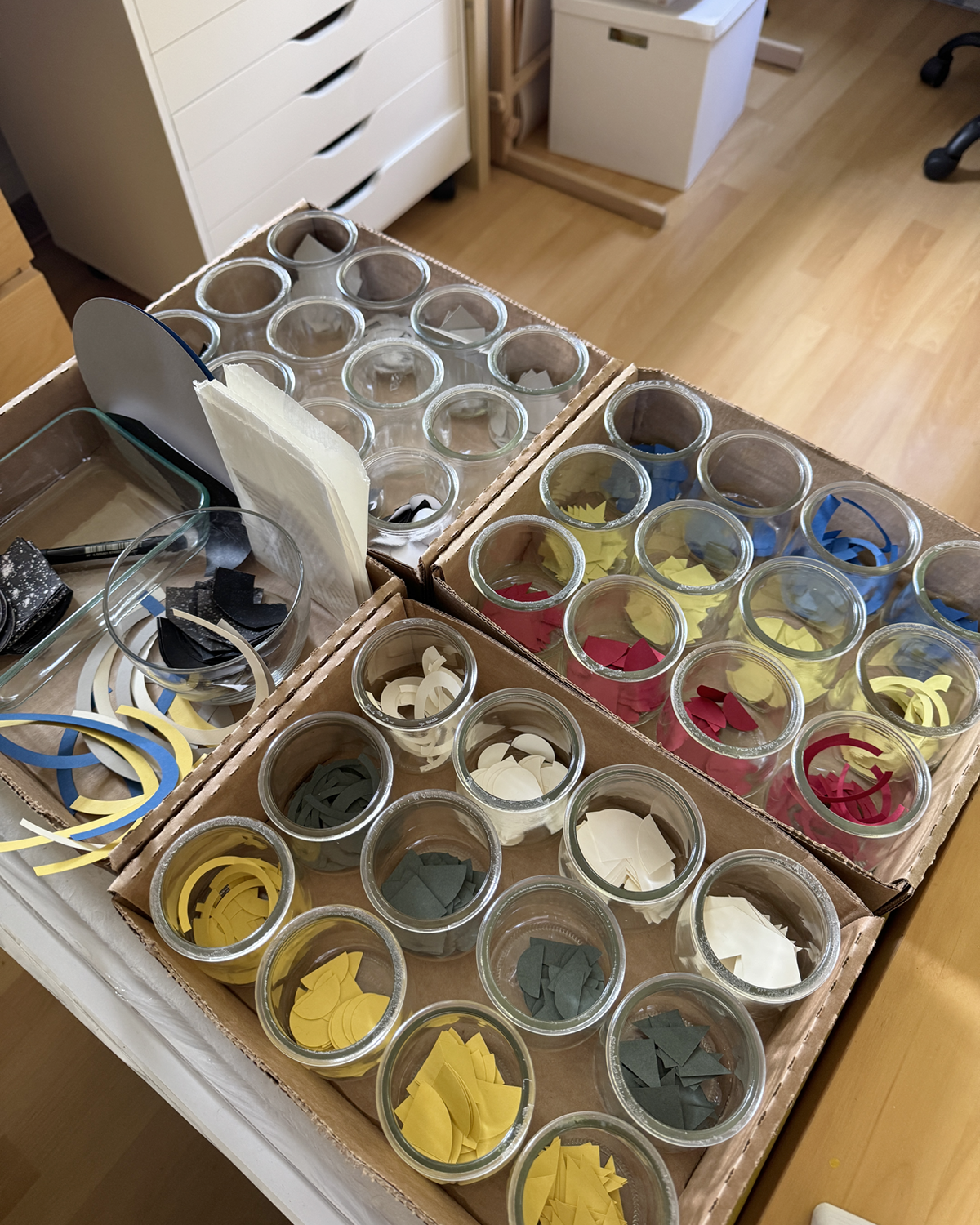
This is part of my color shapes system, with two other flats of the primary mono printed mixed blacks not shown. (And because I’m pulling prints on 28 lb. printer paper, I get to ink the white edges of each shape with a black PITT pen :)
I’m enjoying myself tremendously. All my graphic design training and experience gets to play, and I’m paying homage to some of my original influences: Bauhaus philosophies and practice, International Typographic Design (Cleanliness. Readability. Objectivity.) and, of course, beautiful, satisfying geometry.

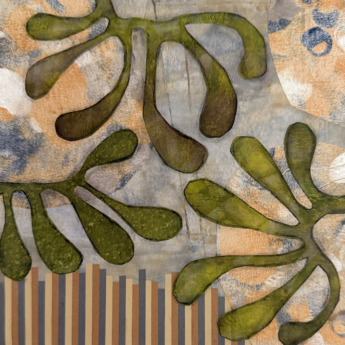
I’ve been enjoying a really good, fun class from Fibre Arts Take Two featuring multi media artist Eva Kalien. Her approach to art making is thoughtful, eccentric, and encouraging — and the concept of working on several pieces simultaneously, to iterate quickly and freely, is a game changer!
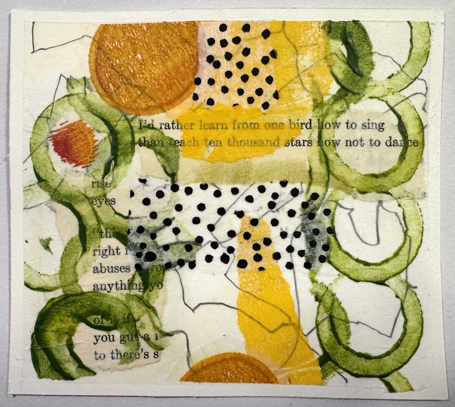
Here’s a closeup of one of a series studies. Eva likes to use printed text in her process (for many reasons) and I chose to follow… with my high school copy of ee cummings’ poetry. (Yes, I tore up a beloved book I’ve been carrying around for many years.) Although the text may not be legible, I know it’s there, a foundational layer of meaning and message, and it’s strangely powerful. She also suggests to “stop before you’re done”, another concept of surprising benefit.
In other news, I’ve ordered an early birthday present — a special thing I’ve been considering for some time: a build it yourself printing press from Provisional Press. Check it out! So very exciting, and I’ll keep you apprised. (It also means I’m going to have to clean off (and defend!) a work bench in the garage for it to live on… no small task.)
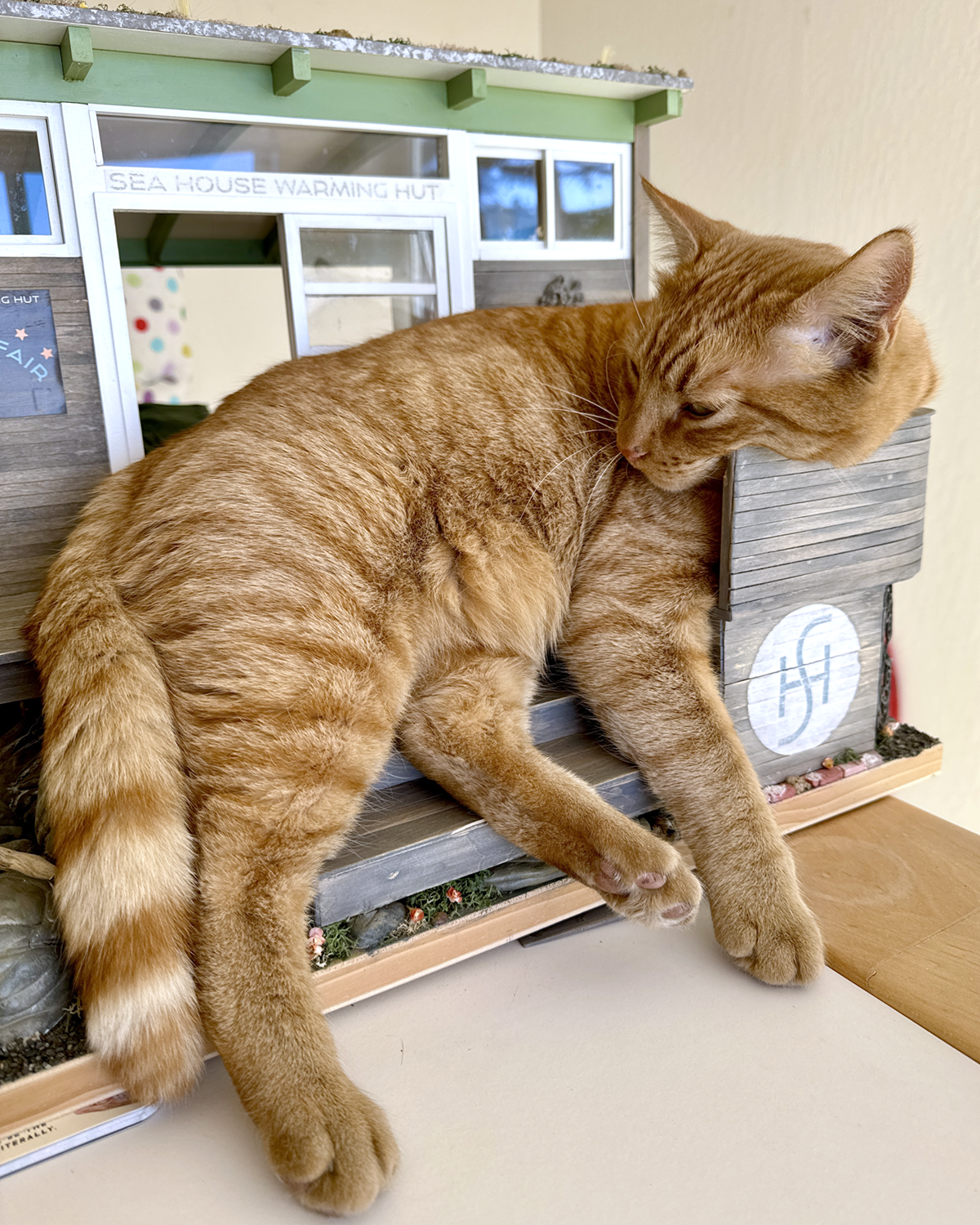
He also likes to rearrange the furniture, and crop the “living” roof :/

Although this photo was taken during high tide, this is the water feature look I want to emulate on the Sea House Conservatory low tide build.

After watching countless hours of video demonstrations from a variety of sources, I started my experiment with a small area at the front of the Leadlights landscaping that seemed natural for a water incursion. I glued a 2-inch tall length of acetate to the project board to form a dam, several inches longer than the intended 4-inch-wide pour, reinforced with masking tape below and tape holdfasts above.
Several deep breaths and I poured a scant quarter-inch of Realistic Water ™ from Woodland Scenics into the prepared area. Recommendation is an eighth-inch, but hey, it pours fast. So far so good.
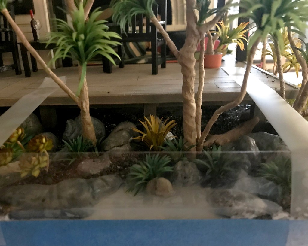
I did the same prep on the Conservatory project board.

One tricky situation encountered is when any element of the landscaping extends past the base, even a little. I had some time to consider ways I will do it differently next time, as I held the acetate to the base while the glue set adequately.

When the glue seemed set, I boldly — yet delicately — poured the first course of water into the prepared base. Altogether, five or six individual glugs into each tide pool and basin.

Unsurprisingly, as I looked and marveled at the swampy effect and the no-going-back-nowness, a few small, very slow leaks began to develop. I used wide painter’s tape to further seal — more on that later — the acetate dam to the base. Checking again about two hours later I added more tape, and also noticed a few small areas where the glue I had used to cement the gravel and boulders to the base seemed to be turning opaque white.
Hmmm.
The recommendation for the water product is to let each layer dry at least 24 hours. It was very late by this time, so I called it a night very early morning and went to bed.

Next morning, not 24 hours later, I was encouraged to see the water was turning clearer, but the small white areas were still present, noticeably in the transition areas of gravel I had applied a few days earlier.

So I re-read the product label instructions.

Not for use with PVA glue. I’ll shorten my whole lengthy tirade — who doesn’t commonly use PVA glue? Why wasn’t this the very first caveat on the label, and why was this condition never mentioned in any of the company’s instructional videos on use of the product, etc… and lots of swears and unkind, rude assumptions and declarations. But then there was the offhand “Cure above 70°F.” Thankfully I have a wise and patient bitch buddy to vent to with whom I can vent. You know who you are are.
Then I calmed down enough to embrace that since there was nothing I could do about it now, I’d wait and see what would continue to happen. After all, it had not been even 24 hours yet, and it is a rather larger area and blah, grumble, blah.
I wasted more time did more research on pouring water, this time with a variety of mediums and preparation techniques, and even grubbed around in some forums, which I detest, and learned that yes/no there are some/not any problems with PVA glue that can be gotten around by sealing everything with — and here again suggestions vary — some sort of varnish, and, most valuably, some clever ways to build and seal dams for water feature success. One involved swamp water.
Time passed, and my watery problems with this product mostly resolved themselves. I continue to steep myself in the experiences of others.

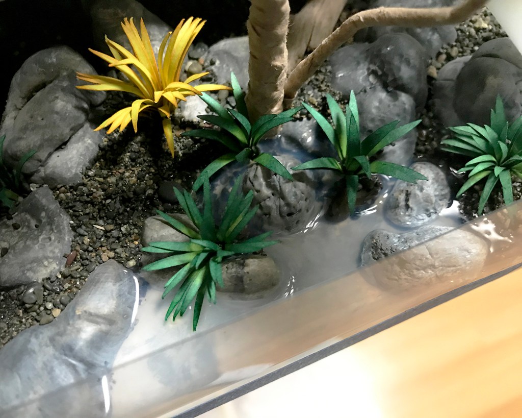
I did a second pour on Leadlights, and a second and third pour on areas of the Conservatory. Above you can see the dam removed to reveal the fully cured water. (One of the plants bled a little color into the water, but I don’t mind.) I wanted a “live edge” to the water, and used an Xacto knife to carve away the lip. The project base itself will be edge-banded with thin basswood for a finished look :)

All in all, I am happy with and consider the results a success. I’ll know so much more on the next one.
Check out the light shimmer on the right pier piling, a reflection from the late afternoon light. Magical realism, which validates my efforts :)
I’ll leave you with this image found in Bolinas, on the estuary marsh/riparian transition on a winter afternoon hike at low tide. (Very low and long ago for this guy.)


In preparation for creating the tidal water surge under the Sea House Conservatory, I mixed up a nice ocean green base color and painted it generously on the project board. I made sure the whole 26 x 20-inch base — foam cliff landslide, boulders, cobble, gravel, old tiled patio — was well-sealed with glue or paint to prevent water leaks. Two-inch tall heavy acetate strips were cut, ready to glue to the base to form a (removable) perimeter dam.
I estimated an area about 18 by 18 inches would be covered an inch deep, then used the Woodland Scenics water estimator to see how much product I needed to buy. Two, maybe three bottles?
Um, no. No, no, no. Depending on whether I chose “Realistic ($24 for 16 ounces)” or “Deep Pour ($30 for 12 ounces)” the estimated 180 ounces required 12 or 15 product bottles, costing a total of $288 or $450. For a feature, however awesome, mostly obscured beneath the Conservatory deck, this makes no sense. Back to the proverbial literal project board to drastically reduce surface area.
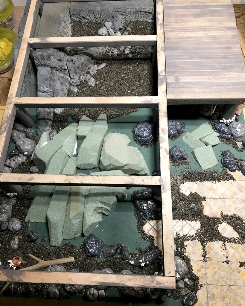
After fashioning more florist foam into reefs and rocks, I glued them to the project board.

Starting this time with black Model Magic, I forged another batch of accent rocks.


The foam shoreline formations were generously sealed and detailed with a few shades of warm and cool gray acrylic and stabbing holes with a pointy thing. All base edges were given a transitional application of gravel, cobble and accent rocks. These were allowed to dry, excess gravel brushed out, and the process repeated.

“What are those white cone things?” I can hear those of you looking at this photo on your phone exclaim. What, yes! Those white things are perfect barnacles, crafted by Keli of iseecerulean.com.

(I am not ungrateful. We have a longtime water-influenced exchange going on.)

I did a final brushing and shaking off loose gravel after the glue dried over my (1:1 life) front deck, just as the sun was setting.


You know how it is when maybe you fall a little bit too much in love with your build? That’s how it is for me right now with these sunset light photos. I have about a dozen that made first, even second cut, and they are all epic. One more, please indulge me.

I sighted through all the open viewpoints, and as I mentioned earlier, most all will be obscured once the Conservatory is in place. But I know, and now you do too, what lies beneath.