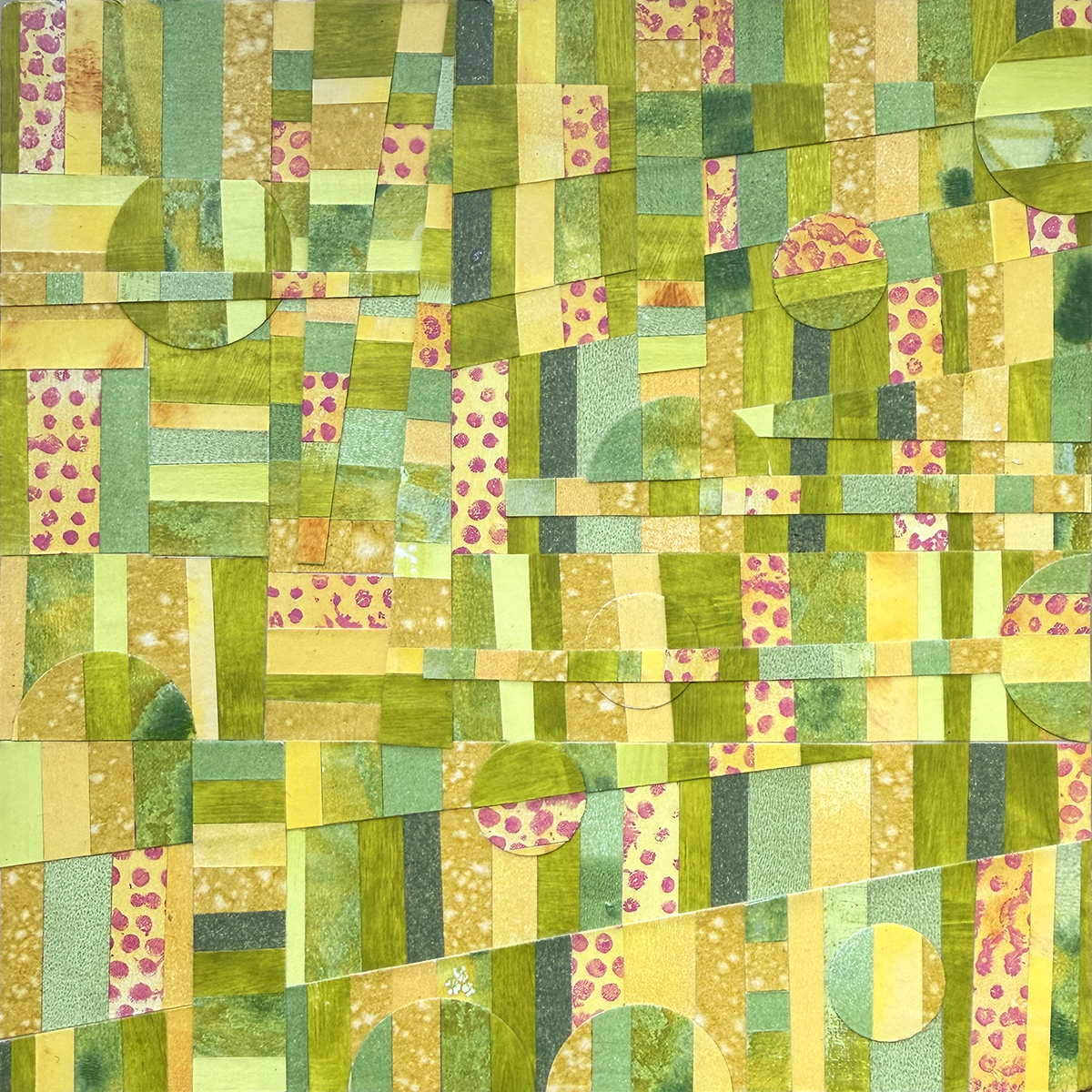
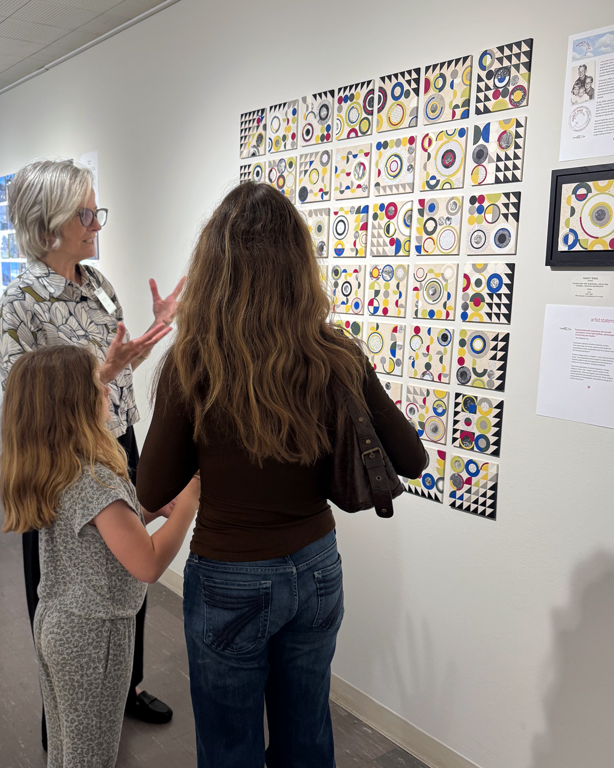
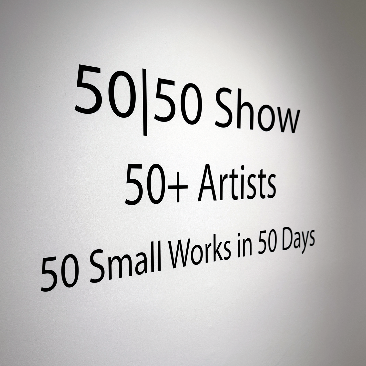
50+ artists, each producing 50 small works (6×6 inches) in 50 days
I’m still processing the experience, unfolding in successive waves. So much goodness and delight. The show runs for a month, and I’m signed up for weekly gallery sitting shifts, which means getting to study/enjoy all the works in depth, and meet and talk with artists and gallery goers (and assist them with their purchases). If you’re in the SF Bay Area, come by! (Sanchez Art Center welcomes visitors at no charge; galleries are open Friday, Saturday, and Sunday from 1–5 pm, through October 5. )

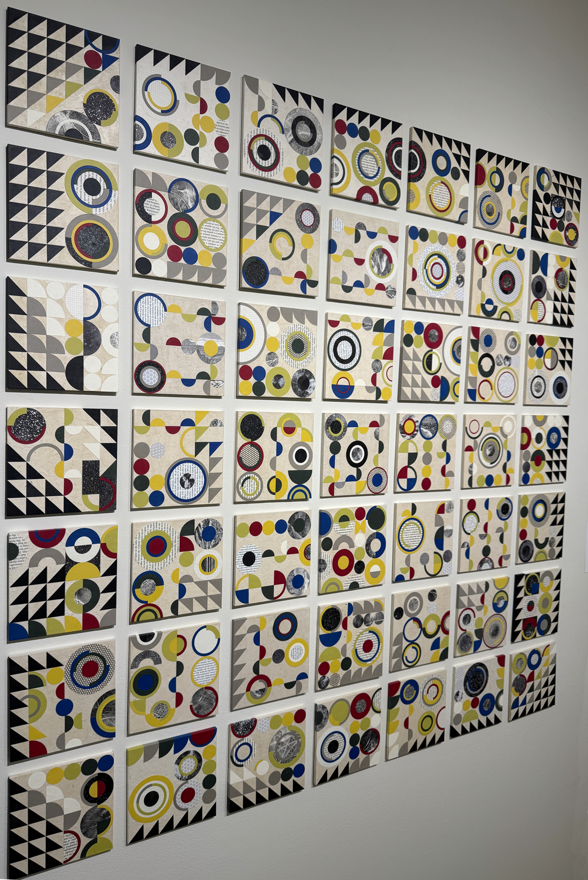
Not gonna lie, fifty 6×6-inch panels is a lot of eventual individual artworks to make in as many days. Priming and sanding them all was a good way to ease into the enormity.
I eventually got into a kind of rhythm of creation, with a set of steps and best practices. Iteration is a great way to really explore the geometric relationships with color and balance. (Amusing, too, as I rejected placements that looked like butts or boobs, although the occasional egg yolk or eyeball were okay.) Every single panel was a surprise, and interesting to see through to its completion. Somewhere after panel 25 or so, I gained trust in the process and my ability. Flow state increased in onset and duration.
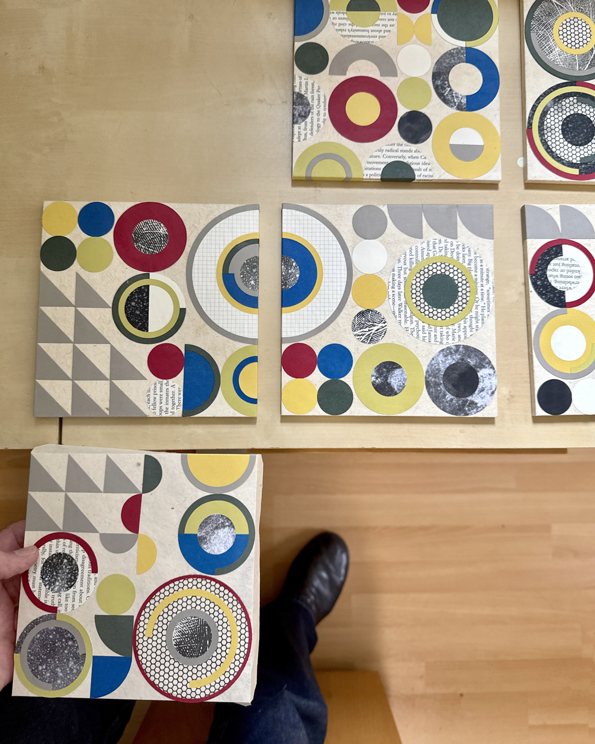
Periodically, I’d lay out the work to date on some inadequate surface and just look, to see what I could see, and use the insight or finding on the next piece.
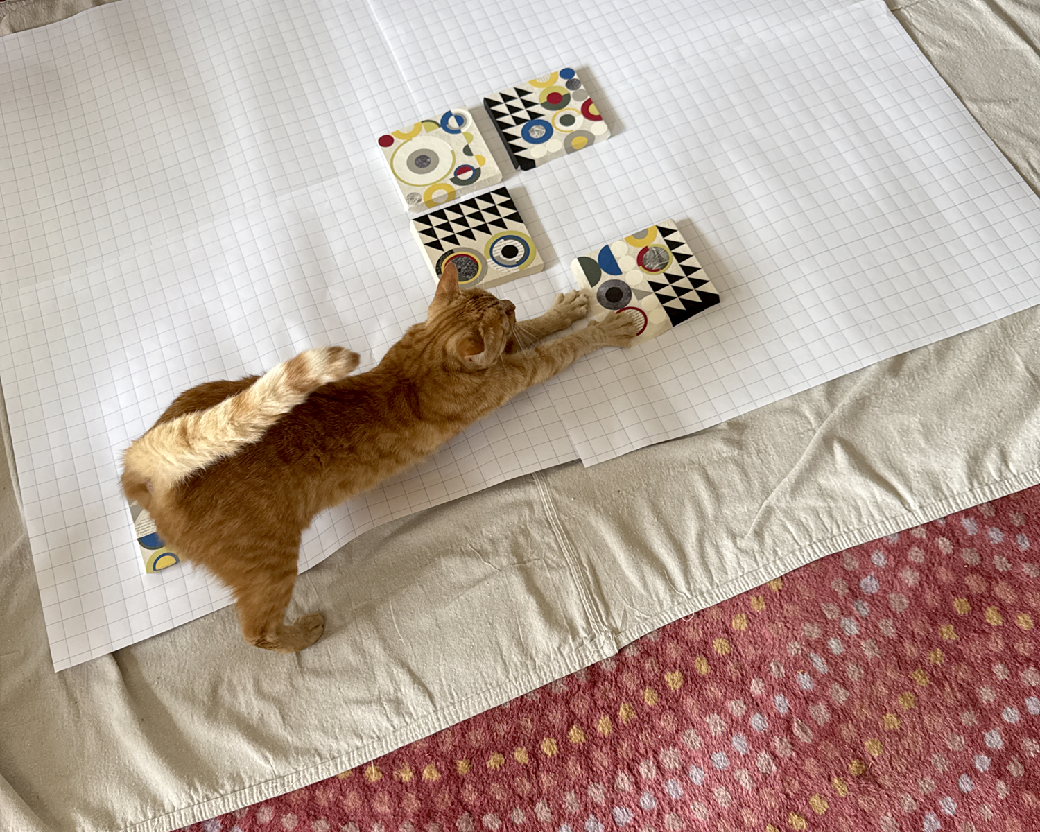

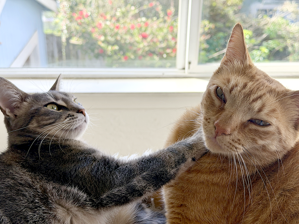
Tater has a large flat box on the ell of my desk in which he lounges and naps, etc., while I work. In the process of sorting and packaging the finished panels for transport to the gallery, I took his large box and replaced it with a smaller one — just temporarily! — and he was not at all having it.
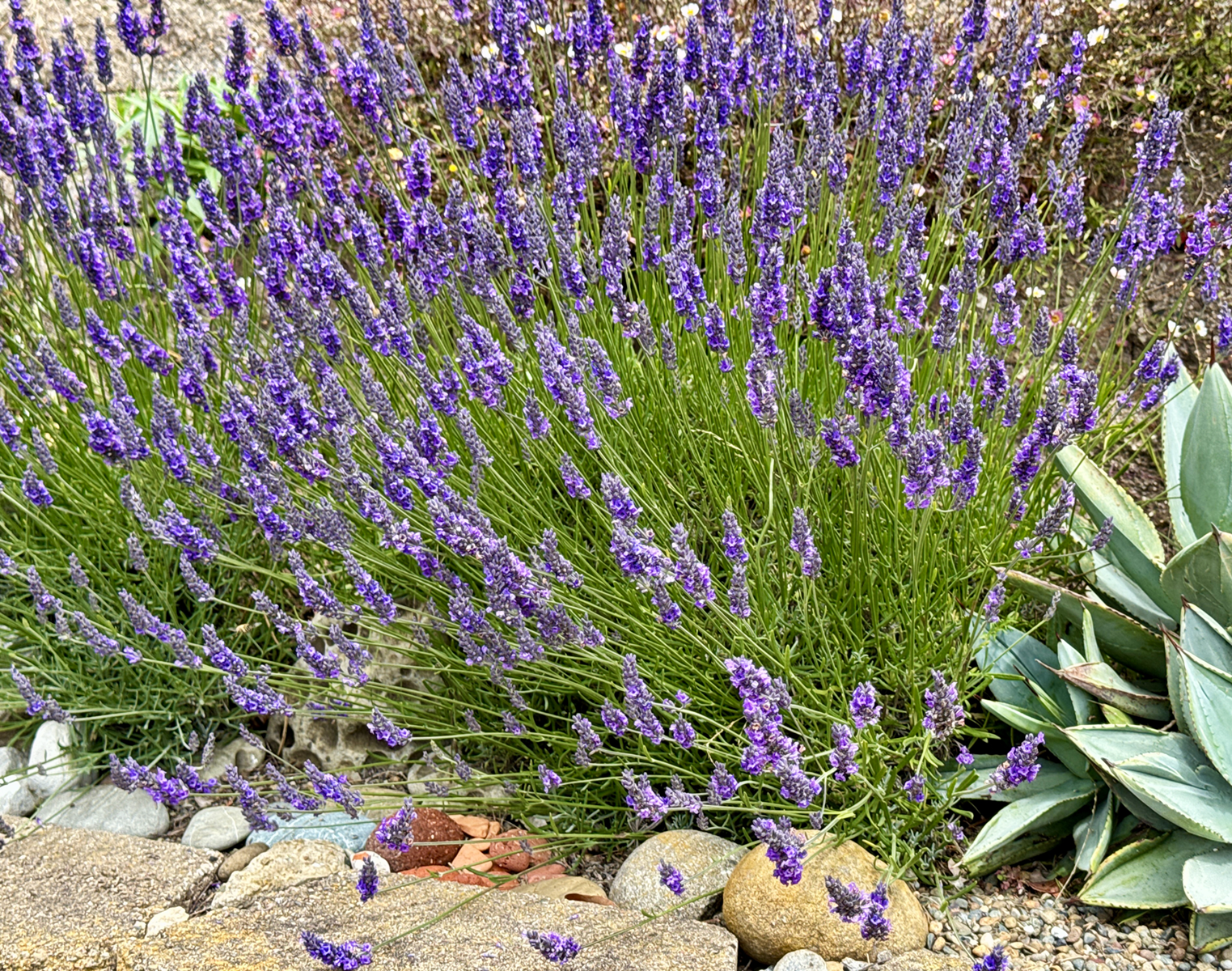
Lastly! The lavender is abloom here in foggy, mizzling Pacifica. There are about 20 bees of various species on the job, on this plant alone, and the scent is divine. I sit on the retaining wall and just breathe.
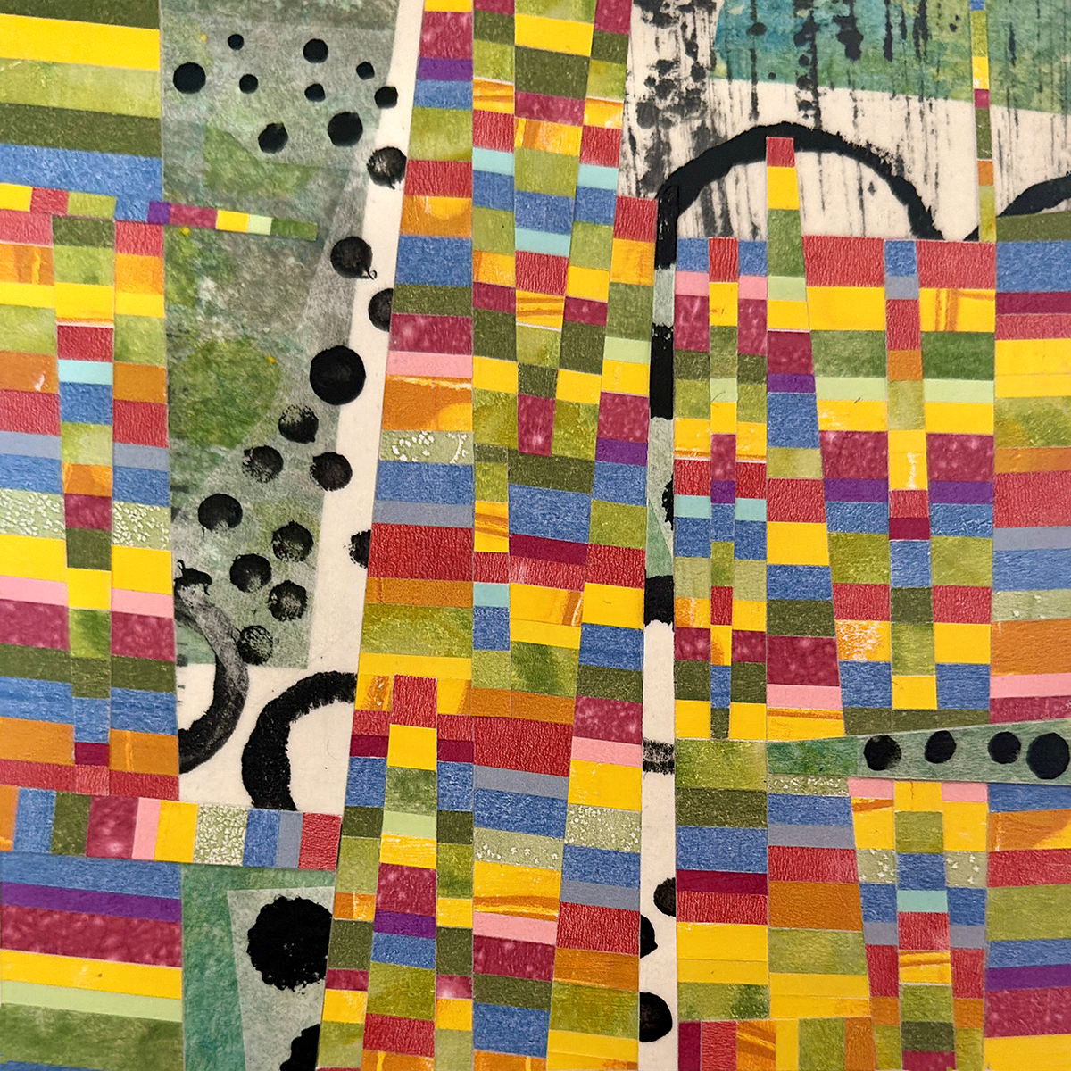
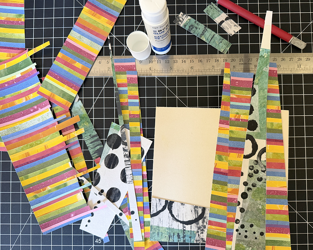
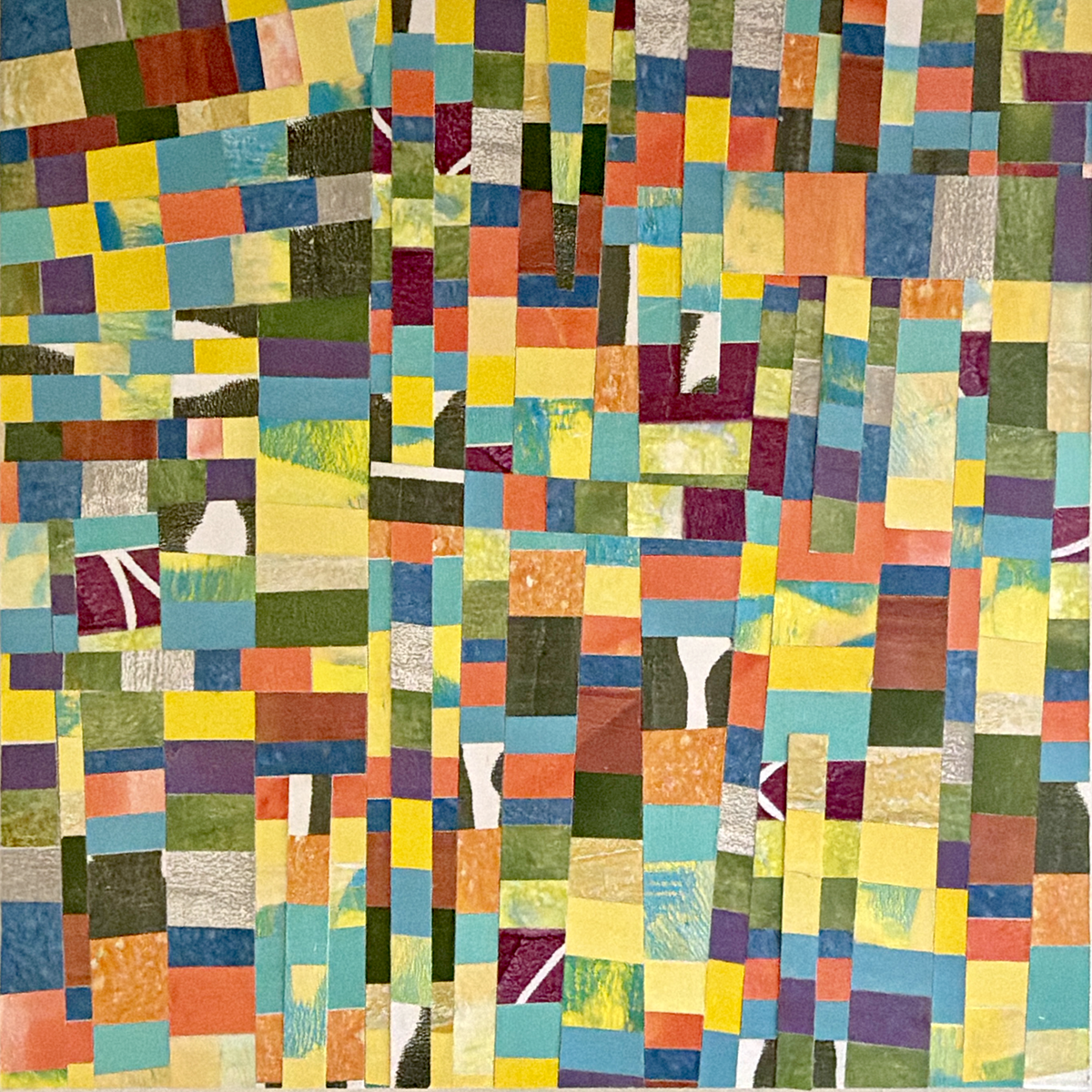
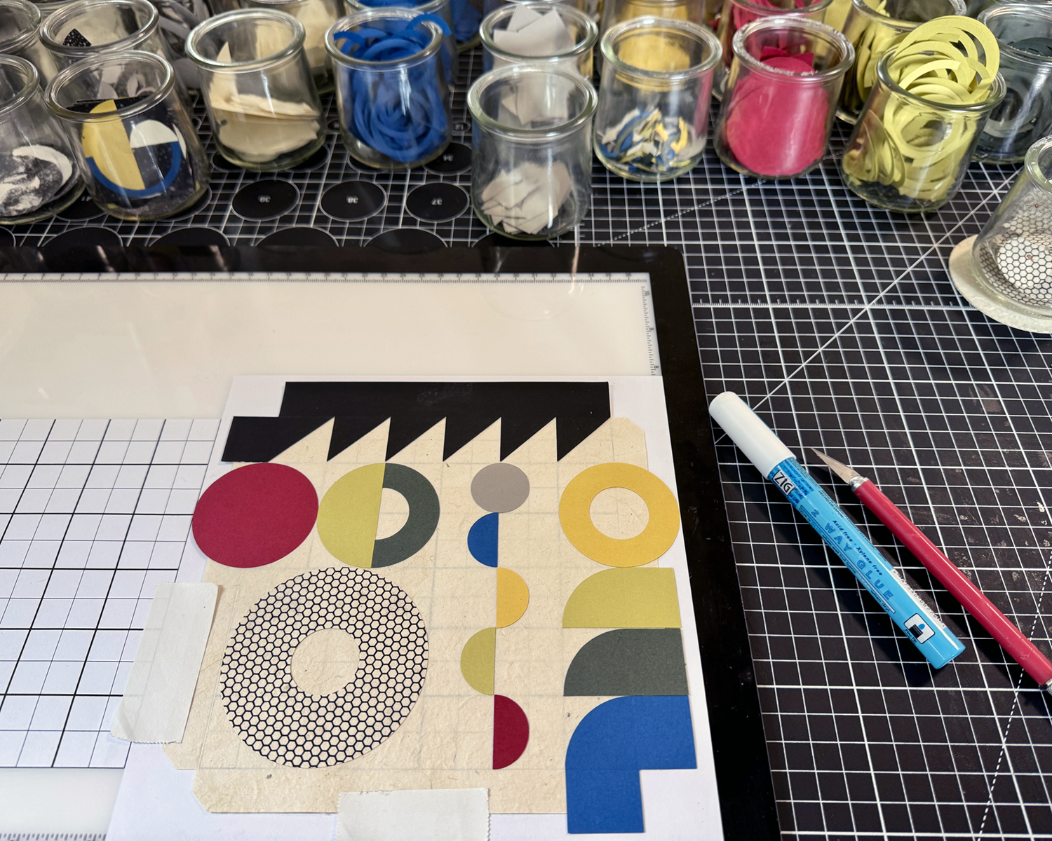
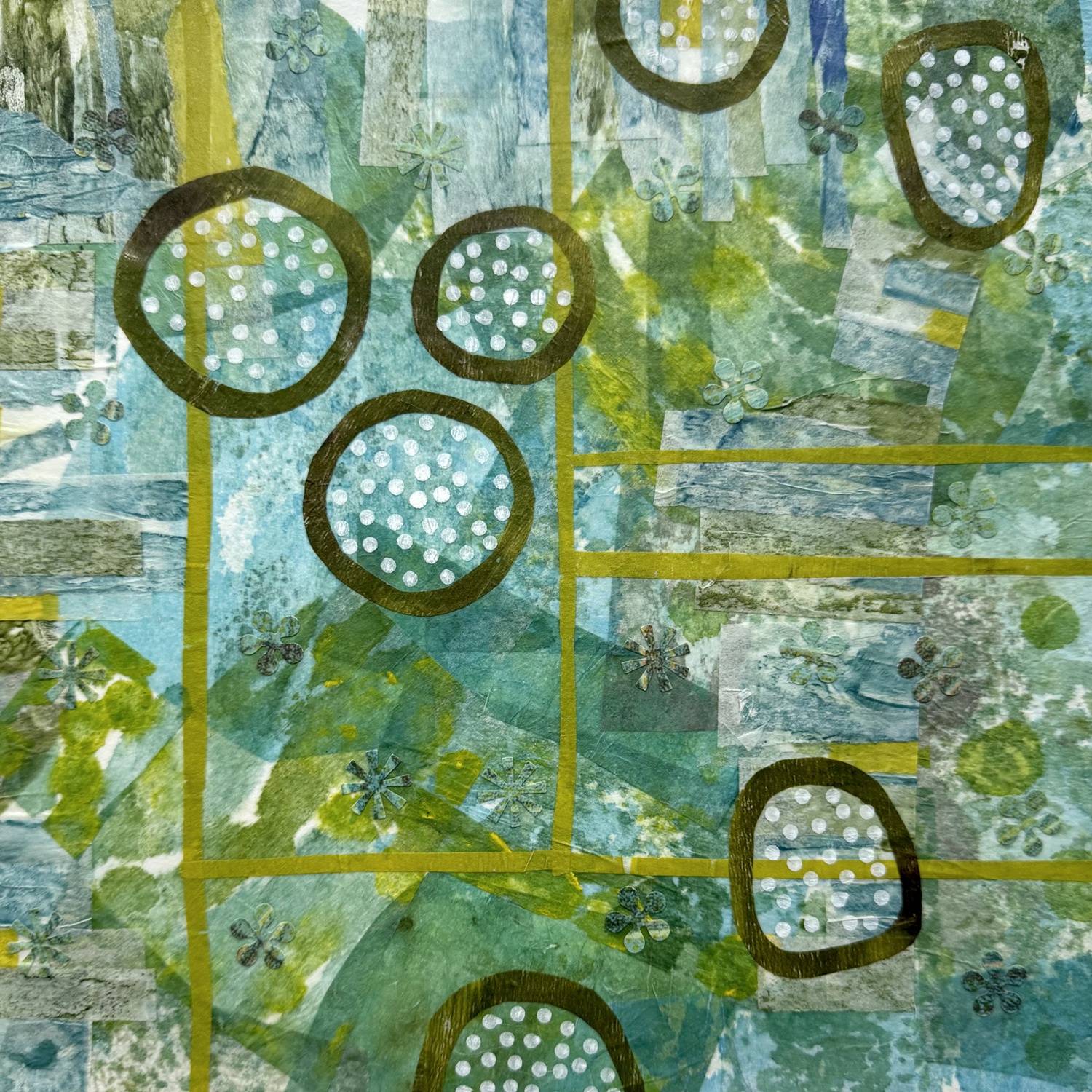
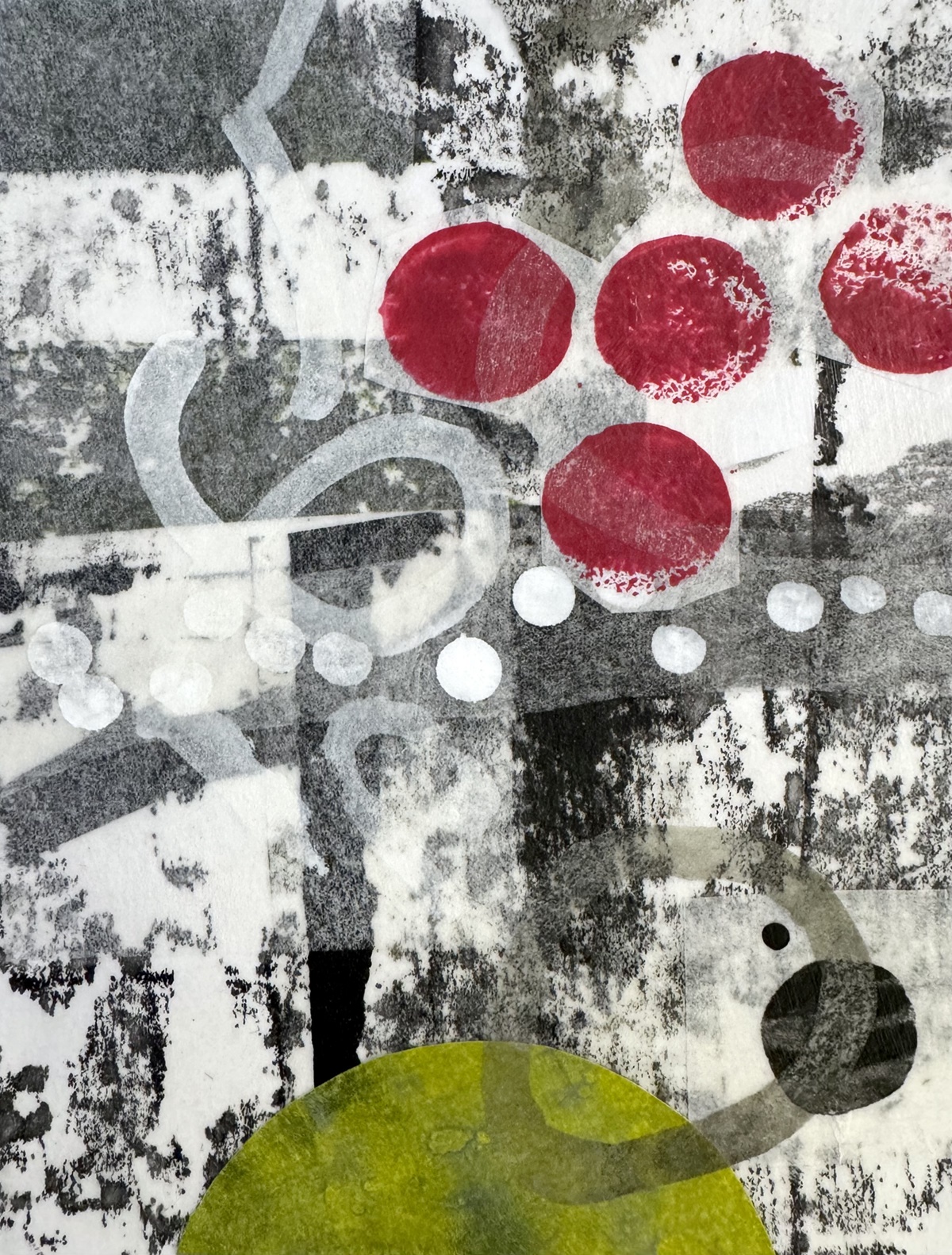
Been a little sidewise lately, what with birthdays and some away time… but mostly with a new project involving compositions of geometric shapes, with limited color palettes and mono printed and solid papers.
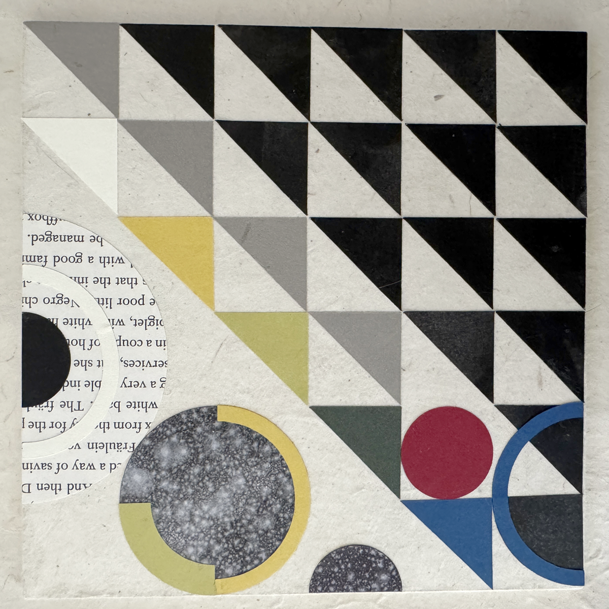

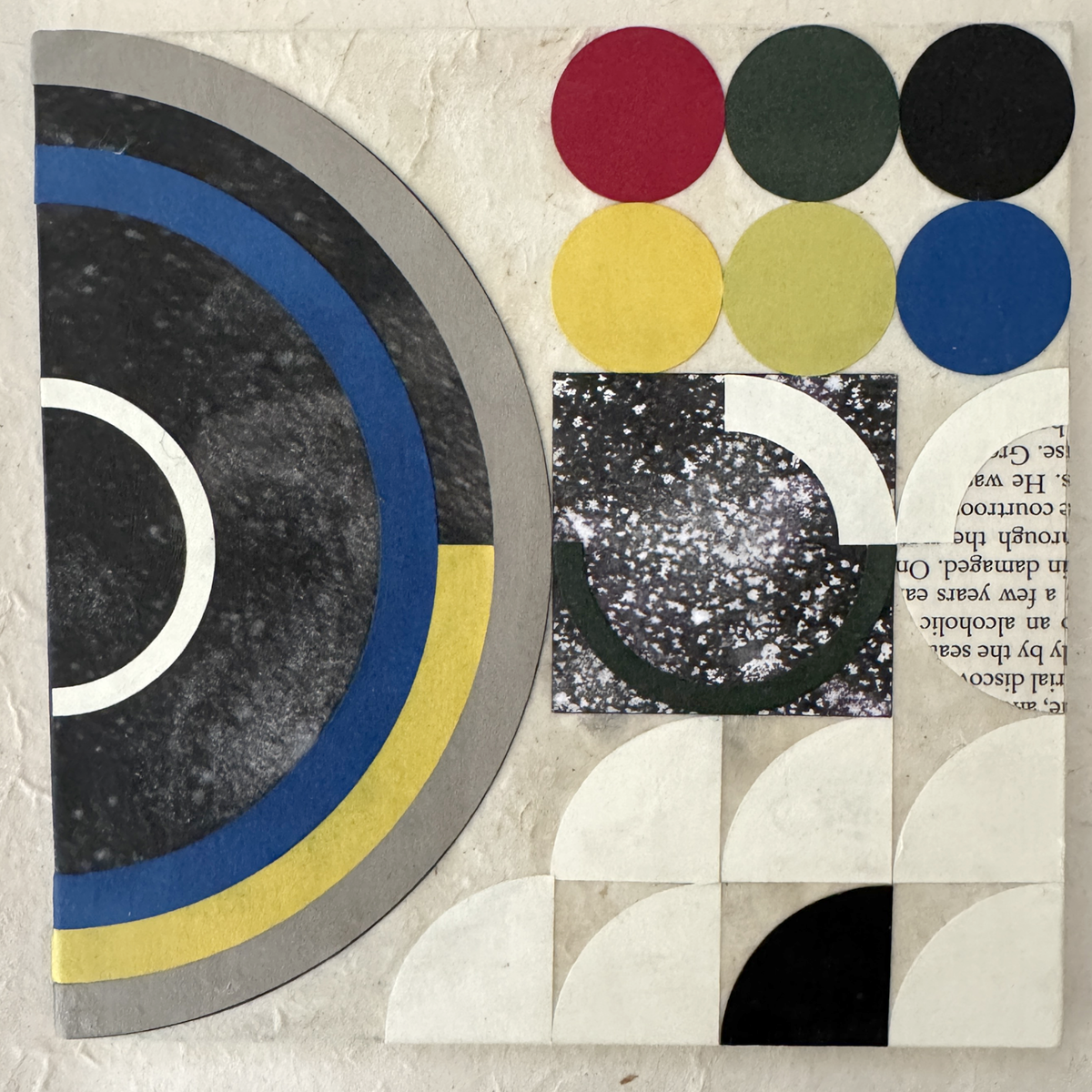
These babes are like the third iteration (thus far) of materials, colors and component shapes. Sourcing non-bleeding papers of suitable quality, weight and hue was/is an ongoing process (looking at you, royal blue, and previously, lokta crimson). Still working out best practices for the hand assembly, adhesive finesse and crisp tidy edges.
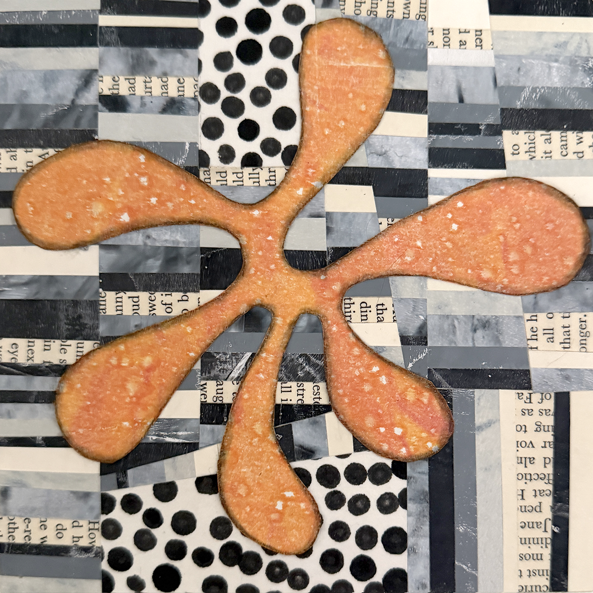
This is part of my color shapes system, with two other flats of the primary mono printed mixed blacks not shown. (And because I’m pulling prints on 28 lb. printer paper, I get to ink the white edges of each shape with a black PITT pen :)
I’m enjoying myself tremendously. All my graphic design training and experience gets to play, and I’m paying homage to some of my original influences: Bauhaus philosophies and practice, International Typographic Design (Cleanliness. Readability. Objectivity.) and, of course, beautiful, satisfying geometry.
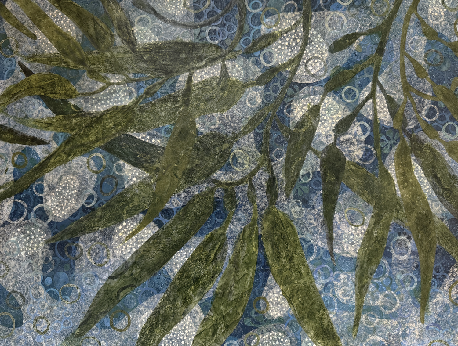
Ocean, plankton, kelp, waves, bubbles, currents, sunlight, depth, upwelling, holdfast, learning: favorite things
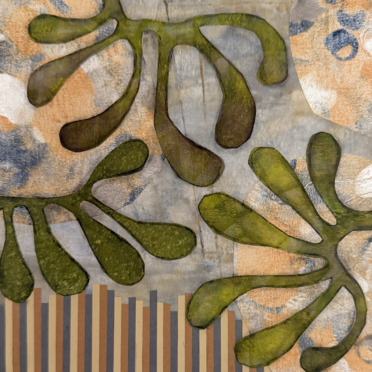
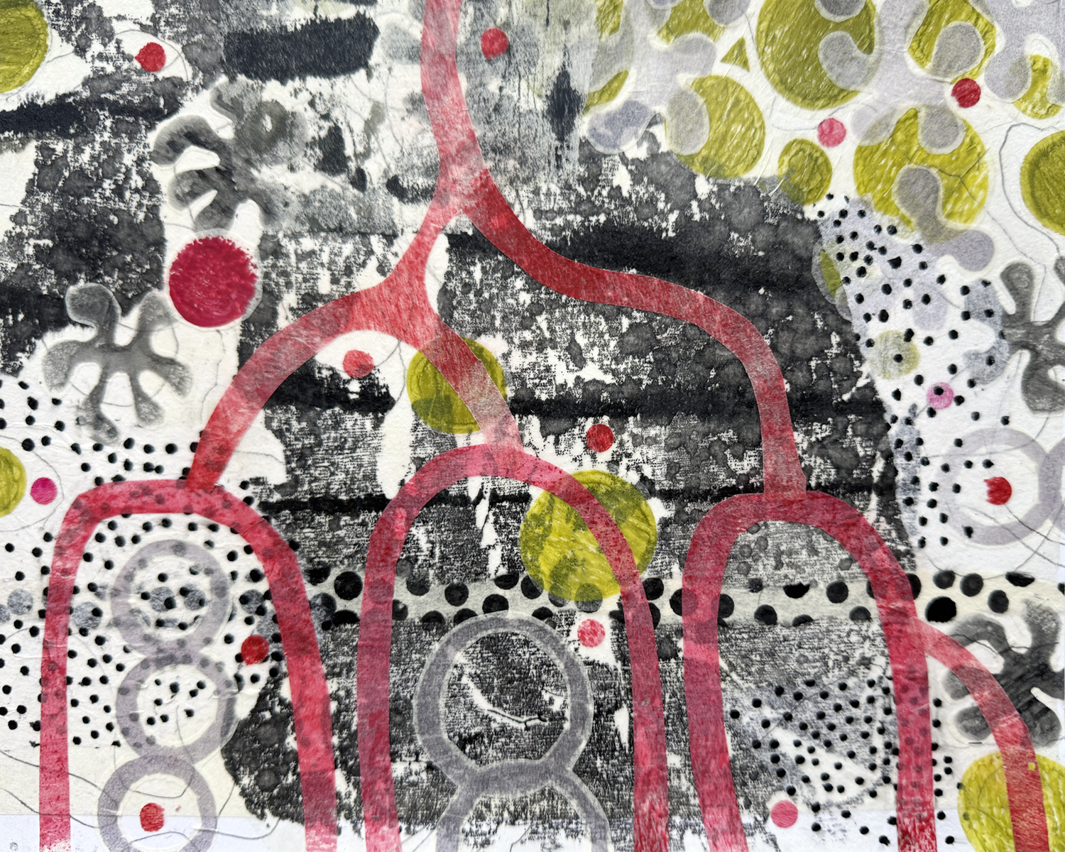
This piece started out last year as a foray into something else entirely, and sat in limbo a liminal state for months.
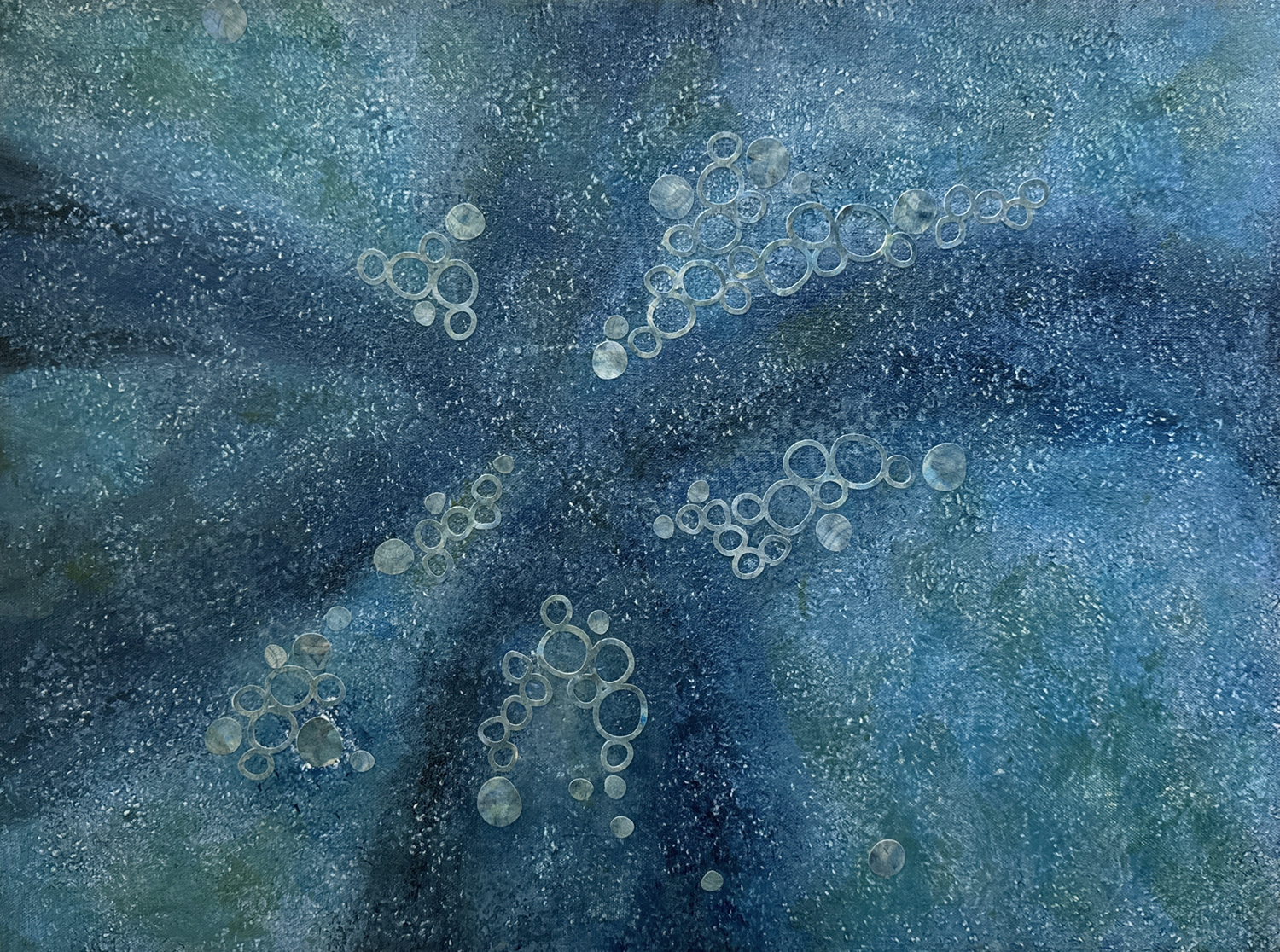
It became a deep blue-green painted background for an exploration of printed and cut papers in bubble patterns.
I worked mindfully, attentively, listening, conjuring beginner’s mind, getting discouraged. Small amoeba shapes — a recurring interest for me — were cut and added, to no avail. The piece and I were lost. It sat on the easel, sometimes covered by other projects, and became studio background. I studied, read a lot of art books, went to the Museum. And then, one day it occurred to me to add large lumpy amoeba shapes cut from thin tissue. I liked it! Then I saw they needed white dotted patches, and dot dot dot, a background was complete.
Ideas came regularly after that, and we were ON. The seaweed fronds and more bubbles! were cut from sheets of stamped, printed and painted tissue papers I keep readymade in stock. It was all cut, paste, consider, a bubble here, a bubble there, from there on.
I’ve learned so much from this piece — mostly what-not-to-do’s — and I’m satisfied to call it done. I can even look at it and smile, and feel like I’m another step along the way to competence. SO good.
I’m learning to come back to a piece and listen.
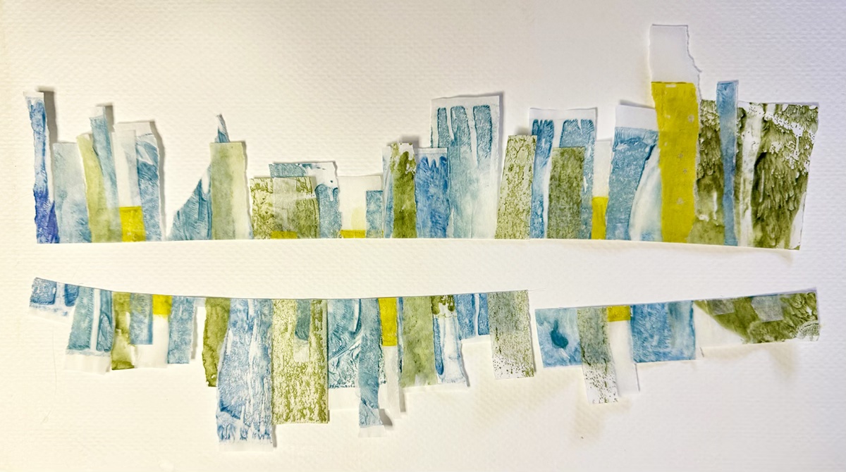
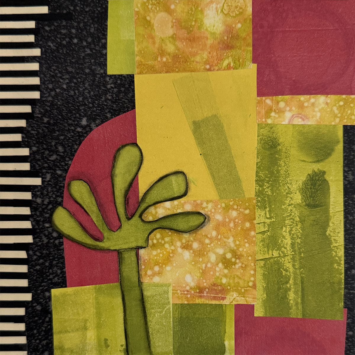
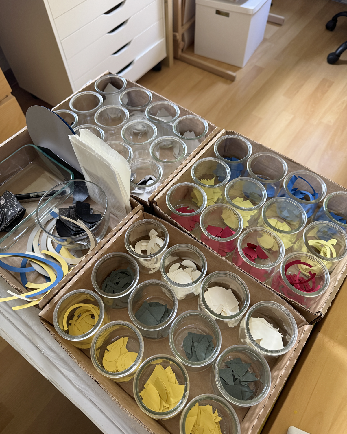
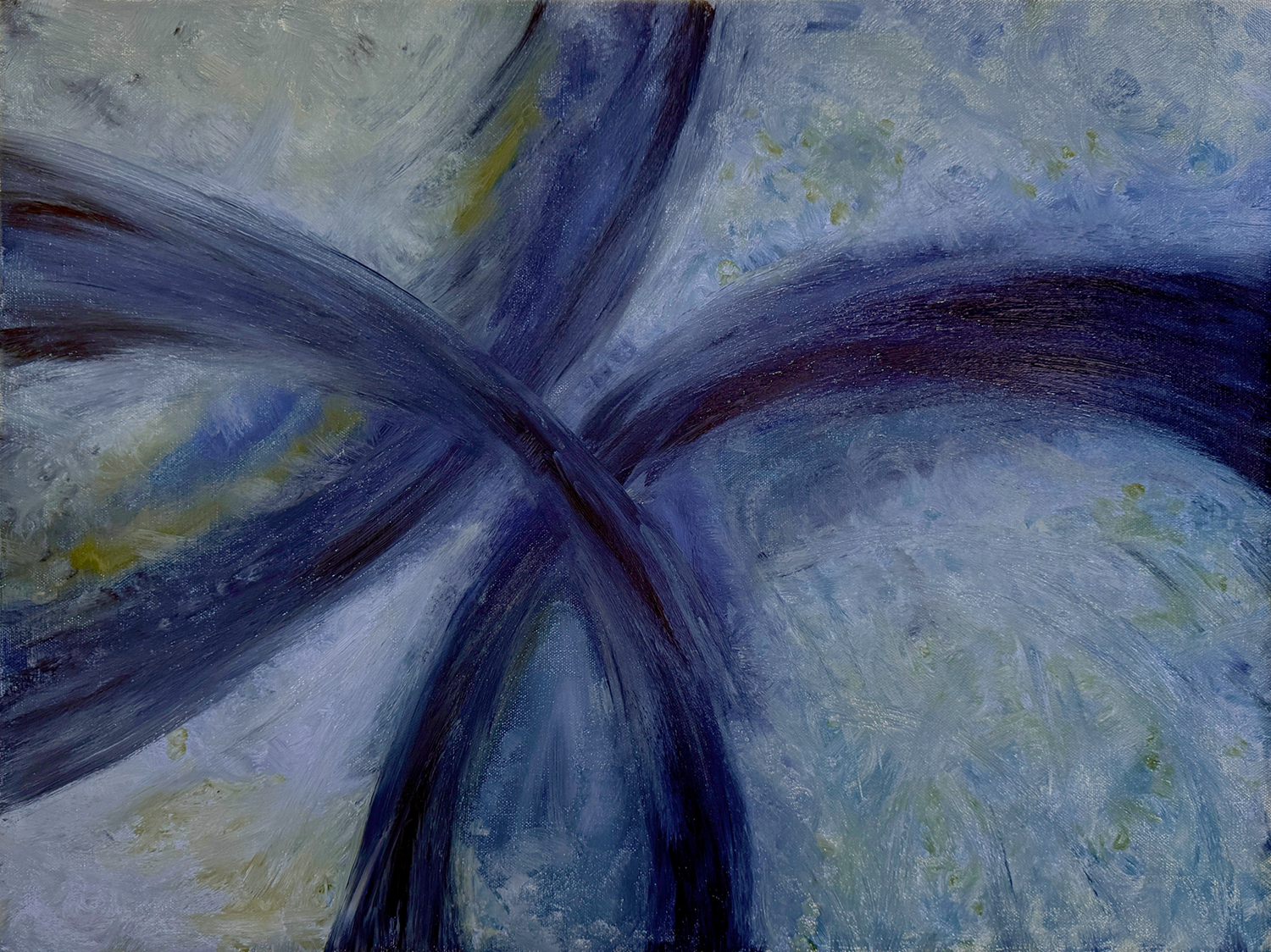
I was getting frustrated with my results and overwhelmed with choices working at larger sizes. I found freedom in smaller sizes and more rapid iteration.

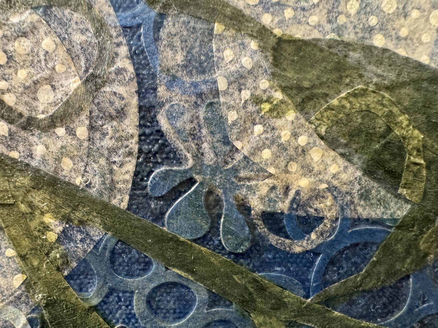
And I also found freedom and joy in slicing up the larger unsuccessful pieces for the smaller compositions, like this snippet. It’s empowering to deconstruct a work that’s just not. Or just throwing! it! away!

(Just realized there’s not nearly enough cat pictures in this post)
Thanks for reading along and feeling my pain in adult learning and artistic expression. May your winter holidays be loving and bright, full of good coffee and rational and/or goofy conversation and companionship. 2025 coming right up!

Mostly a lot of standing and staring, and getting distracted going through the many bins of collected miniature treasure, but I’ve constructed my dream standing-height work surface along the back wall, and assembled a pair of paper storage units from Melvins Miniatures, very satisfying. Alpha Stamps has a set of mini rulers and triangles that make the work surface more functional and desky. Having fun printing out scaled versions of my collages and mounting them on boards to hang and/or display on an easel. Adorable! The exquisite leather cowboy boots are vintage, handmade way before everything was 3D printed; sadly artist unknown to me. One of my paper bags serves as a temporary trash bin. (I’ll have to throw a lot of paper scraps on the floor around it for realism.) The pumpkins are one of the first miniature things I ever made that I was happy with, from wads of plastic film bound tightly with thread and covered in small shreds of tissue paper and acrylic medium. Potted yuccas and succulents are production samples from the MMS+S kit days, all in Braxton Payne terra cotta pots. And the vintage Kunstlerschutz Wagner flocked pig is an old dear friend who’s come to live in the studio to keep us all company.
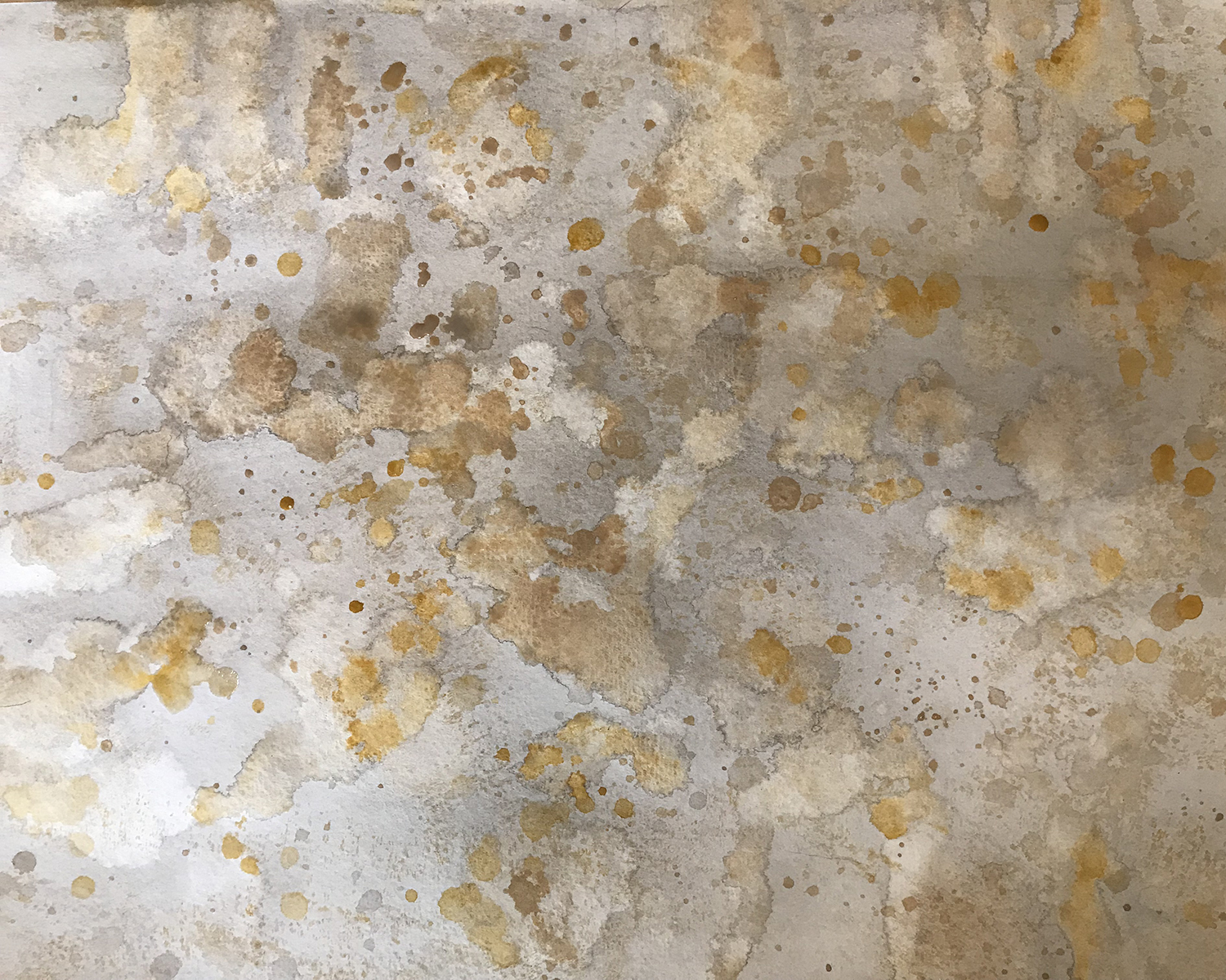
I painted a couple of sheets of 11 by 15-inch 140 lb. cold press watercolor paper with washes and splats of neutral gray, tan and yellow oxide acrylics, then pressed them flat between two drawing boards weighted with books.
The tile pattern and grout lines were refined through several test cuts and pasteups. I added a 3-point corner radius to the tiles to suggest age and wear.
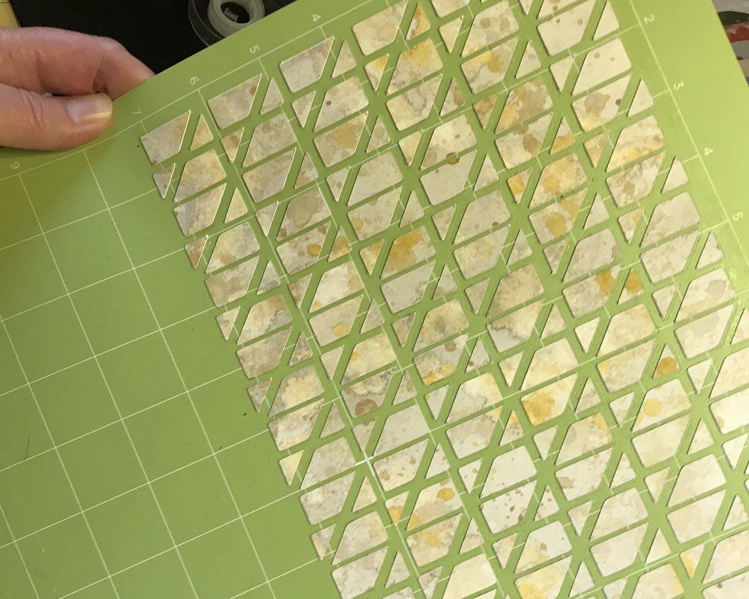
After a few more test cuts, I loaded the painted watercolor paper and began cutting tiles. Because this paper requires three passes of the deep cut blade for each tile, I used masking tape on the edges to hold the thick paper to the cut mat to ensure adhesion. (Lessons learned through bitter informative experience.)
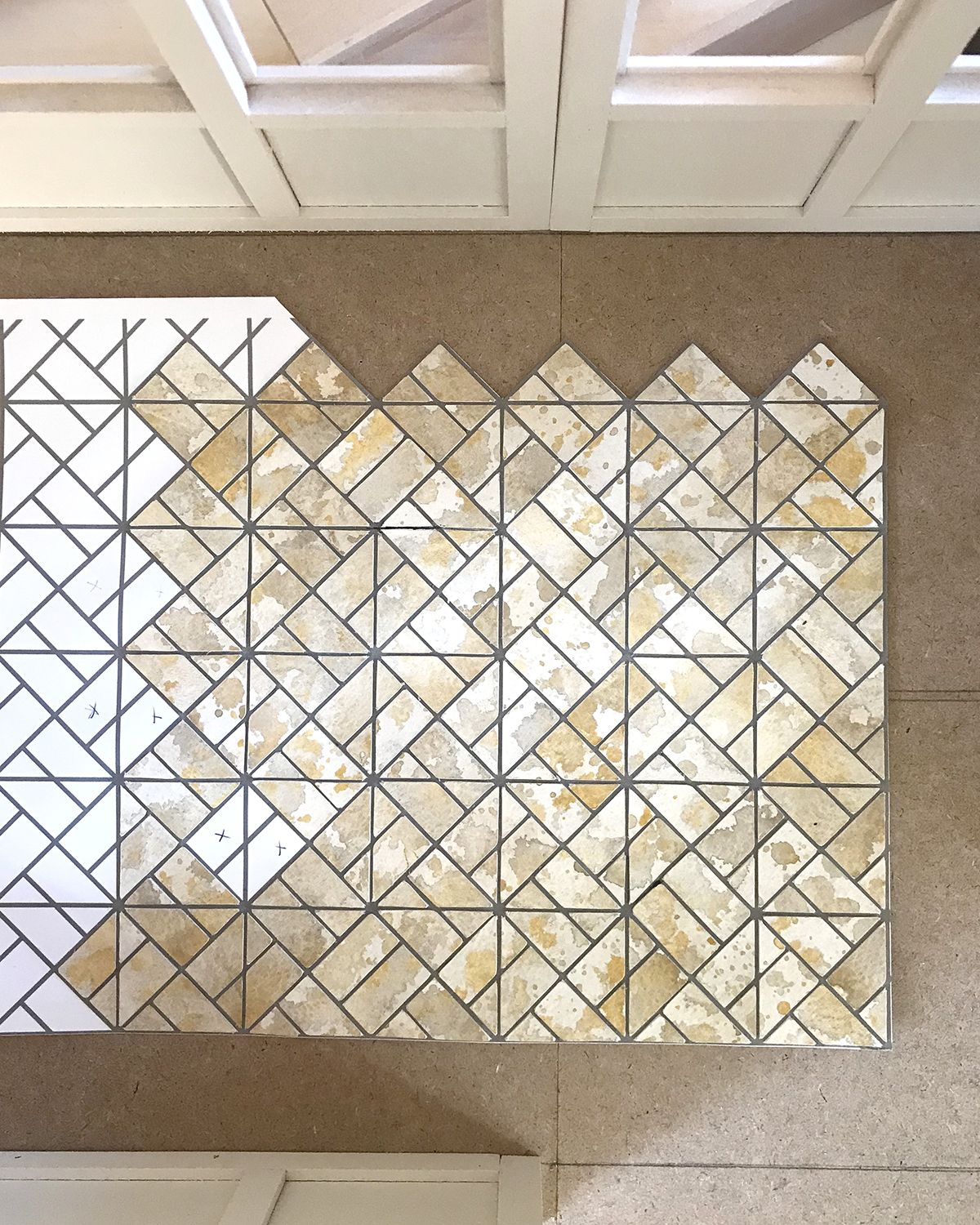
I’m gluing the individual tiles to prints of the pattern layout showing the grout lines. The process is far less tedious than I anticipated, a pleasant surprise. It *may be* that I won’t have to actually add grout after they’re all assembled and adhered to the subfloor. I plan to add one final light gray wash and some delicate speckling to the whole floor to unite the separate assemblies. And with pressing and a coat or two of matte varnish… we shall see.
The final tile floor won’t be put in place for some time — so much painting to do! — and the ideas for its total design still floating need not be finalized at this point. Which is good, because I’m still kind of all over the place, design-influence-wise. Right now I’m trending from Art Deco back to Bauhaus, and how that might all fit in with the larger Sea House story, sea level rise, and a crow named Clary.

There is much to appreciate in this drawing, presented to me by 5-year-old Maddie. No hand turkeys for that girl; a peacock is more compelling. This avian’s boisterous tail, for one, is a breakthrough in both interpretation and technique. Vibrant life radiates in the rich purple effortlessly confident strokes on wings and body. Its feet hold firmly to the bottom of the page. Not least is the pathos of the bright pink worm; its expression reminds us that outward beauty is not a sure sign of good will. Be inspired.

Had my first opportunity to walk outside today (!), along (what remains of) the paved Manor Bluff trail, and even on some hard-packed sand atop the bluff. It was breezy with rain-moist air, and felt so good. Another milestone in my recovery, almost eight weeks post-op. Yay go me, and she was.

Still somewhat working from my bed top, but I have made progress in cleaning the various surfaces in the studio proper. Sad and ridiculous, I know, but just what is. It’s like I’m growing up all over again.
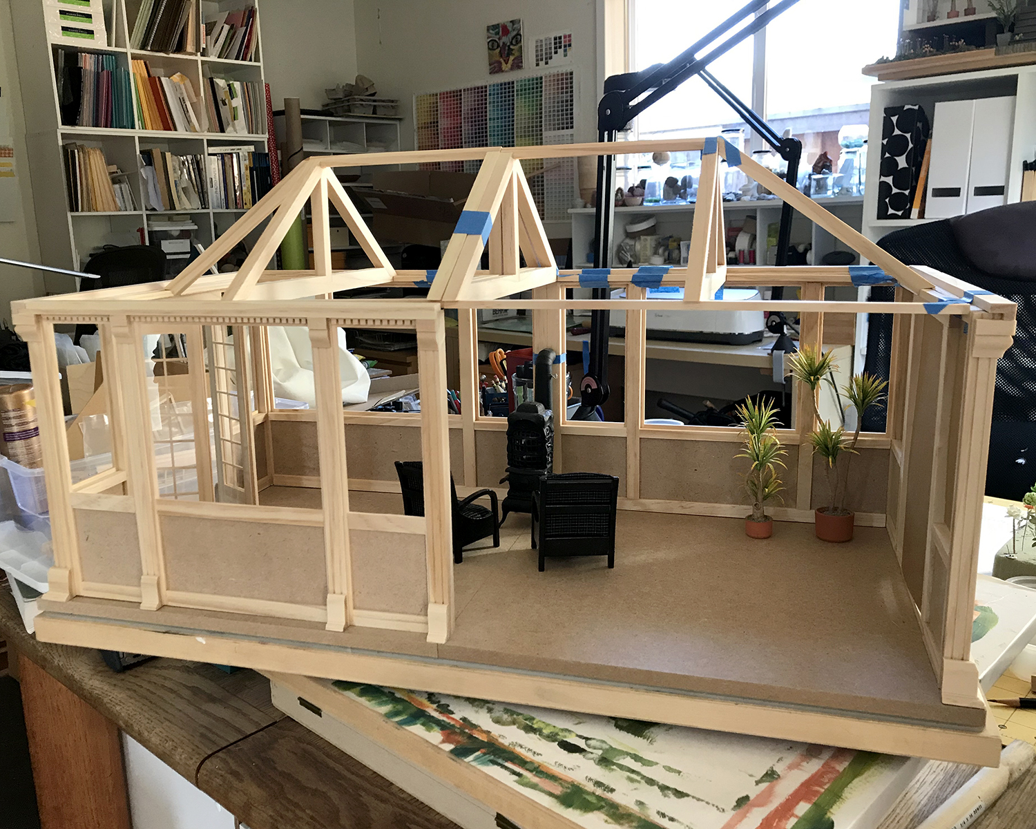
The other half of the conservatory is in rickety dry fit, and I’ve decided on a layout and also that this might will be the new (former) home of the small local business, Modern Miniature S___ & Sundries, est. 1921.

It of course had a different logo (and maybe name) back then. Backstory, in media res.
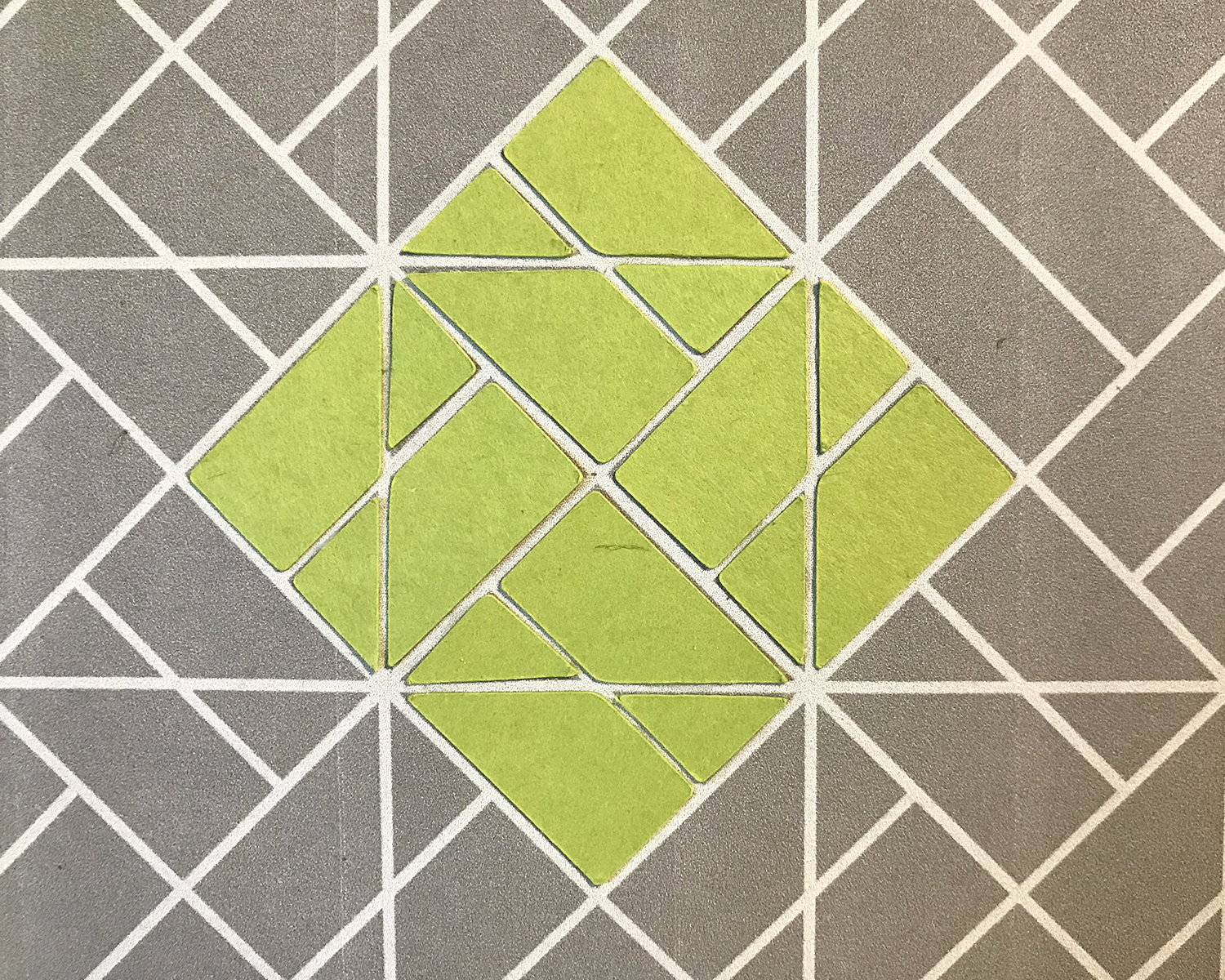
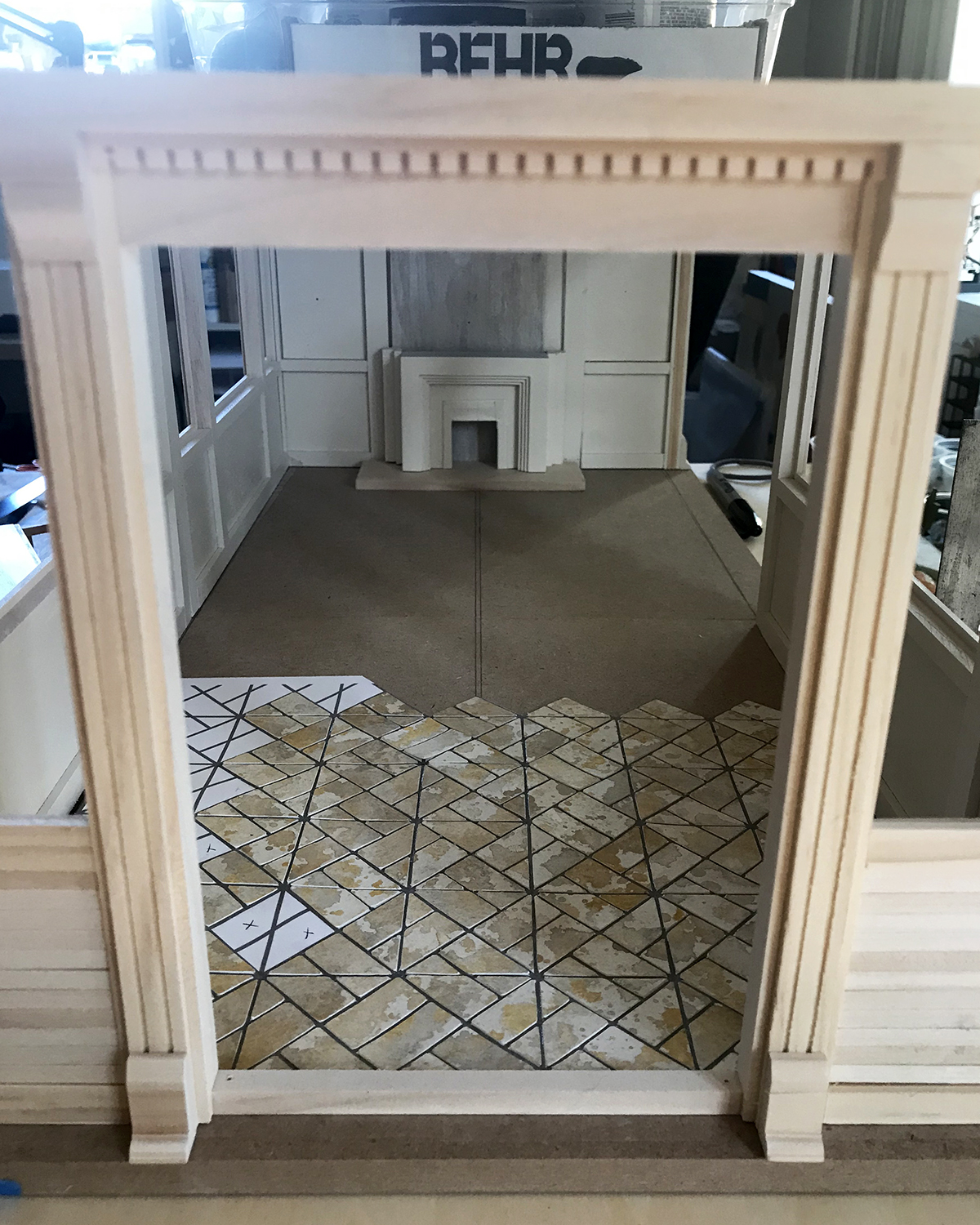
I’ve given a great deal of thought and research to the floor, and have arrived at this pattern. Still undecided between watercolor paper or egg carton for the pavers.
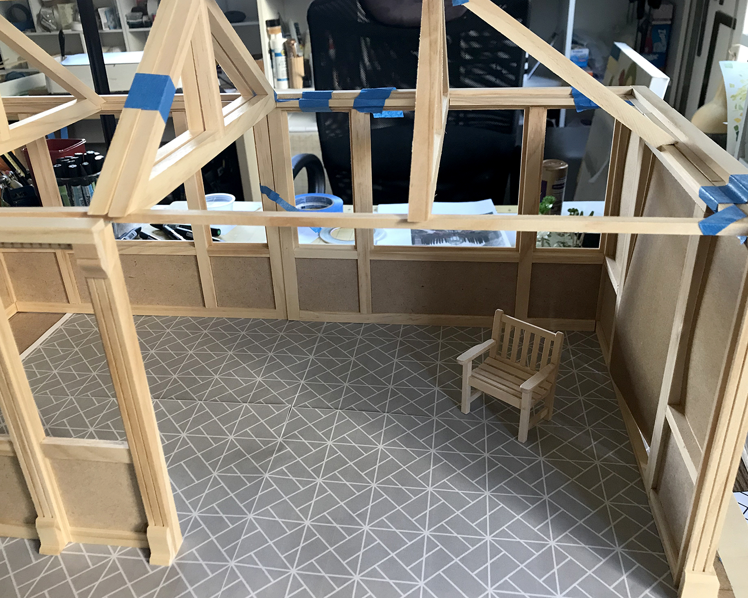
A closer approximation to the tonal contrasts. The interior walls will be a warmish white, perhaps with Art Deco-y botanical stencils on the lower panels.
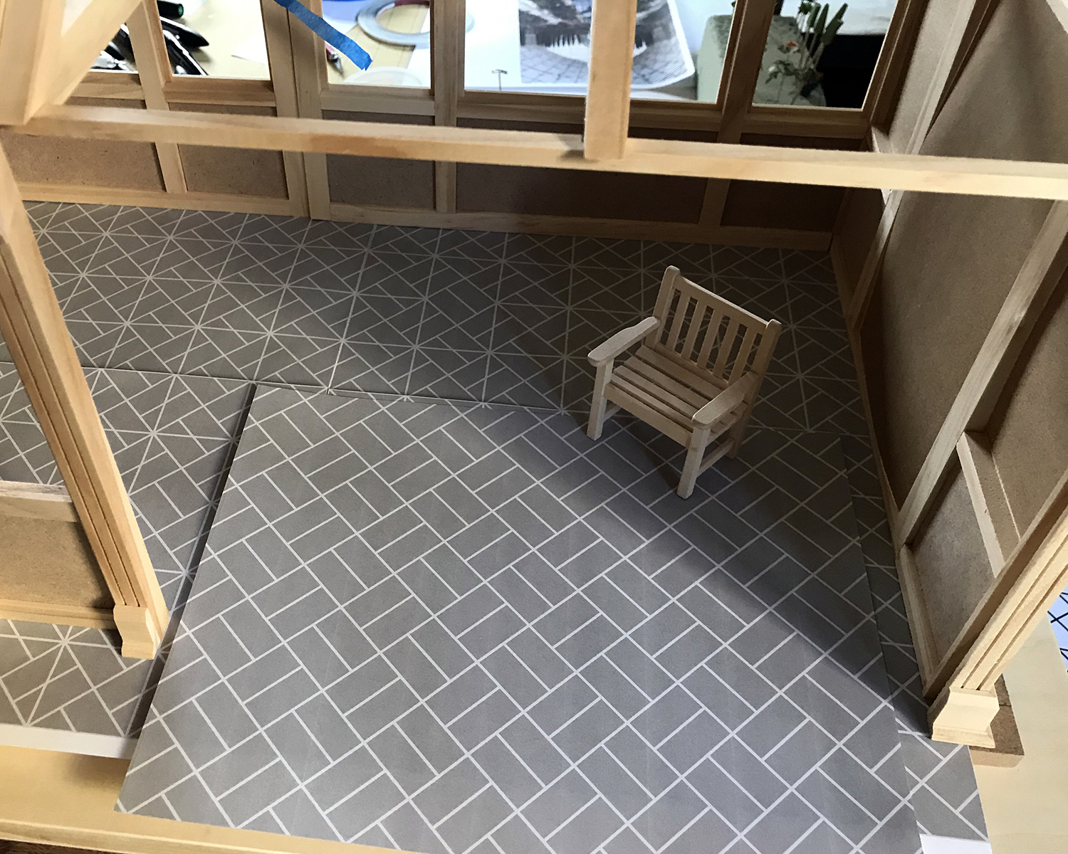
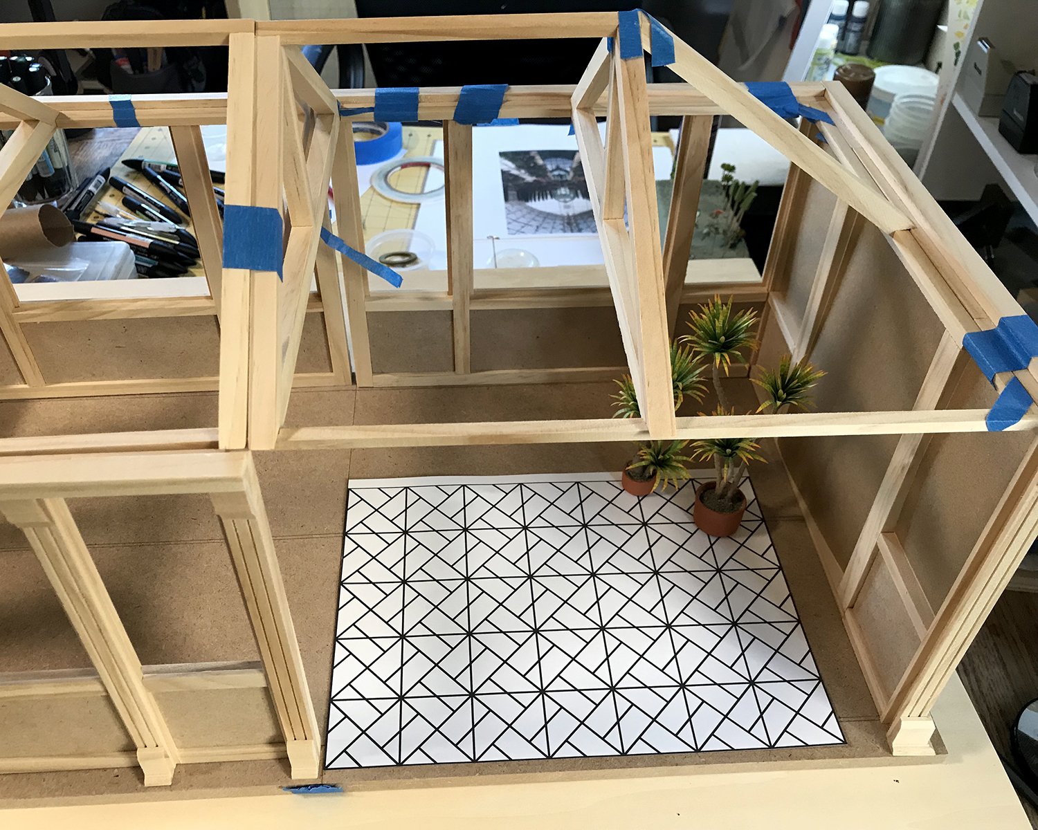
The floor pattern with the top grid removed. I’m torn between simplifying the amount of work it will be to cut and lay the more intricate pattern with the simpler design.

Current thinking is to break the rigidity of the more complex pattern with setting “whole block” units randomly into the design. The amount of work required is not appreciably less, but the overall effect is more pleasing to my eye.
As always, your input and reactions are welcome, for yay or nay or… other. Lively discussion encouraged! (I’m still not getting out enough :)