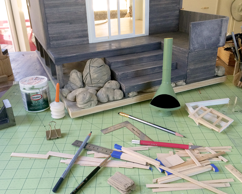
Here’s a mess of things in progress at once:
First coat of paint on version 4 of Kris Compas’s cone fireplace, from her wonderful tutorial this month. My initial color thought was classic minimalist matte black, but then I noticed it looks like a giant tiny Darth Vader’s helmet, and once you see that, there’s no unseeing it. Current thought is the same green as the rafters, but based on my experience with the Chrysnbon stove, who knows what the final outcome will be?
Also installed the front wall cladding. I bundle up the quarter-inch stock with tape, measure and cut with a chop saw. Lots of not-quite-long-enough offcuts for the scraps box. I’m using the blue-gray Derwent watercolor pencil after the stain dries to add variation and depth to the warm gray color. Subtle, but effective. I’ll show some examples when there’s better light. Plus it’s fun to intentionally scribble all over your project :)

Biggest decision was the color for the outdoor furniture. Last night I was thinking a deep, rich yellow, but then arrived at this orange, somewhere between California poppies and the Golden Gate Bridge. This is just the first coat, and I might temper it a bit more towards poppies, but I have to wait until light of day. I also want to finish painting the rocks and adding some of the greenery. The living roof with growing poppies will tie it all together.
I want the deck furniture to really stand out from the weathered gray wood and rocks of the cliffs, to welcome walkers to sit and enjoy the vista.
The inside seating will be upholstered arm chairs circling the stove, for those days when inside is best. I found an engaging peacock blue linen that I plan on using for those. With the sweeping views of the ocean and the sky, they’ll be less of a contrast in the otherwise light room.

I love your colour choices. The green works perfectly with the grey. It stands out but blends in perfectly too. And the Orange furniture looks fantastic. You have chosen a beautiful palette.
Thank you, Kat. Warm gray is such a great base color. It makes all the other colors really be themselves :)
The weathering looks fantastic, I really like the hints of blue. Your fireplace turned out great, the green is perfect!
Thanks, I appreciate your appreciation! I messed around with a few different pencil colors, and was surprised at how effective the blue-gray was, both blending in and standing out at the same time. Color magic!
I love the green fireplace and orange chairs. They add a pop of color against the gray.
Thanks, Bennie. Selective color popping adds so much to a scene, like a big smile :D
Lovely colour choices – I especially like the poppy-coloured furniture.
I thought you might approve, Barbara :)
I just love that fireplace…it’s such a happy shape! :D
I so agree, Brae. The design is beautiful and functional. And Kris Compas’s ability to deconstruct *anything* and create component patterns and how-to is genius. I’m looking forward to seeing all the versions!
You’ve chosen such warm, inviting colours. The orange and green are really striking against the weathered tones of the build. You have a great talent for mixing colour and texture into your projects. Love it =0)
Thank you, Pepper. Glad you respond to the colors in such a positive and affirmative way. I bask in your praise!