This is the piece I showed at the Art Guild Annual Members Exhibit. Glimmering Girl. Found metal objects, hand-stitched cotton thread, mono printed torn and cut paper collage, 8 x 10 inches
Here’s a closeup peek at the piece I’m working on now. The patinas and colors are so luscious. I’ve been collecting the found bits for years, and the process of messing around assembling them into beings is enjoyable. Something wants to emerge.
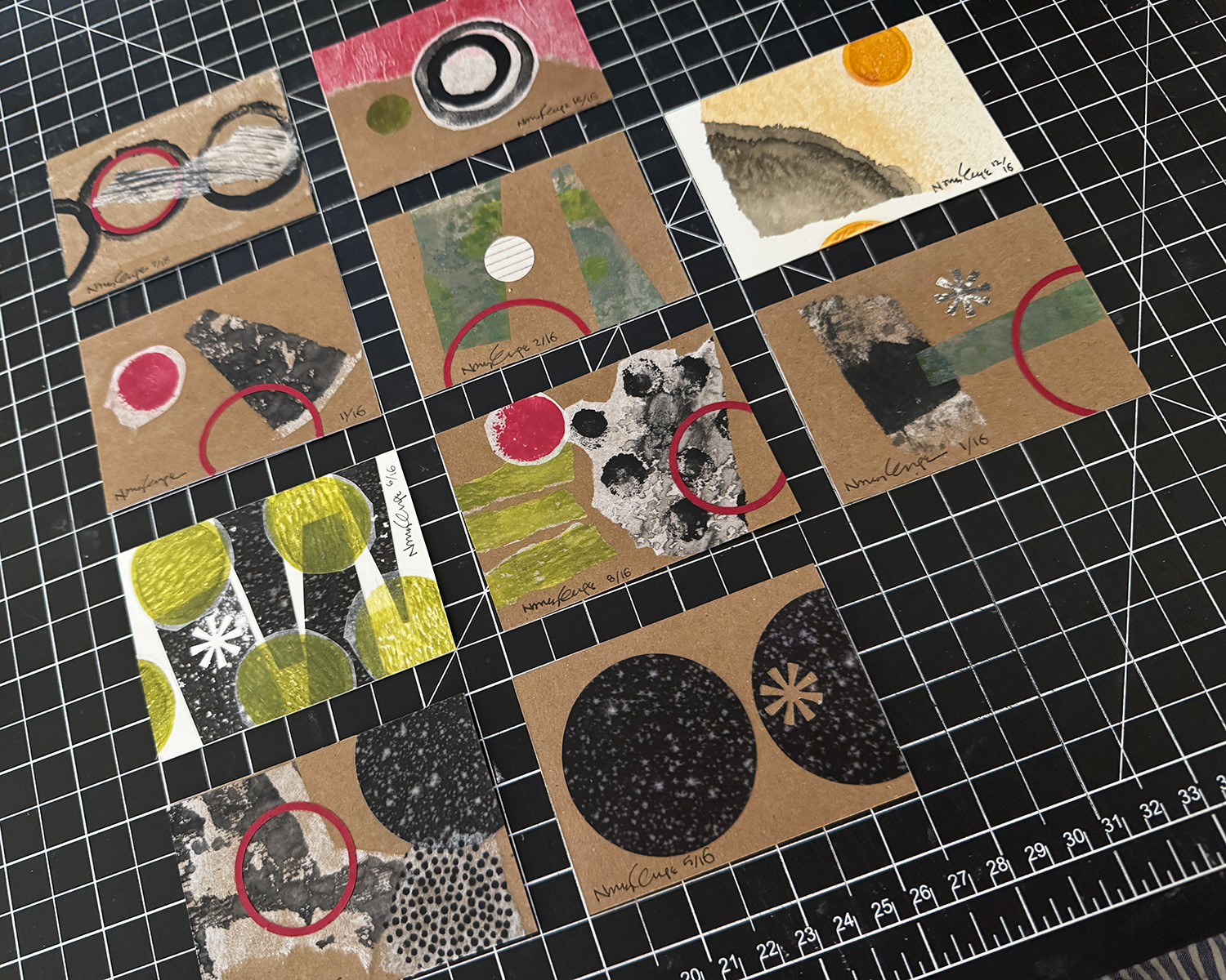
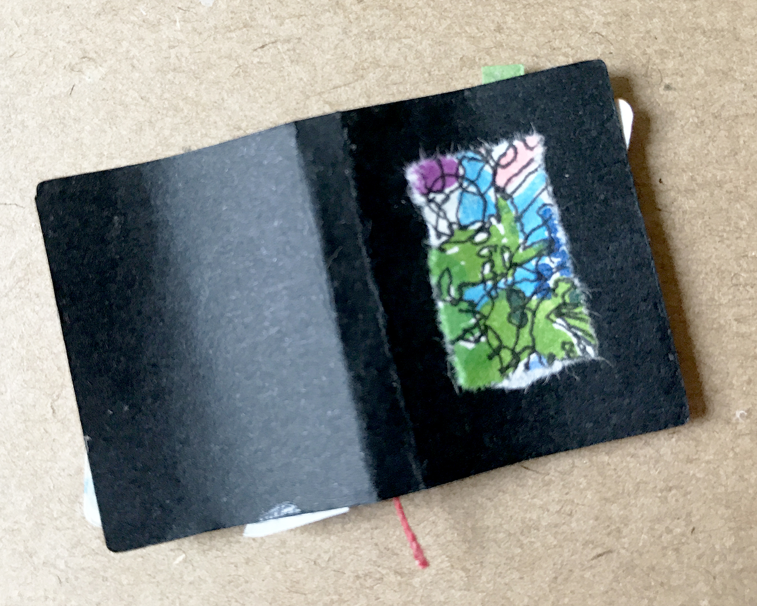
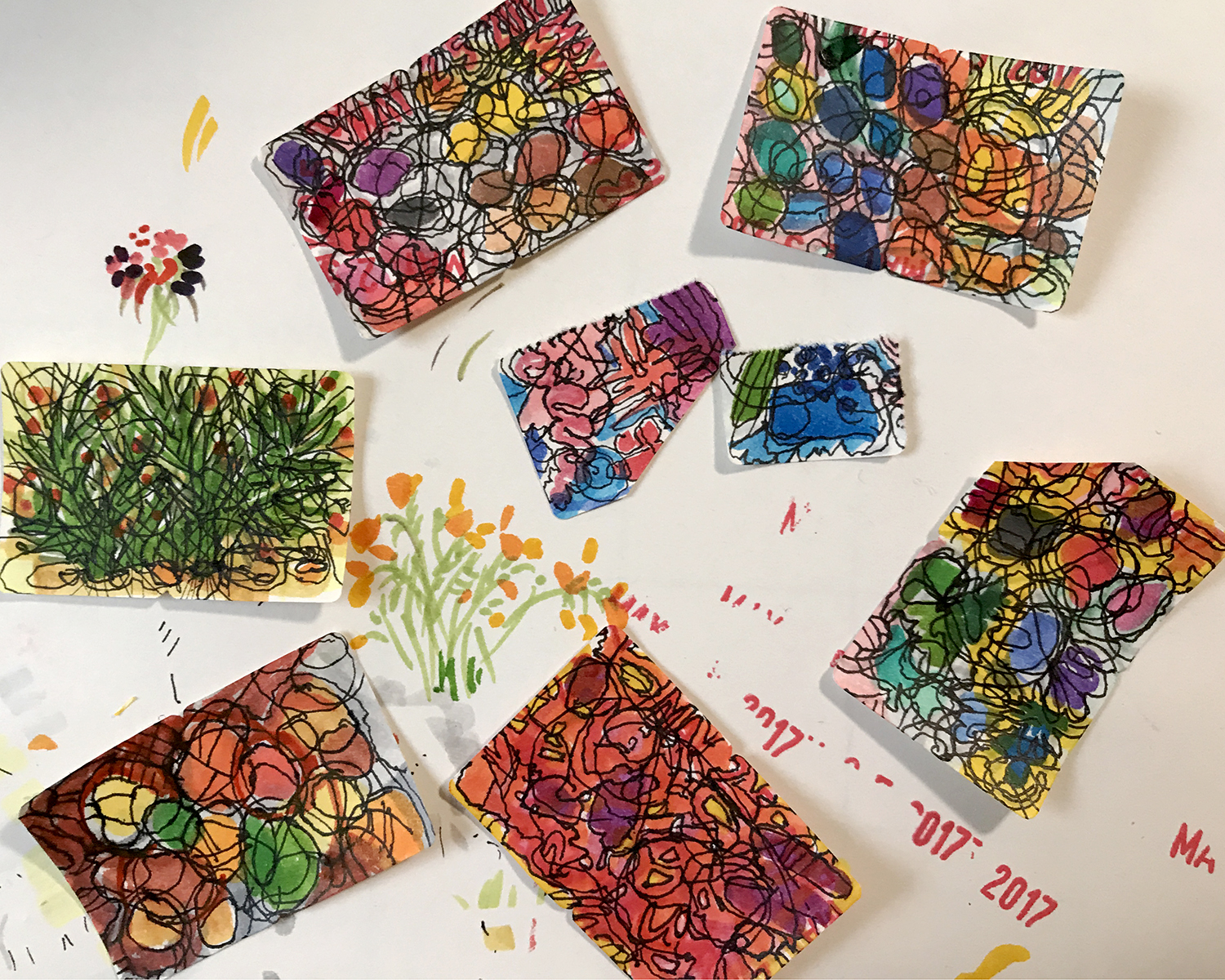
In the monthly discussion group I attend, we decided to exchange Artist Trading Cards. Fun to make, pulling out all the old scrap materials, and working small and fast.
So fun that I decided to do the backs as well. And afterwards, I was moved to tidy up and get rid of so many bits and pieces and better organize what remains.
Sharp Park winter sun beach walk, high tide, storm clouds gathering
Earlier this month I was delighted/surprised to be accepted to the 17th Annual Sanchez Art Center 50|50 Show, in which 50 artists complete 50 small works in 50 days. (I’ll just let that sink in a bit. It’s both a lot and a little at the same time.)
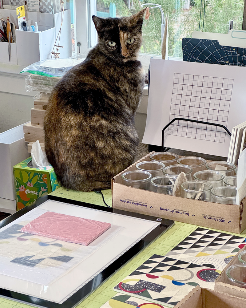
Maxine surveys the new mayhem on the studio table
In the weeks leading up to the call for entries, I worked on ideas for proof of concept — Can I do fifty of this? Is it sufficiently interesting and compelling? Will I wish I was never born? I finally arrived at an exploration of abstract geometric collage — well suited to the size and scale of the project and of deep historical and personal significance. Working through a dozen or so test pieces, I refined my materials and techniques until I heard that still, small voice announcing, “Yes, this is good. You can do this.”
Prototypes in progress, solid, printed and found papers on handmade lokta
Then, I had to write the dread Artist’s Statement — a standard part of any entry process — and one of the most challenging things I’ve ever had to do. I made it excruciating, but! I persevered. Here’s what I arrived at (in fear and loathing) as the submission deadline was approaching:
“Constructed with awareness, but not with calculation, led by high intuition, and brought to harmony and rhythm.” — Piet Mondrian, 1916 Awareness, intuition, harmony, rhythm… How many ways can circles, squares and triangles be assembled to create compositions that flow, balance and fit in the space allowed? In these collage works, cut papers — color, mono printed and found — are manipulated and arranged to create balanced, rhythmic patterns and correspondences that please and satisfy our curious pattern-seeking sensibilities. In exploring abstract geometric collage, evidence of the — my! — maker’s hand is evident in tiny misalignments; they are forgiven and unintentionally lend an animation to the work. When multiple compositions are hung together, new patterns emerge. Possibilities remain endless.
Once I got over myself and that hurdle, I realized two things: first, artist statements are not carved in stone for all eternity and can and should be revised at will, at any time. Second, I’m pretty sure most people are not as mean, judgmental or paralyzing as my inner critic. And so, merrily, we rolled along.
Front deck setup for panel priming, ten at a timeA new LED light pad makes accurate placement possible
Wish me luck, inspiration and endurance, friends! These panels are (thus far) fun and satisfying to build! They make your eyes dance (in a good way)! The show opens Friday, 05 September, and runs through Sunday, 05 October. If you’re in the SF Bay Area, do consider stopping by the Sanchez Art Center to enjoy this exhibition of 50 artists’ works!
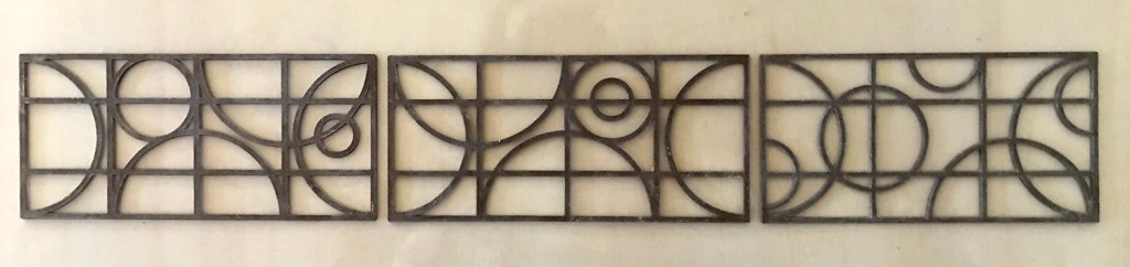
The Conservatory has a celestial motif in the leaded windows, which is carried through in the railing panel design.
I cut multiples of each panel from chipboard on the Cricut Maker. (Side note: I get the best results from editing the cutting presets, after a test cut on my chosen material.) I decided on a double, rather than triple layer, to lessen the alignment errors.
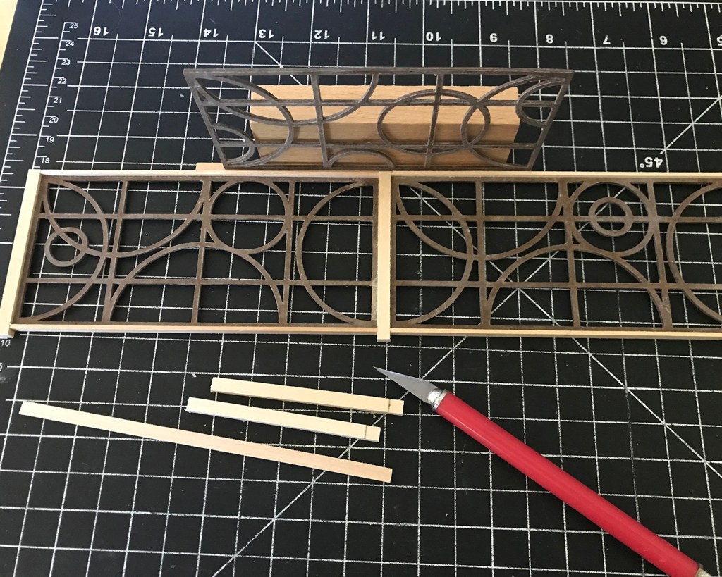
I used a lamination technique I learned from the talented Heather Tracy at Thicketworks. She uses thin cyanoacrylate on her intricate chipboard pattern pieces to seal, strengthen and stabilize the material. When dry they are easily sanded and very, very hard, and take acrylic paints beautifully.
Wheelbarrow pattern design by Heather Tracy of Thicketworks
To learn the nuances of the technique, I used one of Heather’s patterns she generously makes available free of charge. (She also has an Etsy shop, a YouTube channel of tutorials, and a maker club.) I made the blue wheelbarrow first, and then the red, slightly improving my results. It is a worthwhile technique, but messy. (Also, to me cyanoacrylate is one of those devil’s bargain products.) If you’re not familiar with Heather’s work, I encourage you to check it out!
After sanding the panels smooth — paying particular attention to the outside edges — I glued (using wood glue) them into post and rail surrounds.
These were then joined into the L-shaped railing.
I sprayed the assembly with multiple light coats of matte black primer + paint, to seal and increase attachment bonds. After the glue and paint cures overnight, I’ll finish sand it and paint a final coat, then give it a matte seal.
I like a good wide top railing, for cats to lounge, elbows to lean, and drinks to be set upon, so I used 3/4- by 1/8-inch basswood. Thinking now of bracket designs to be cut from card stock to attach the railing securely to the deck, but that’s for tomorrow.
Having just finished watching the Amazon series Tales From The Loop, I’ll leave you with this image of Point Montara Light.
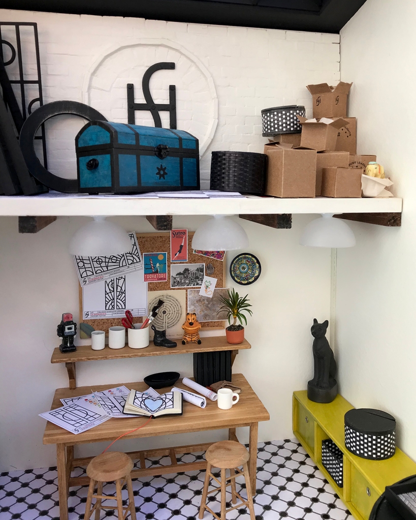
The entrance to the Sea House Leadlights office is up a few stairs and across the deck to the left of the fireplace. A set of leaded glass doors opens into a snug but functional design studio.
Details: Terra cotta pot by Braxton Payne. Basswood deck and siding stained with Minwax Classic Gray. Pumpkins made from tissue paper and thread. Boulders sculpted from air dry clay painted with acrylic washes and sealed with ultra matte varnish. All succulents, yucca and other plants hand colored with W&N Promarkers. Many are prototypes; some available as kits at Modern Miniature Succulents + Sundries.)
Desk and bulletin board
Beneath the half-loft a large tabletop desk has plenty of room to roll out plans and inspiration. Low built-in cabinets with black leather cushions provide more seating, storage and level surfaces for tea trays.
Details: The ceiling lights are 12V modified for warm white LEDs. Bulletin board is made from cork sheet framed with basswood stained to match. Sketchbooks made from my kits at MMS+S. Various meaningful artifacts including original leaded glass designs for other Sea House buildings, and a drawing of a cat by my then 4-year old daughter. Fèves, prized vintage Monopoly shoe, and an anodized earring from the 1980s.
The white-washed brick loft stores window frames, tools, Sea House memorabilia and miscellaneous treasure — as well as the switch (lift the black basket) and battery pack (hidden in a custom box) for the LED lights.
A gazebo-style roof welcomes natural light. (I’ll detail more of that happy construction in another post.) I made the 1:144 scale basswood model of the source kit for the original Sea House Pavilion, built some years ago. The Egyptian cat is a porcelain fève. Best of all is the vibrant painting by Jim Tracey that commands the studio — also another post.
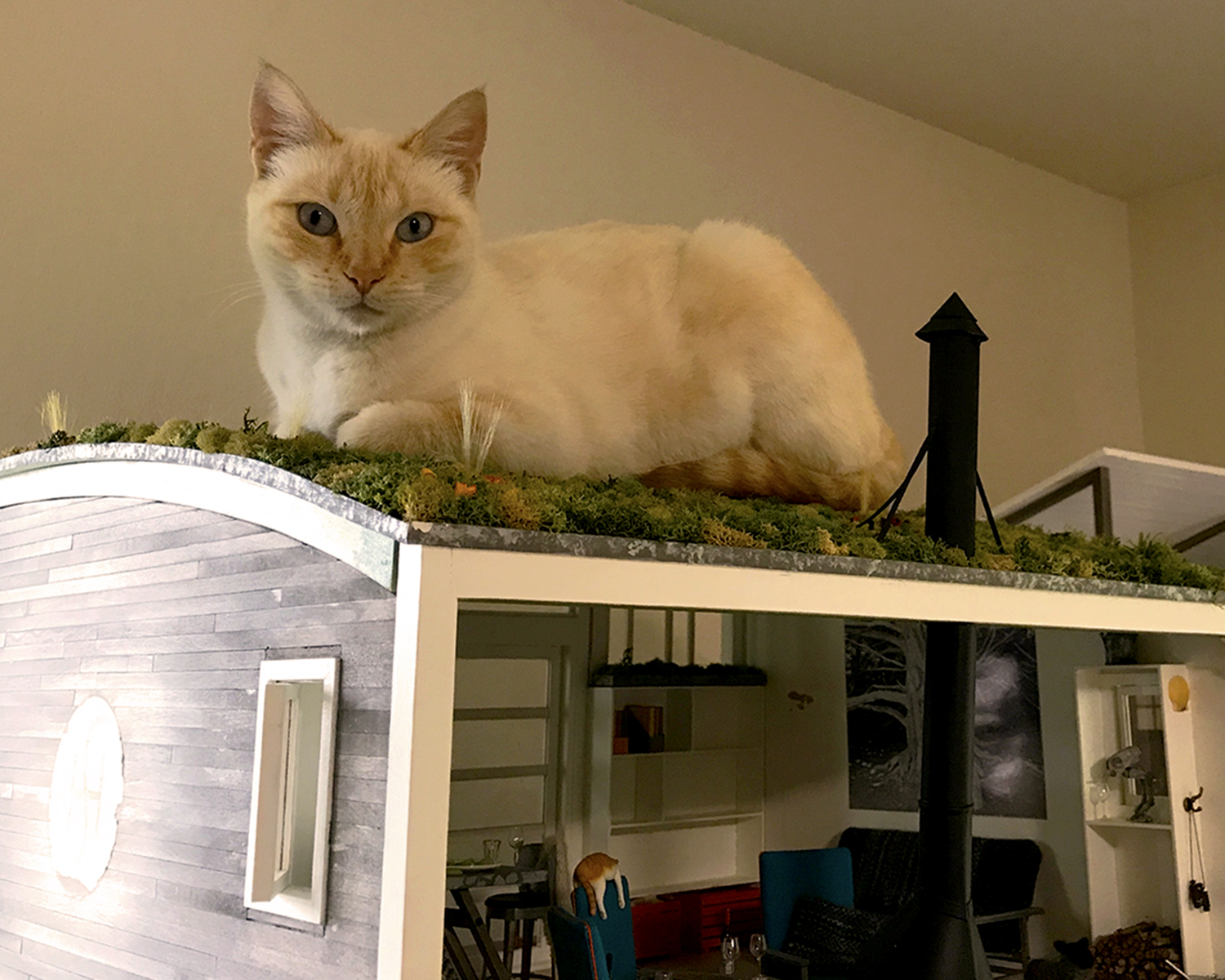
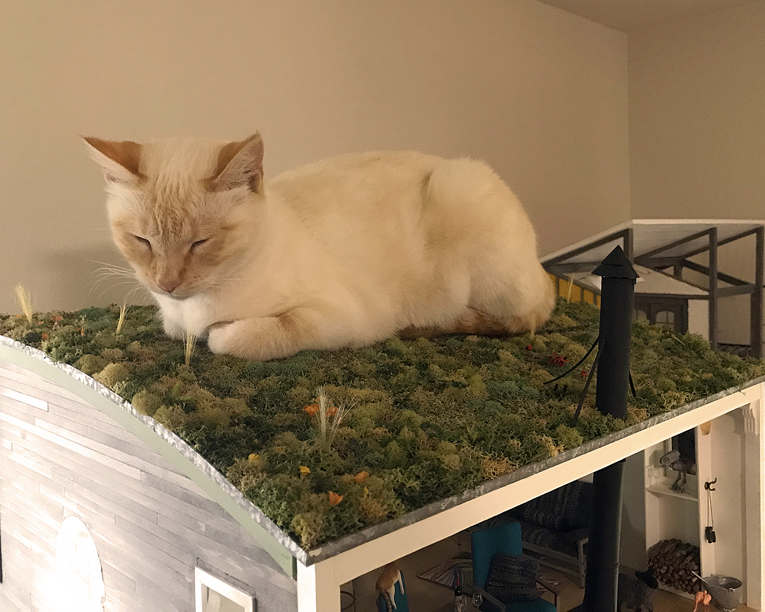
Finally, of course, Scarlett. Here she has somehow managed to fluidly infiltrate an impossibly small entrance to the Sea House Sea Rise Pavilion loft (my ongoing remodel of the original 2013 build.) I swear she does these things just to remind me she can.
There is much to appreciate in this drawing, presented to me by 5-year-old Maddie. No hand turkeys for that girl; a peacock is more compelling. This avian’s boisterous tail, for one, is a breakthrough in both interpretation and technique. Vibrant life radiates in the rich purple effortlessly confident strokes on wings and body. Its feet hold firmly to the bottom of the page. Not least is the pathos of the bright pink worm; its expression reminds us that outward beauty is not a sure sign of good will. Be inspired.
Had my first opportunity to walk outside today (!), along (what remains of) the paved Manor Bluff trail, and even on some hard-packed sand atop the bluff. It was breezy with rain-moist air, and felt so good. Another milestone in my recovery, almost eight weeks post-op. Yay go me, and she was.
Still somewhat working from my bed top, but I have made progress in cleaning the various surfaces in the studio proper. Sad and ridiculous, I know, but just what is. It’s like I’m growing up all over again.
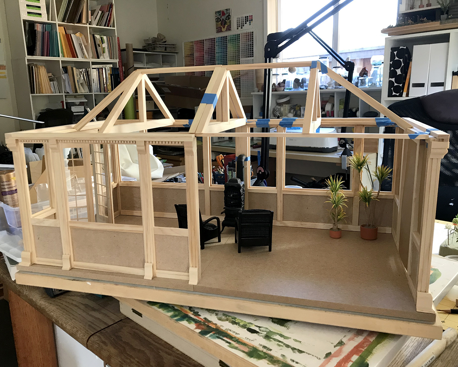
The other half of the conservatory is in rickety dry fit, and I’ve decided on a layout and also that this might will be the new (former) home of the small local business, Modern Miniature S___ & Sundries, est. 1921.
It of course had a different logo (and maybe name) back then. Backstory, in media res.
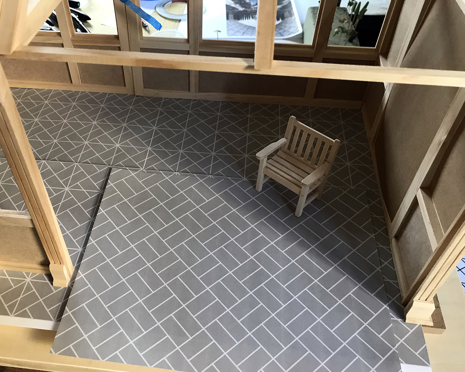
I’ve given a great deal of thought and research to the floor, and have arrived at this pattern. Still undecided between watercolor paper or egg carton for the pavers.
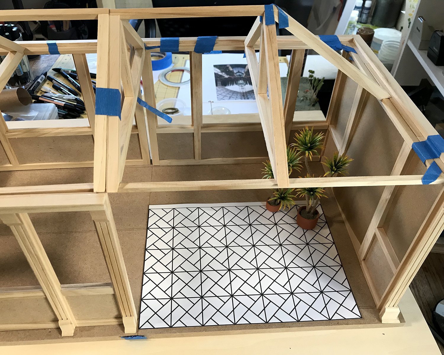
A closer approximation to the tonal contrasts. The interior walls will be a warmish white, perhaps with Art Deco-y botanical stencils on the lower panels.
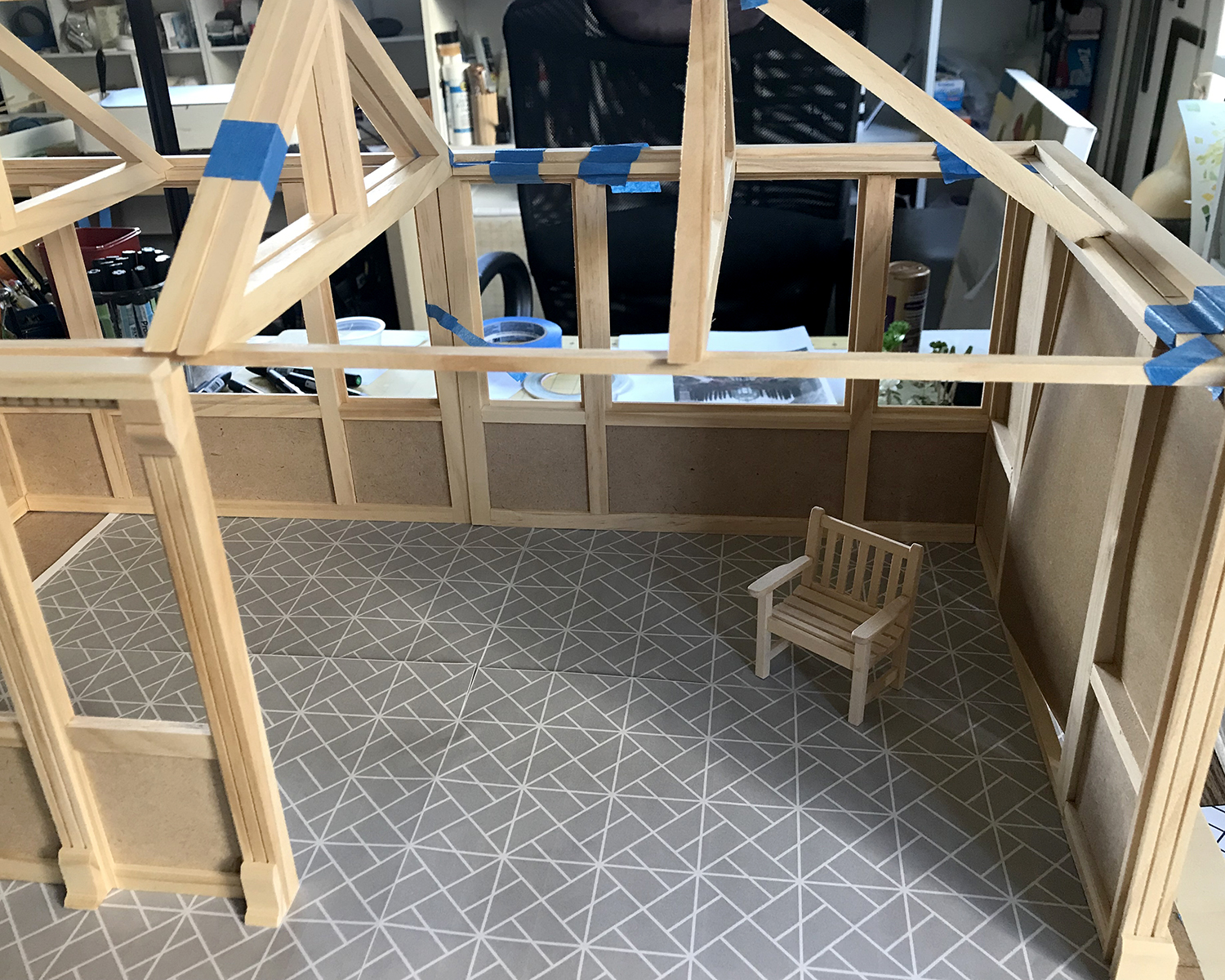
The floor pattern with the top grid removed. I’m torn between simplifying the amount of work it will be to cut and lay the more intricate pattern with the simpler design.
Current thinking is to break the rigidity of the more complex pattern with setting “whole block” units randomly into the design. The amount of work required is not appreciably less, but the overall effect is more pleasing to my eye.
As always, your input and reactions are welcome, for yay or nay or… other. Lively discussion encouraged! (I’m still not getting out enough :)
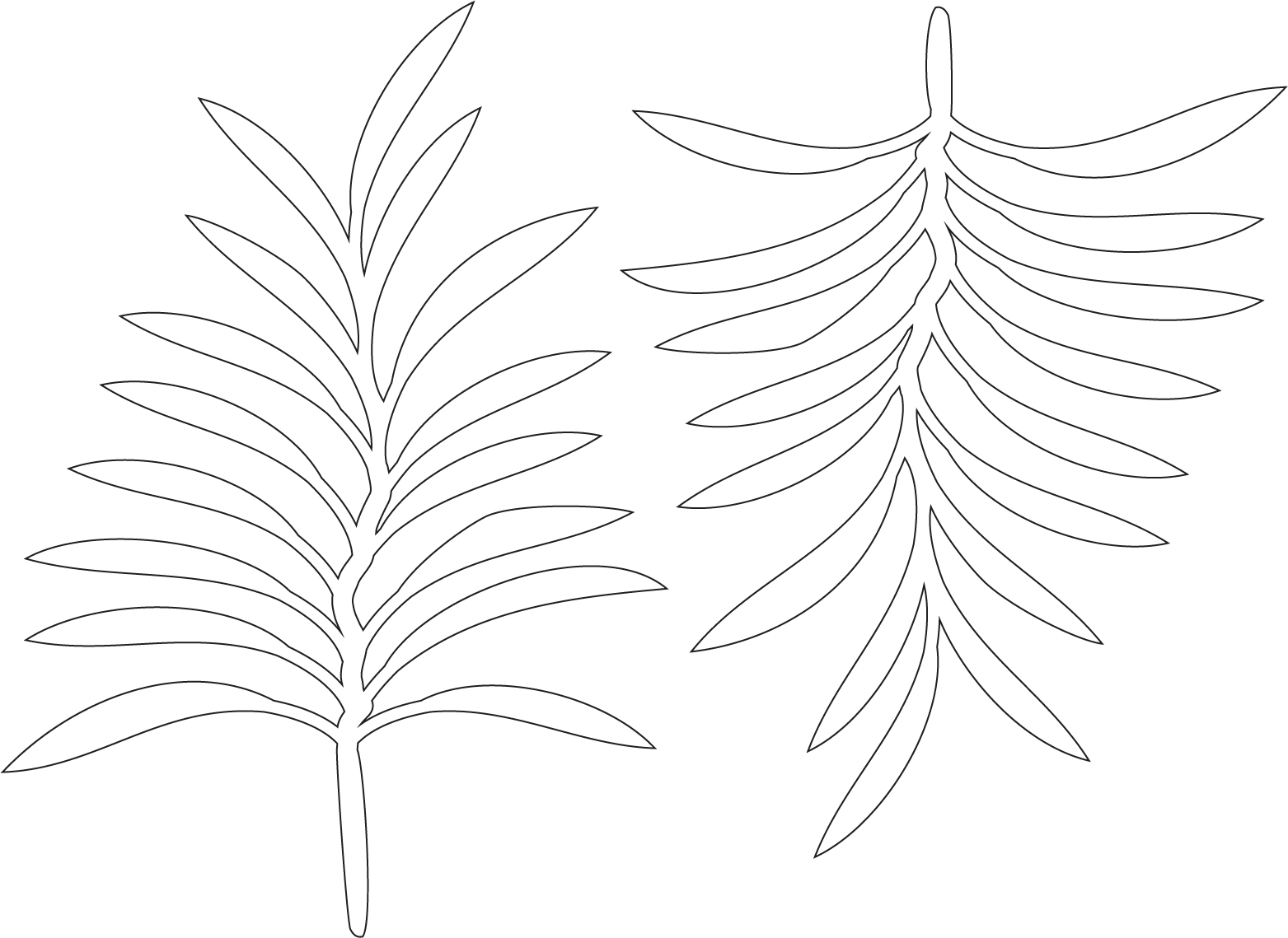
I sketched out and constructed a palm plant motif in Illustrator, then reversed a copy of it to make the most of the painted papers.
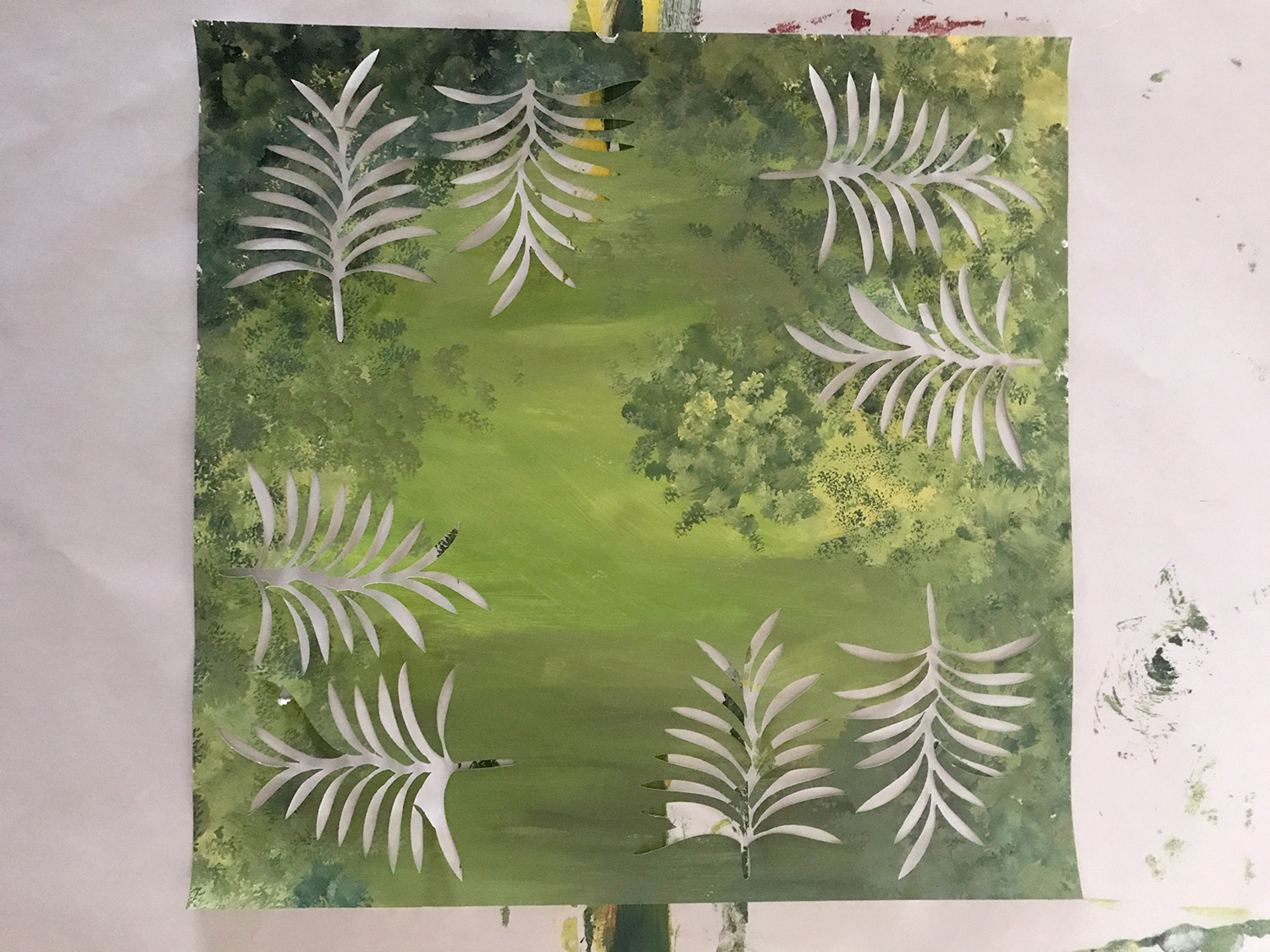
Here are my first cuts of the pattern from two of the painted papers, flung onto the wall. I was working against the losing of the light (because hey, Game of Thrones). They will work splendidly as a middle background layer, when arranged.
Still undecided how I will stick them down.
It took me a couple of cuts to get it right, but here is what a (partial) painted paper looks like after four passes of cutting. Still plenty of material for hand cutting parts available.
A few weeks ago I came across this spread in the April 2017 issue of House Beautiful. It’s a wall mural inspired by the imaginary jungle paintings of Henri Rousseau. Designed by Laurel Canyon homeowner Molly Luetkemyer, it was painted by LA artist Jeff Robinson.
I was instantly smitten, and thought a miniature version could be the perfect third wall for the MMS+S set. Since I am currently very keen on repurposing and/or drawing from my considerable hoard stockpile of materials and supplies, I grabbed a peaked MDF wall from — um, actually I no longer remember what build it was from.
Years ago, I dabbled in some cut painted paper collage paintings, inspired by Eric Carle. I love this method of illustration. For this 1:12 wall, I plan on using hand- and machine-cut painted papers augmented with markers.
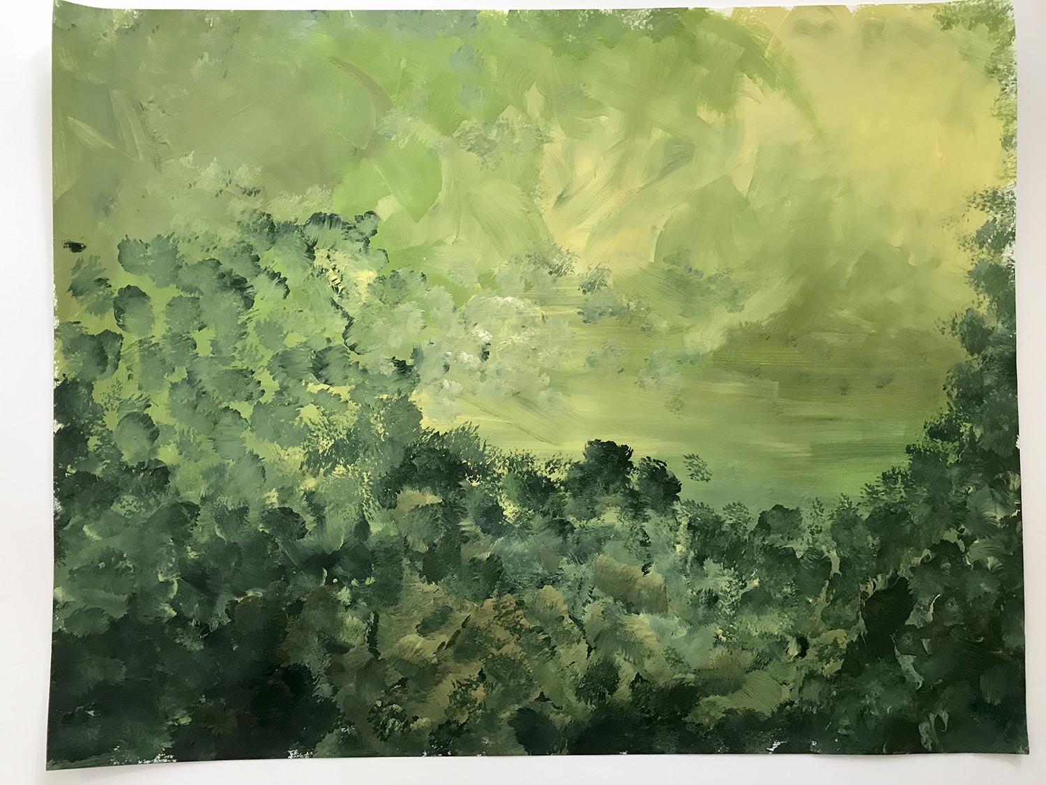
Here is the wall (MDF, 12 x 17 inches) with the preliminary foundation background painted in acrylics. I’ve been studying Rousseau’s jungle paintings, and making note of elements I want to include: light to dark background gradations; sky, moon/sun, jungle; exaggerated plant details; simple two-tone object shading. In Luetkemyer’s inspiration mural, she says the plants are based on California’s landscape, and I plan to do the same. What an awesome opportunity to draw all my favorite plants and flowers: yucca, ficus, succulents, sansevieria; gorgeous orange and red mystery fruit; outrageous florid orange and yellow flowers.
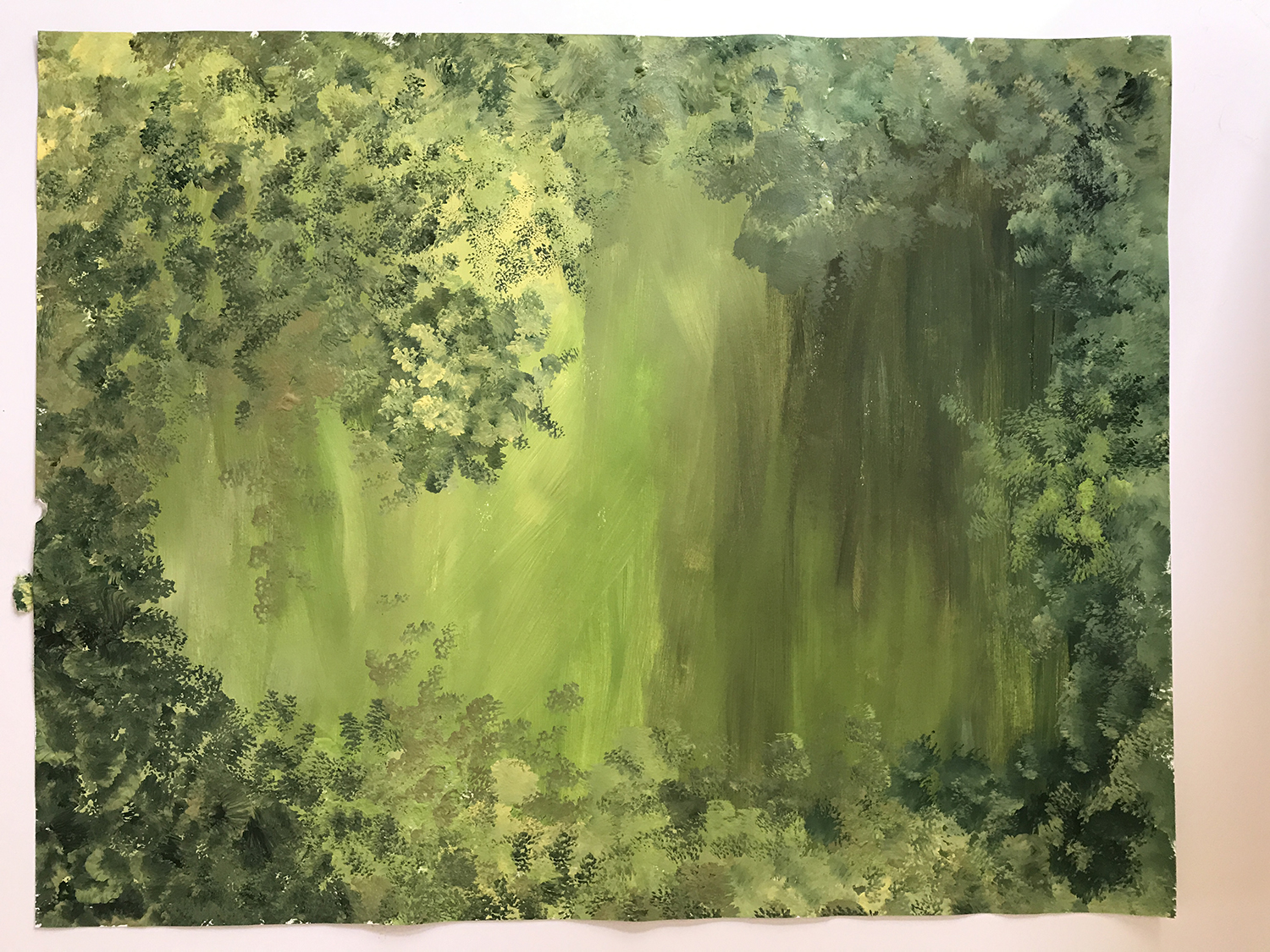
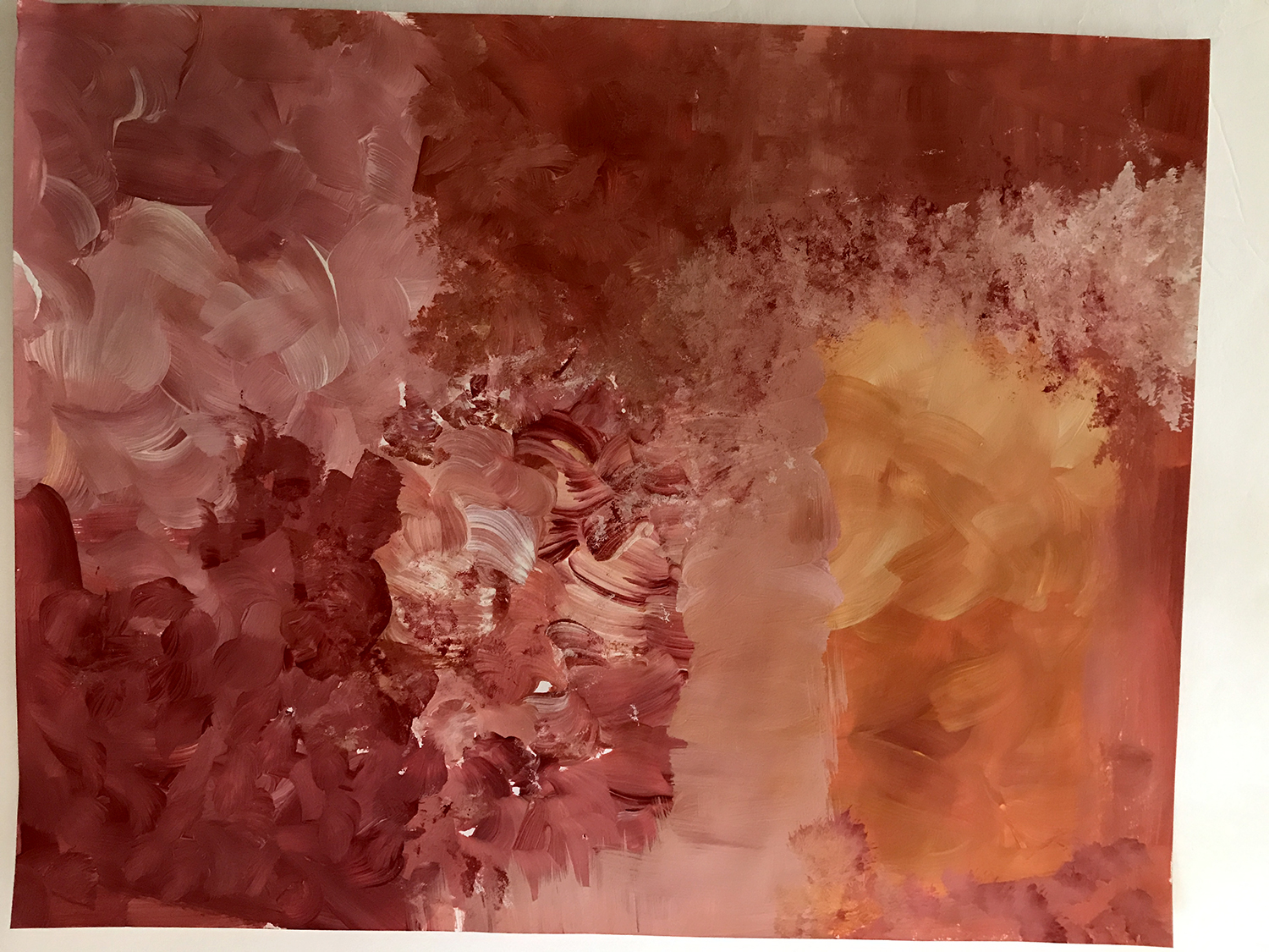
Using 14 x 11-inch medium-weight drawing paper and acrylic paint, I’ve begun making my papers, starting with the greens.
And then some warms:
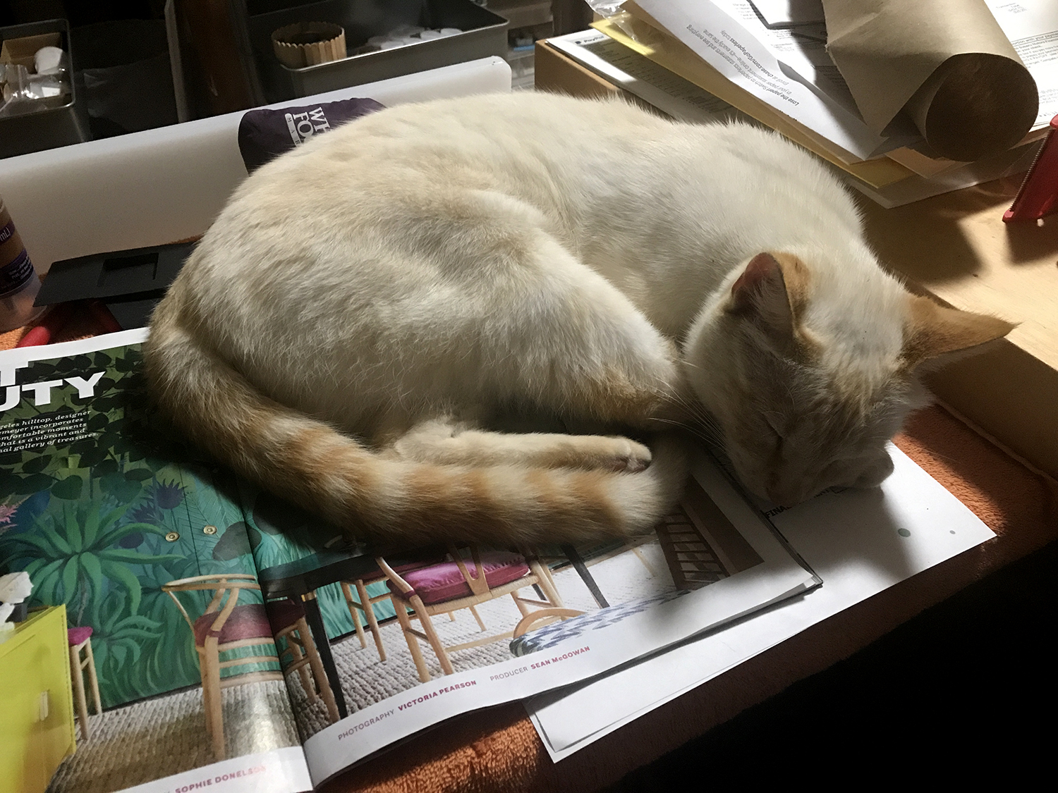
It’s getting late, and I’ve run out of room on my drying rack, so my helper cat and I are calling it a night.
Nancyland’s August (or Fogust, as we say here in the Bay Area) home page splash image is made from two of the above painted papers, layered using the magical “Lighten” blending mode in Photoshop. The lyric snippet is from Grouplove’s “Colours”, a song Maddie and I both enjoy singing along to when it comes on the radio :) Lyric snippet update: The National’s “The System Only Dreams in Total Darkness”. Listening to on repeat.
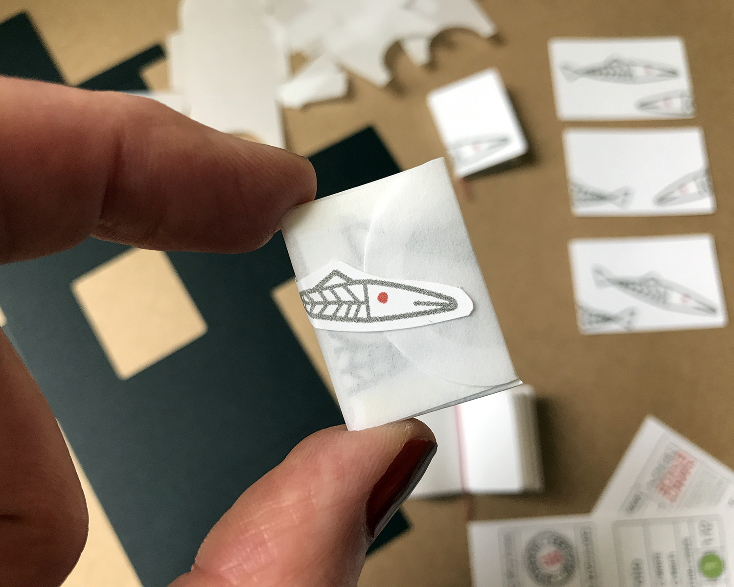
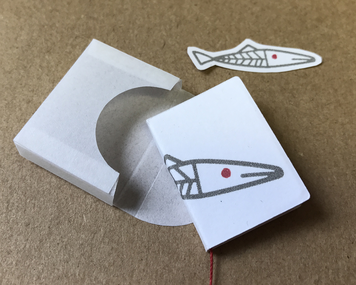
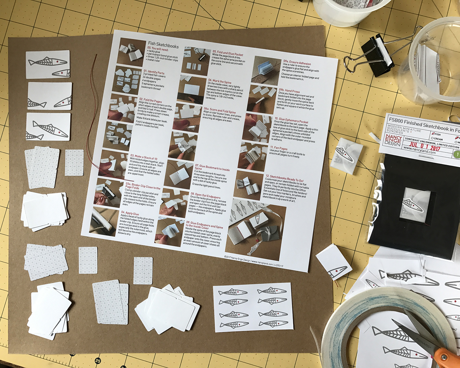
I’ve been enjoying making fish sketchbooks, and have finally come up with packaging I like. They’re individually packaged in a cotton fiber vellum folio, and sealed with a fish.
:)
There will also be a kit of three blank fish sketchbooks, with some bonus printed fishes for you to play around with.
I have a little more photography to do, then look for them tomorrow in the shop!
Three different covers. Endpapers are cut from one of Recollections “Black Jack” papers. Book pages cut from a nice substantial Southworth paper I’ve had for maybe… *thinks back to the last time we may have actually printed out a résumé* … a really long time. I drew the fish a few years ago when I was dabbling in surface pattern design. So we meet again, eh, fish?
Of course an ephemera pocket.
I have been gone a lot lately from my home, and Scarlett especially was not stoked. There was some regressive behavior and acting out.
I was reminded, though, of how much I liked the Sea House Warming Hut living roof, and how much I miss having a current build. But then I remembered the fate of the Argo Wool Works…
… and sighed. Thus far, the room box that houses the set for Modern Miniature Succulents + Sundries is unravaged, cunningly set atop a bookcase, so that will have to continue to suffice for my construction longings. Scarlett is a year old now — a small cat in stature forever! — and although her depredations have diminished considerably, I am reluctant to reengage with my nemesis.
The reason for my absence is shown above, in this picture taken by my daughter, of her daughters. Here is four-year-old Maddie reacting to the sounds of her 10-day-old sister, Ruby. We are all so in love.
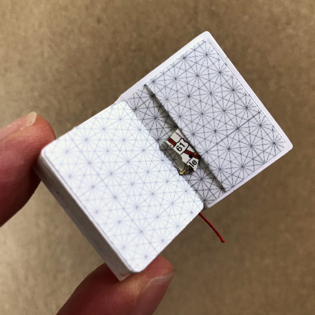
For the first time, I am making finished sketchbooks.
Featuring a bookmarked center spread with an original watercolor sketch, there are bits and bobs peeking out, much like our own 1:1 sketchbooks. The inspiration for the bits and bobs is Keli’s clever receipt notebook.
The covers have a snippet or collage of other original art, meaning that each sketchbook will be one-of-a-kind.
Here are the first four center spreads. Each will be bound into the classic sketchbook cover, then individually bitted and bobbed.
In addition to sketches I’m doing some abstract expression-y explorations.
What doesn’t make the design cut to center spread will be used for the bits and bobs, and cover illustrations. The books are finished to be relatively flat, measuring 1.625 x 1.125 inches (4.13 x 2.86 cm). This is the real deal — original art made 1:12 scale — for the love of miniatures and color and drawing and watercolor markers. And bits and bobs :)