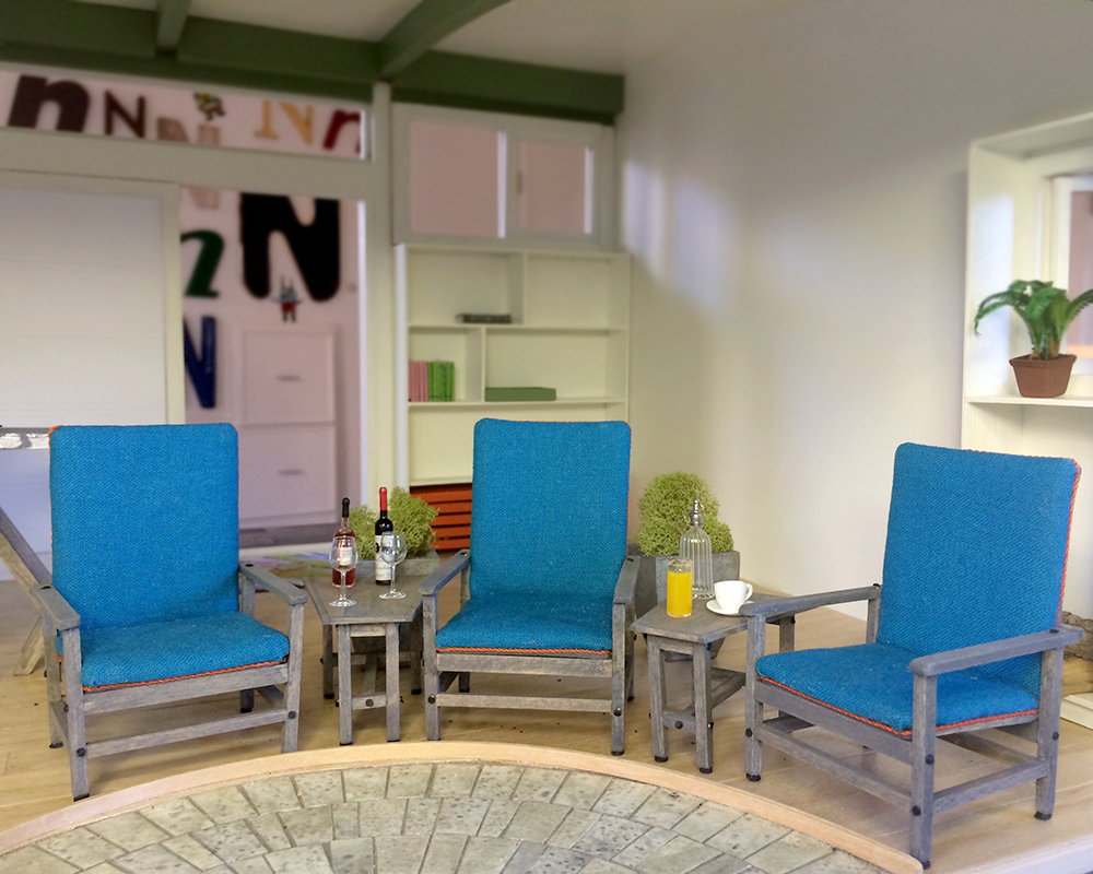
After looking at the photos, the chairs looked a bit leggy to me, so I added front and back stretchers to square out the bottoms. Much better, yes?
I also decided I didn’t care for the shiny exposed pin heads. I tried dabbing on a tiny dot of black paint, but my hand is not nearly steady enough to deliver consistently. I’ve gone with 1/16-inch punched dots. Countersinking the pin heads would have been ideal, but instead I’ll wait for the glue to dry and then smush the dots down with a pencil eraser, conforming the paper around the wee tiny stupid pin heads.
I call done again no really.

I like the additional finishing details. I’m beginning to think I’d quite like a real life version!
What are all the ‘n’s in the background? Do you collect ‘your letter’ in various fonts?.
Thanks, B. And scaling up a 1:12 chair to life size — it could totally be done. I think you have your next project!
As for the N’s… I have long collected signage typography, and you know how it is when word gets out you “collect” something. I have had friends deliver exquisite dumpster dives and flea market finds. My delightful husband, in particular, has been very inspired to keep the collection growing. Each one is a marvel with some kind of story to tell.
I like the changes. Improving on an already beautiful chair!
Thanks, Kat! I love the iteration process of design and building. When we have the time and patience to do so :)
yep, that was a good decision – looking really great now!
Marion, thank you! They do seem more stable and low-center-of-gravity now, inviting a sit down.
I didn’t think they looked leggy at all until you fixed them, but yes indeed, they’re much better now.
“Wee tiny stupid pin heads” made me laugh out loud….I’ve been there! Good luck with the paper smooshing.
Ha, Keli. I hadn’t realized I was as nettled as I was until those words came out of my fingers. I immediately felt better, even kindly :)