S: Smorgasbord

S_smorgasbord

S is for Smorgasbord. Yes I know I’m stretching it, and being somewhat silly. There was a break between storms, and the ocean at Manor Bluffs looked so pretty. That’s the unstable, crumbling edge of the cliff you see in the lower right, and the beach 60 feet below. (This was also the vantage point for February’s H: Horizon shot.) 

grapefruit_slice_032418

S is for Slice. In this case, grapefruit. Or pamplemousse in French, which is a superior word. 

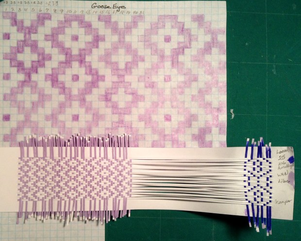
S is for Shelley, sharing. I bribed Shelley with some wider (taller?) looms to continue experimenting with her weaving magic. She sent variations on three traditional patterns, bird’s eye, twill and goose eye.

shelley_B_birdseye

shelley_B_twill

shelley_B_gooseeye

Mind blown (again.)

jan_toto2

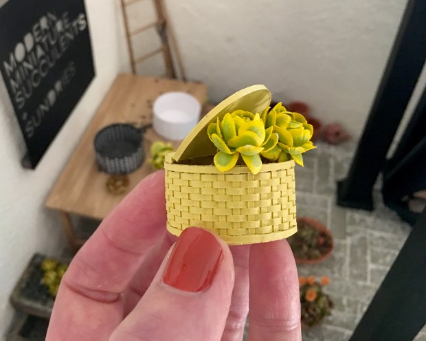
Jan of morphunkyMiniatures in Edinburgh, UK let me share what she’s doing with the Toto2 basket kits. Love the vintage illustrations on the lids! Be sure to check out her other great luggage, furniture and “eccentricities” — very original and beautifully made.

petroskey_stone_032418

S is for Stone. I like rocks, a lot. This one is incomprehensibly old, and it used to be alive O_O. Keli recently surprised me with a package of Michigan goodness, including this specimen of fossilized coral called Petoskey Stone. Well worth reading about! In the sun, the white parts sparkle. Stunning.
S_sign

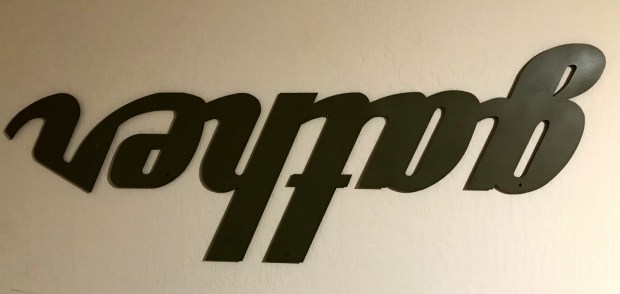
S is for Sign and a Sign-off Story. This is a large — almost five feet wide — sheet metal sign, “handcrafted by an Amish craftsman known around Lancaster County as Rusty Merv”, that I accidentally got some years ago. Originally ordered as a gift for my daughter, I mildly damaged it slicing open the shipping box with an X-acto. (In my defense, it was very poorly packaged.) So I had a new one shipped to her, and held on to this one. It was a nice brick red color at the start; when I lived in the mid-century house with all wood paneling, I spray painted it this dull moss color.

Right-reading, ‘gather’ has hung in various places in a few different houses, and most recently, perpendicularly in the entry way that opens to our living room. With the nancyland studio re-org, I moved it over the thinking couch (which folds out into a guest bed) and hung it upside down. This makes me smile all the time, I think because I’m an introvert.
N: N

N_00

N is for … N.
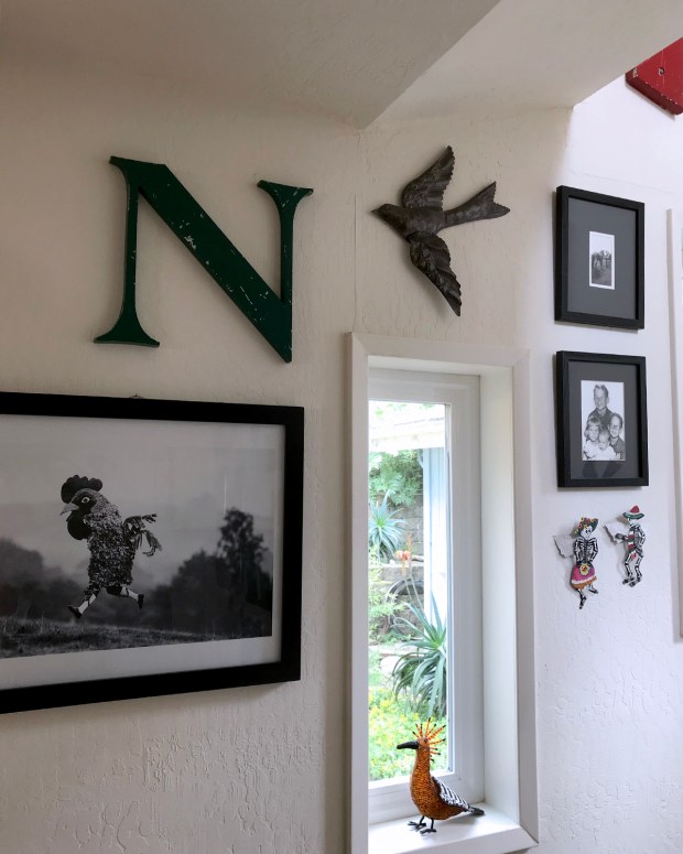
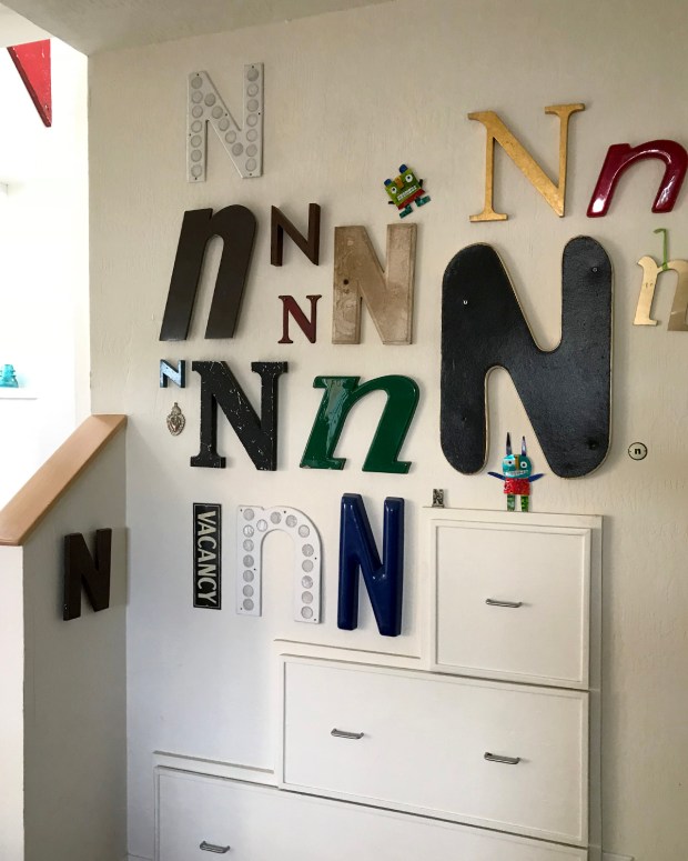
I’ve been collecting vintage sign salvaged Ns for some years. My husband is especially accomplished at finding and gifting really good ones.

N_05

Some I admire for their intricately weathered surfaces.

N_01

Some I love for their over-the-top appearance. This one is three feet tall, of heavy wood painted red, and oversees a stairwell.

N_06

Much of the typography is beautiful, like this well-balanced classic uppercase N, of green metal.

N_04

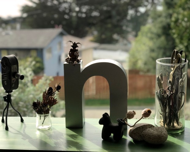
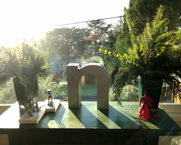
This is the newest one, a hollow aluminum lowercase n, about 12 tall by 3 inches deep, an early Christmas present (of course) from my delightful husband.

N_Napoleon_021418

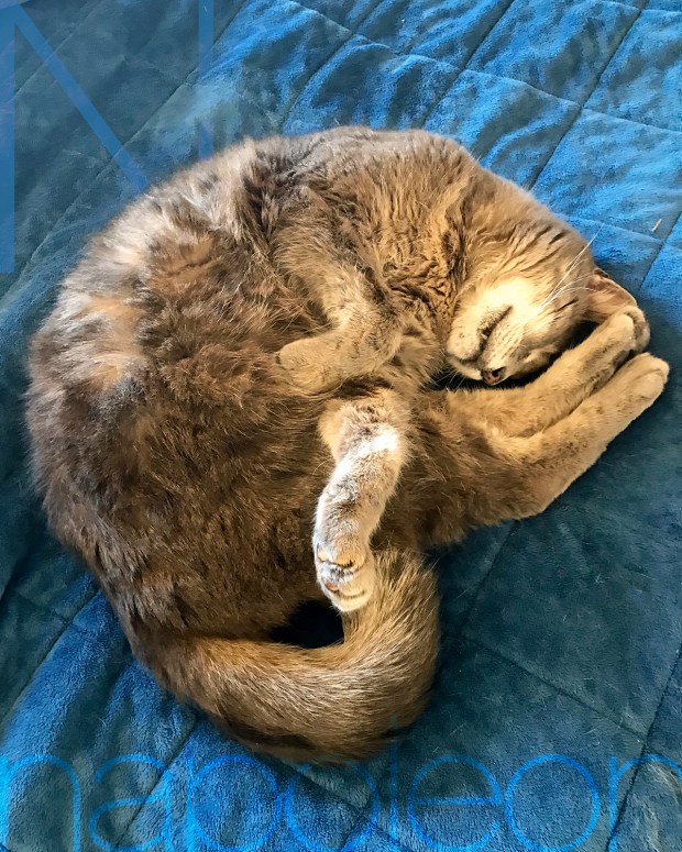
N is also for Napoleon, my stoic and dingy old man cat, who is growing very boney. It makes me so happy to see him comfortably napping in the early morning sun.

dawn_021418

This was the remarkably pastel dawn over the ocean that morning. There’s the horizon obscured with a far-off fog wall, as often happens, but the colors — especially the lilac and rose — were extraordinary.


Wrought Iron Sign Salvage

SH_roof_122017

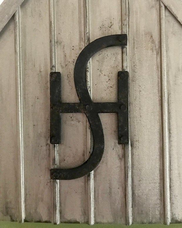
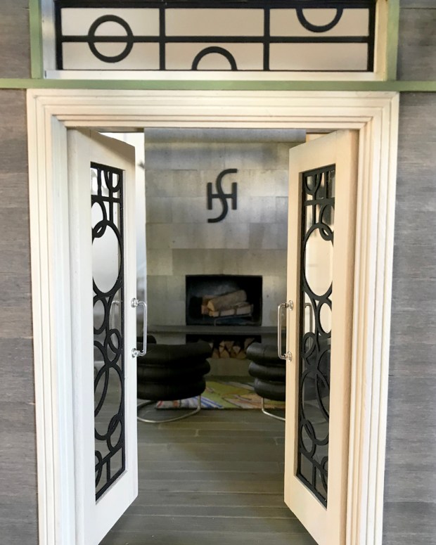
I wrought Sea House emblems for the landward and sea-facing sides of the pavilion roof. They’re meant to be salvage from the old Sea House Pleasure Pier and Estate. And so they are.

SH_logo_roof_122017.jpg

Sized to fit between the raised seams on the metal roof, I cut seven copies of the emblem from 65 lb. black cardstock and glued them together. After drying under weight, I sanded the edges even, and slightly beveled the top edges. I added fastening “bolts” then lightly stippled and dry brushed some wear and weathering. Not too much. The caretaker is diligent about her conservation duties.

front_122017

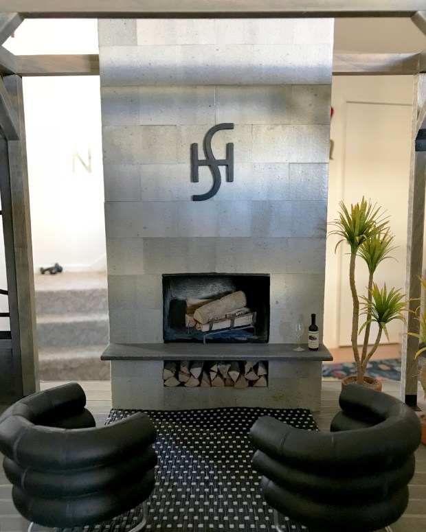
Then I had to make a smaller version to mount on the fireplace.

SH_fireplace_122017

It looks splendid, don’t you agree? (Well, except for the ripply rug. There’s always something.)

kitchen2_122017

I bashed out the support column in front of the kitchen, and felt much better about the space, even though it still looks like every other ELF kitchen ever made, ever. (Not that there’s anything wrong with that.) I’ll scrape away the brackets on the floor, patch where the post was, and it’ll be an intentional remodel artifact :) I found the LED pot lights I ordered, then lost, so next step will be the ceiling/roof, and then the exterior siding.

gh_122017.jpg

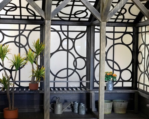
In the greenhouse, the hydroponics have been relocated to an anchored barge just off the rear utility deck.

lowercase_n_121817

Meanwhile, I got to open an early present, a vintage sign hollow aluminum lowercase n, about 12 tall by 3 inches deep. Feeling the love. Thank you, my B.

Packaging Process, In Progress

concept

The new finished open sketchbooks require different packaging than the current MMS+S flat kits. I set about designing an insert for the books’ 3 x 4-inch plastic bags that will provide a protected, recessed container. After roughing out dimensions on paper, I work in Illustrator to draft a model. White cardstock cuts first, with numerous and many revisions.

cut

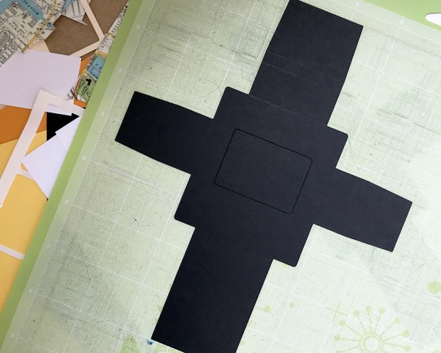
Once I’ve got a solid working white model, I cut models in my intended paper, a rich black cardstock.

testing

Numerous iterations transpire. Where does the cutout appear? Where will the labels go? How does it fit in the bag? Where are the dominant folds vs. the grain of the paper? How can I best optimize use of paper, given a 12 x 12-inch maximum dimension? How might I make this easier, more elegant to assemble?

variations

Some versions later, I’ve got my best solution (though what’s pictured is not it :) I streamline the pattern in Illustrator for optimal cutting on the Cricut machine, joining paths, eliminating rogue anchor points, and doubling key scorelines. This happens about 11 times.

surprise_flower.jpg

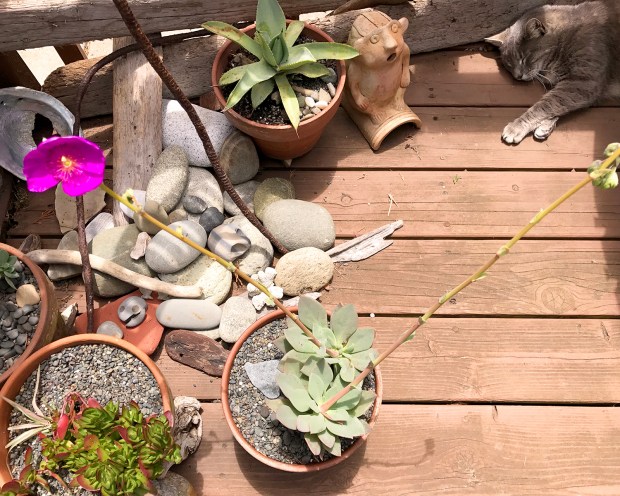
Earlier today I walked out on the back deck to take the mass quantities of paper scrap I generate to the recycling bin, and I noticed this sudden dramatic bloom on one of the new nursling succulents. Dumb angle photo, but what a pleasant surprise!

sideview

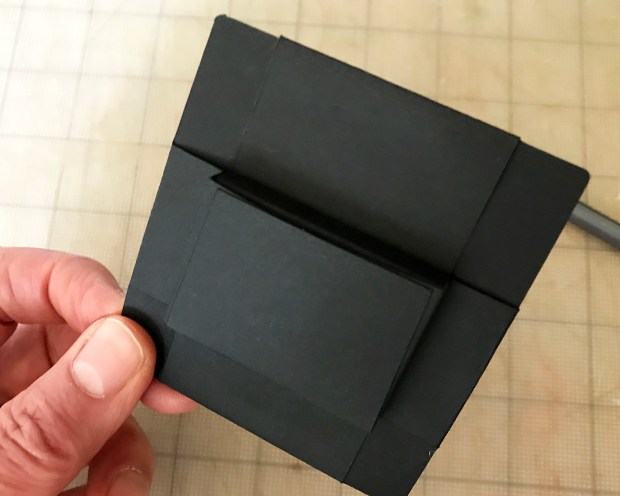
A side view of the insert. It’s effectively one layer of cardstock thick on the sidewalls, and three on the bottom, with two on the immediate front face. Sturdy enough to withstand shipping? Do I need to add another layer to the sidewalls? Test mailings will tell.

backview

The backside. Utilitarian!

Sidenote: I work in inches for packaging, and in points and picas for most other applications, such as labels. Graphic designers are bilingual that way.

header00.jpg

Insert sorted for now, my attention turns to labeling. The current 3 x 3-inch labels will not work for this package. I consider two 1-inch labels — enough to order some — when a header card occurs to me. First ideas include, for some reason, a cutout circle to hang on a rack.

v1

But then I wonder why? I’m not a hanging rack sort of shop. The circle is unnecessary.

v2front

I rework the design a bit more. A staple will anchor lower center, through the bag and insert, to secure the header card and further reinforce the package.

v2back

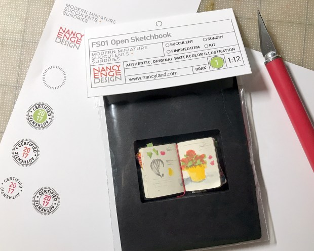
Because this packaging is for a one-of-a-kind, original artwork, a signed certificate of authenticity is included :D

deskmess

And the deskmess to back it up (not included).

Basket Kit Progress, Bobo Fun

working_010517

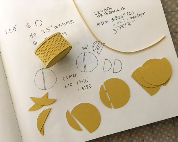
This was my desk, late last night, working away on the paper basket kits. After many pattern iterations, file conversion aberrations and test cuts, I had the basket itself fairly well worked out. I was thinking about basket lids — if, how and why — when I had an idea. I was too tired to implement it, but scrawled some notes.

lid_idea

This morning I drew the pattern and did a test cut.

lid_first_cut

lid_proto1

And yay! It works swell! (Also, chilly in the studio this morning! My poor fingers.)

lid_proto1_top

It’s a simple construction, very open to customization.

lid_proto1_shop

I’m thinking about handles now. But enough! I want to get these kits out.

cfm_logo_01

For those who saw the item in the January newsletter referencing my delight with the typeface Bobo — designed by Jean-Baptiste Morizot in 2016 and published by Indian Type Foundry — I put together this logo. Each character in the all-caps font has at least three variations. So fun, even as an example of expanding your notions of what makes a thing a thing. (And it’s available from Fontshop right now for half price.) Check it out!

First Packaging Prototype

first_packaging2_111816

Exciting times here in Nancyland. Been researching and getting in supplies for packaging and shipping, and working on the graphics for labels and such. Need to reshoot two four photos for the first kit instruction sheet, and that’s done. Then do glamour shots and write product descriptions for the Etsy shop, and actually list stuff for sale. Getting good response to the newsletter offering — thank you, thank you — and Volume 01, Issue 01 drops the first of December. Whirlwindy!

Equivalents

equivalents_100516

Wonderful poster from 1938, hanging in woodshop class. In case, for instance, you needed to know at a glance the decimal equivalent of 43/64. I’m especially fond of the way numeral two is drawn, graceful as a swan.