Sea House Conservatory, Pacifica, Santa Cruz

Sea House Conservatory, in progress, February 2019

The Sea House Conservatory removable plexiglass and faux iron beam roof is assembled. It is supported by iron pillars and wood siding painted N-C16 Midnight Stroll by Clark+Kensington. I made new finials from wooden beads and toothpicks.

Brackets join and support the faux iron roof beams

Where the two corner beams met the center beam and roof ridge there was an inelegant gap, so I cut iron brackets and bolts from two layers of black card stock, to reinforce both the roof structure and the illusion :)

Wheelie at the fireplace end of the Conservatory

The fireplace and hearth underwent yet another color change. I wanted something more working/utilitarian looking, less living-roomy. Picture the chaise draped in reference books and aprons and a seaweed drying rack hanging from the rafters.

Sea House Conservatory leaded window design, 3 of 11

Turning my attention now back to the many windows, cutting the original kit grid mullions out of the frames with a Dremel. Tedious. Then sanding, painting, and fitting the cut leaded designs into the frames, front and back. Oh, and finishing (but not mitering) the outsides with 1/16-inch square trim. Ugh.

Pacifica sunset, between storm fronts, 15 February, 2019

We’ve been getting breaks between rain storms, glimpses of the sun, and some beauty clouds.

Ruby at 20 months, shopping in her sister’s vest for her mama’s birthday present

Spent a long weekend in Santa Cruz with my daughter and younger granddaughter Ruby, while her papa and older sister Maddie were in Lake Tahoe getting Xtremely snowed on. Ruby’s choice of outerwear was her sister’s vest. Ruby on the runway.

I like me. Print this out and hang on your refrigerator, lest you forget

Maddie, who turns six next month, is loving Kindergarten. Her mother shared some pages of the journals the children keep. The first remarkable is that upper and lowercase writing is still being taught — yay! So for Maddie, already proficient in capital letters, this manifesto represents challenge, learning, practice. And then the everything else: the sentiment, and the exuberantly joyful self-portrait. Perfect expression, I’d say.

Z: Eyes on the Prize

Z_eyes

Z is for eyezzz on the prizzze.

You can take a hundred pictures of the same thing, as I do, and five of them might be true. Living on the edge of a continent facing due west, with a view of the horizon, I find joy in this vista every single day. This is the prize.

This also concludes my ABChallenge, with a final nod to Dr Seuss’s On Beyond Zebra —one of the most personally influential books I’ve ever read. (I wrote about it here.)

zebra_spread

distinction_final

Speaking of prizes, here is the official, distinguished Certificate of Distinction for you poets to download and laminate and proudly display. Fond regards for all who haiku’d their X hip hardware puzzle answers.

This is meaningful
Hope I spelled all the words right
And that you like fish

pill_highlighters

Keli sent these giant pill capsule highlighters, which still make me laugh. The only thing better than miniatures are giant things.

memory_foam

Scarlett finds it comfortably convenient that we got a new 3-inch thick memory foam topper for the downstairs guest bed, which is where I’ll be recuperating for the next few weeks after tomorrow’s surgery. I am so ready to do this thing.

Looking forward to seeing you all on the other side.


W: Weaving, Waxing, Waning

baskets _091518

W is for weaving. I’ve been playing with hand-tinting the looms of the round basket kits in spectral and hombré shades. I started with black weavers and rims, then went to a medium warm gray. After a few baskets, I thought the offcuts would make good banners or samples of the colorways, and then the idea was born for the Basket Circus + Exposition.

BCE_sign_v1

Many thanks to Keli for participating in the totally legitimate focus group which determined this name.

black_weaver_warm

What a difference between black and gray for the contrast. I love them both.

gray_weaver_greens.jpg

gray_green_basket

sunset_091418

We’re getting to the glorious sunset colors time of year here in foggy-summer Pacifica. I remain in awe. Nature, you know she don’t mess around.

Albie_sunset_091418

Albie joined me a short time later on the front deck. This picture is significant because it answers the question, “What phase is the moon in?” Each September, my husband and I celebrate the anniversary of our marriage on the full moon. This year, it seems we have 10 or so days to go. (Hope we remember.)

gravity

And finally — as if you’ve ever doubted — here is proof that cats can defy gravity. Even when they’re sleeping.

T: Thoughts, Things

B_Tobin_Tunnel_040718

T is for Tobin’s Tunnel. Yesterday, it was clear and sunny. B and I walked out to Mussel Rock at low tide, and came upon the remains of Tobin’s tunnel. It was first blasted out in 1874 so the landowner could enjoy scenic carriage rides along the beach without having to detour around the headlands. Very soon the tides, winter storms, and finally, the 1906 earthquake made other arrangements of the work. This is the only section that remains. (NOTE: The geologic and social history of this area is truly fascinating; I recommend a google dive. The best is Shawn Heiser’s SFSU thesis, Living on the Edge: Environmental History at Mussel Rock, 2010.)

B_tobins_mussel_rock

T is for triptych. The view looking west, over the ocean. That’s Mussel Rock on the right, with the wooden posts sticking up, and old highway riprap, which forms part of the seawall, in the lower right. The San Andreas fault line is directly underneath us.

brick_riprap_040718

T is for trails. The network of trails leading down to the beach — when there is one — are the remains of the old Ocean Shore Railroad (abandoned in 1920), and the Ocean Shore Highway (bypass over the headlands completed in 1957).

SF_quilt

T is for thread. I am eagerly awaiting the San Francisco pattern I ordered from Haptic Labs to hand-stitch a small quilt. Serious goodness in this shop. I’m sure I’ll have much more to say when it arrives.

T is for thought. I can’t say I’m fond of this particular enamel pin, but the copy that accompanies it struck a chord:

“Handmade is as much a path as it is a product, an ethos that creeps into every aspect of life. When we make things for ourselves, we take a singular pleasure and satisfaction from every use, sure of its provenance and intention. The creations of our hands become the warp and weft of our days, until life becomes a tightly woven tapestry inspiring us with purpose and pride.”

first_batch_bottled_040118

T is for tea. Fermented kombucha in this instance. My daughter gave me a book of recipes and a large Weck jar at my birthday. This is my first batch, brewed with Yorkshire Gold — a two-week-process in my chilly kitchen — bottled for second fermentation. That’s Meyer lemon + ginger in the Weck, and ruby grapefruit in the cute recycled bottles. Yum and Salute!

S: Smorgasbord

S_smorgasbord

S is for Smorgasbord. Yes I know I’m stretching it, and being somewhat silly. There was a break between storms, and the ocean at Manor Bluffs looked so pretty. That’s the unstable, crumbling edge of the cliff you see in the lower right, and the beach 60 feet below. (This was also the vantage point for February’s H: Horizon shot.) 

grapefruit_slice_032418

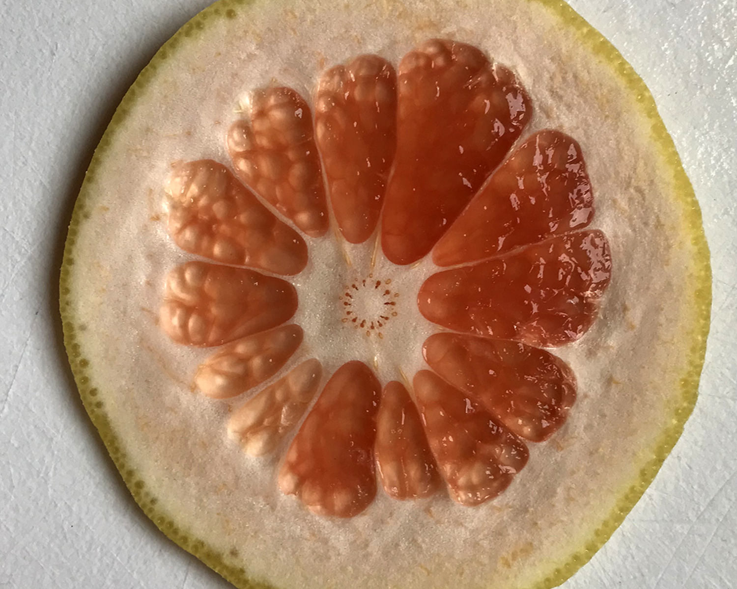
S is for Slice. In this case, grapefruit. Or pamplemousse in French, which is a superior word. 

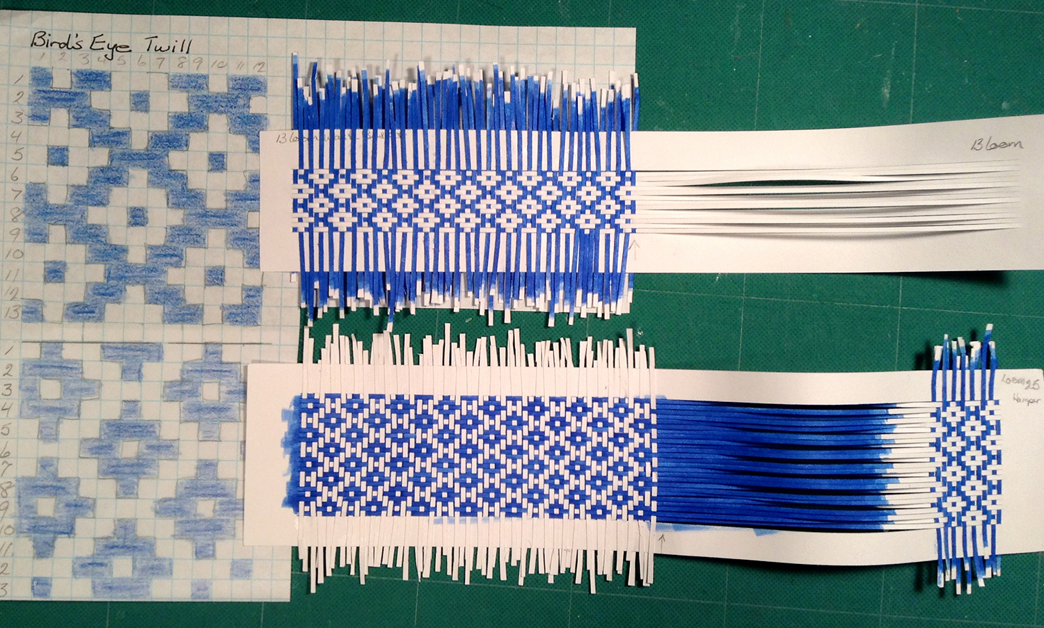
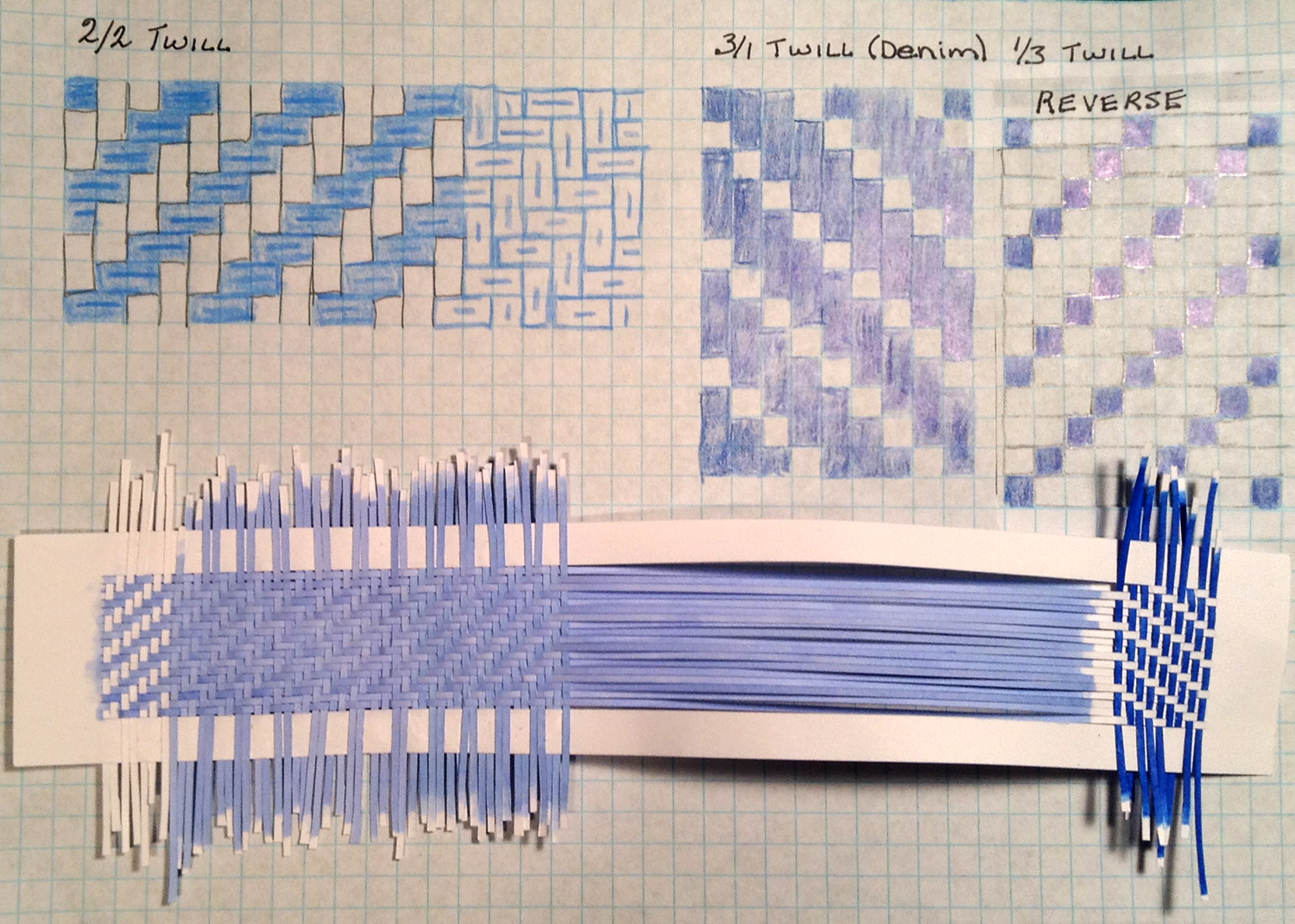
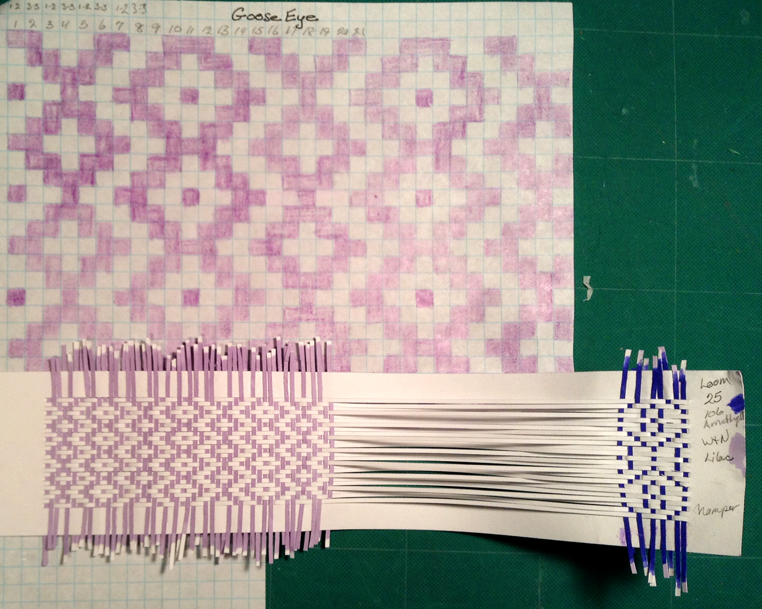
S is for Shelley, sharing. I bribed Shelley with some wider (taller?) looms to continue experimenting with her weaving magic. She sent variations on three traditional patterns, bird’s eye, twill and goose eye.

shelley_B_birdseye

shelley_B_twill

shelley_B_gooseeye

Mind blown (again.)

jan_toto2

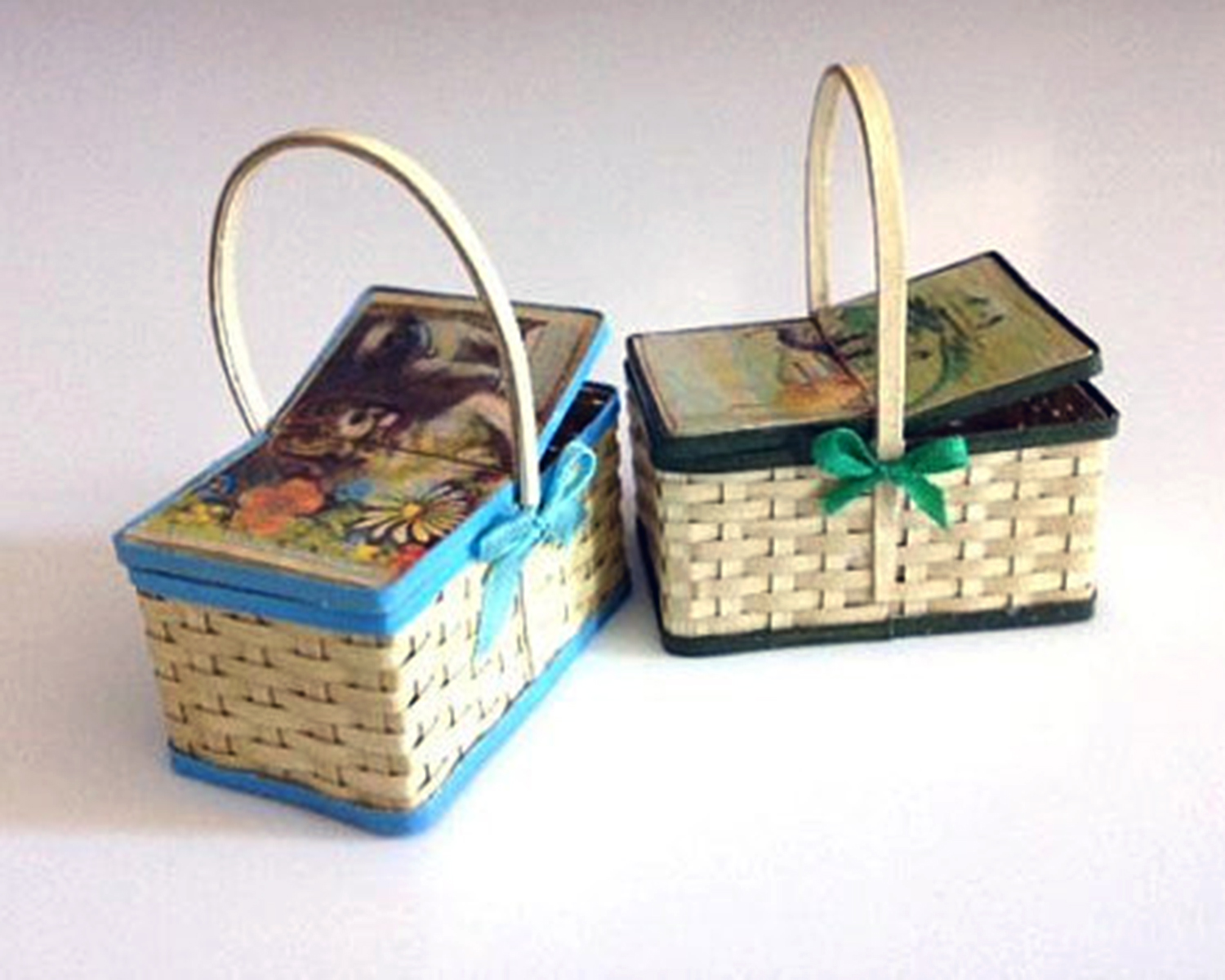
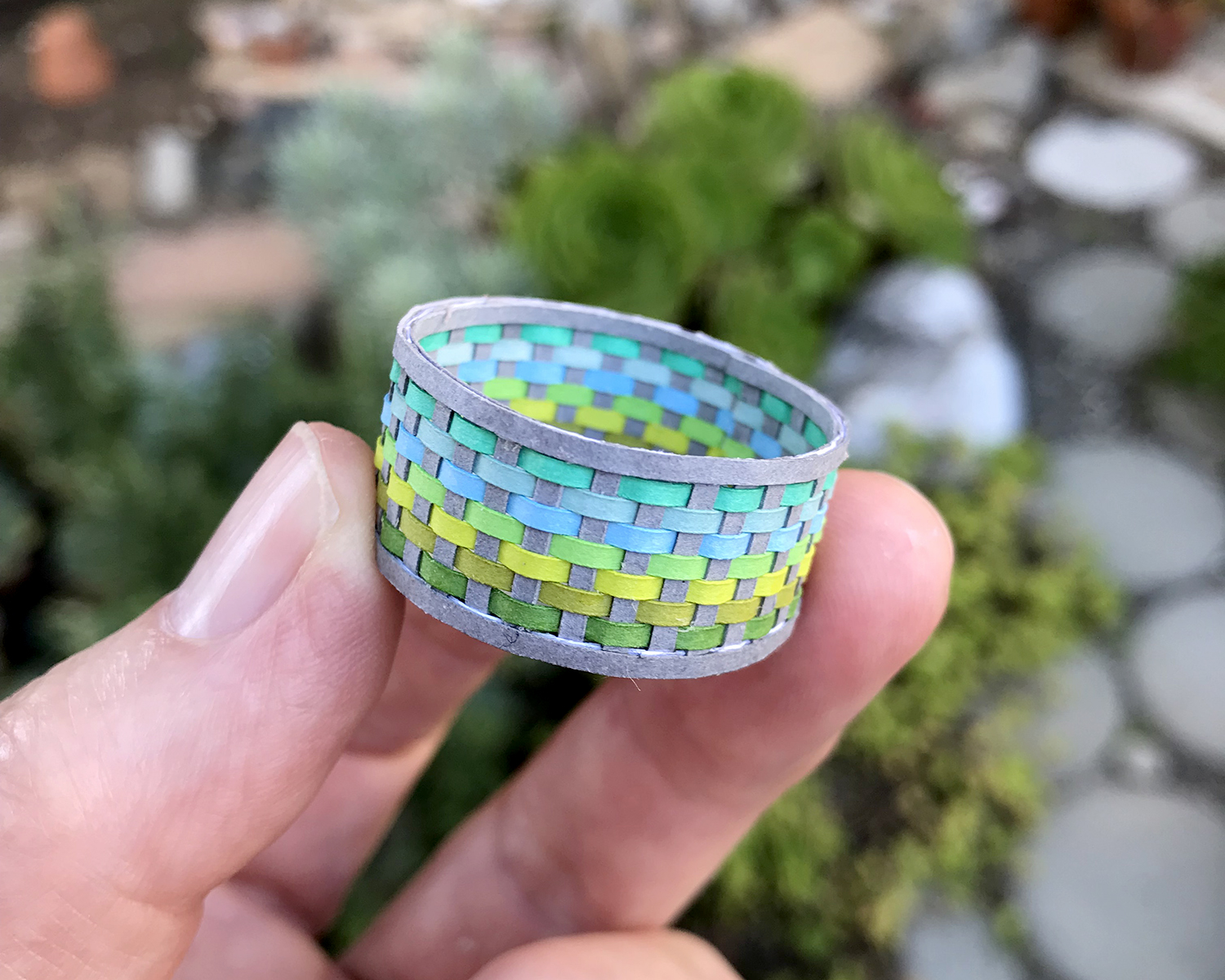
Jan of morphunkyMiniatures in Edinburgh, UK let me share what she’s doing with the Toto2 basket kits. Love the vintage illustrations on the lids! Be sure to check out her other great luggage, furniture and “eccentricities” — very original and beautifully made.

petroskey_stone_032418

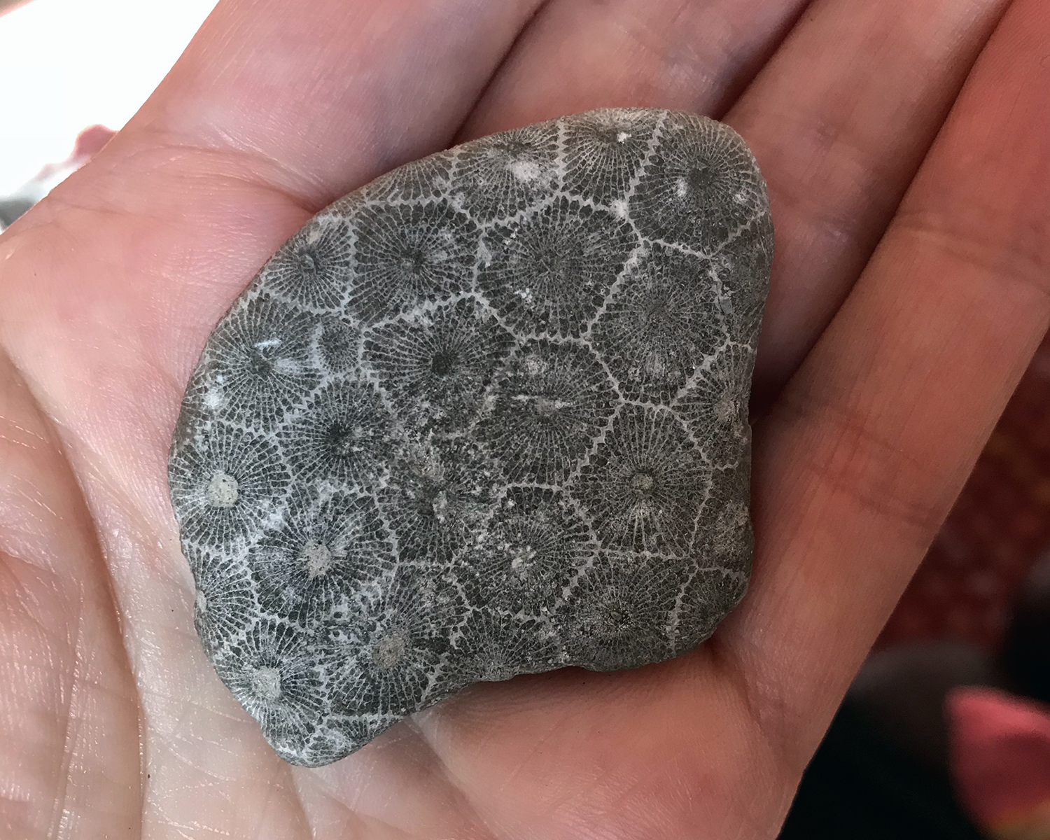
S is for Stone. I like rocks, a lot. This one is incomprehensibly old, and it used to be alive O_O. Keli recently surprised me with a package of Michigan goodness, including this specimen of fossilized coral called Petoskey Stone. Well worth reading about! In the sun, the white parts sparkle. Stunning.

S_sign

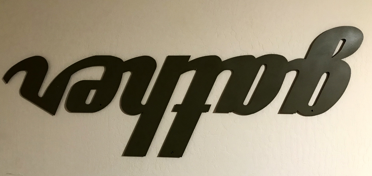
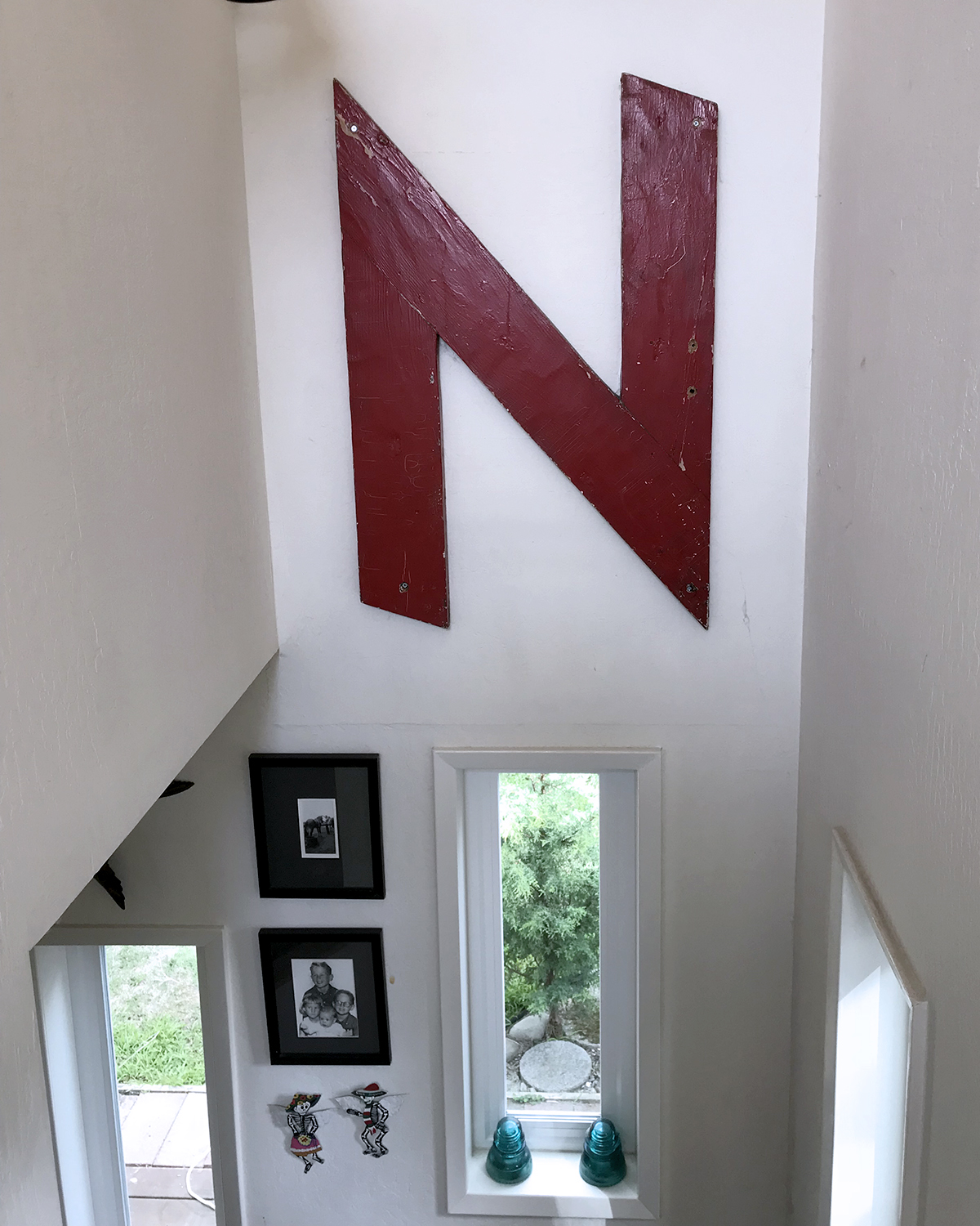
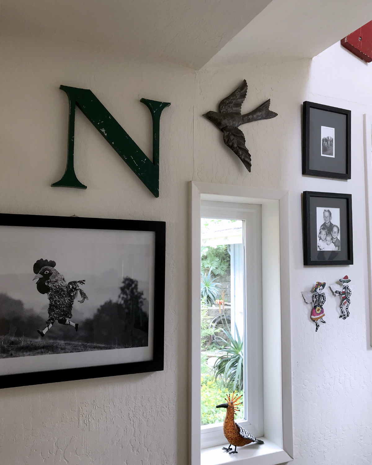
S is for Sign and a Sign-off Story. This is a large — almost five feet wide — sheet metal sign, “handcrafted by an Amish craftsman known around Lancaster County as Rusty Merv”, that I accidentally got some years ago. Originally ordered as a gift for my daughter, I mildly damaged it slicing open the shipping box with an X-acto. (In my defense, it was very poorly packaged.) So I had a new one shipped to her, and held on to this one. It was a nice brick red color at the start; when I lived in the mid-century house with all wood paneling, I spray painted it this dull moss color.

Right-reading, ‘gather’ has hung in various places in a few different houses, and most recently, perpendicularly in the entry way that opens to our living room. With the nancyland studio re-org, I moved it over the thinking couch (which folds out into a guest bed) and hung it upside down. This makes me smile all the time, I think because I’m an introvert.

N: N

N_00

N is for … N.
I’ve been collecting vintage sign salvaged Ns for some years. My husband is especially accomplished at finding and gifting really good ones.

N_05

Some I admire for their intricately weathered surfaces.

N_01

Some I love for their over-the-top appearance. This one is three feet tall, of heavy wood painted red, and oversees a stairwell.

N_06

Much of the typography is beautiful, like this well-balanced classic uppercase N, of green metal.

N_04

This is the newest one, a hollow aluminum lowercase n, about 12 tall by 3 inches deep, an early Christmas present (of course) from my delightful husband.

N_Napoleon_021418

N is also for Napoleon, my stoic and dingy old man cat, who is growing very boney. It makes me so happy to see him comfortably napping in the early morning sun.

dawn_021418

This was the remarkably pastel dawn over the ocean that morning. There’s the horizon obscured with a far-off fog wall, as often happens, but the colors — especially the lilac and rose — were extraordinary.


H: Horizon

H_horizon

H is for the horizon.
Seen from Manor Bluff, late afternoon, very low tide. The jumble of dark in the lower left is riprap (huge granite boulders) the City has been placing in an attempt to protect the sandstone cliffs from inevitable (and natural) erosion. Two humans for scale. This view is directly across the street from the post office, which I visit most every day.

G: Gray, Gray + Green

G_gray

G is for the grays of a winter storm.
Sharp Park Beach, looking south to Mori and Pedro points.

G_gray_green

G + G, for the warm grays and bright-eyed greens of a handsome cat.
Napoleon, overseeing the Sea House Warming Hut build.


D: Dollhouse, Wheelie

D_dollhouses

Alongside a small apartment building in Rockaway Beach is an odd assortment of broken Talavera pottery, derelict lawn ornaments and abandoned dollhouses. It is thought-provoking, but not at all sad.

Wheelie_cappuccino_012518

In an effort to get out more, I’ve been auditioning various coffee shops around town. Current fav is Perfect Pour on Clarendon. Small, friendly, excellent coffee (they do their own roasts). Wheelie enjoyed making my cappuccino appear mustachioed. Little hipster.