Now and Then: Chairs, Leadlights, Conservatory, Rocks

The first of two estate chairs for Sea House Leadlights. Probably.

I bought two of Kris Comapas’s Estate Chair kits because I wanted to use more of this thrift store dress fabric, which I love.

From a Pescadero thrift store strapless, bubble-hemmed dress
Happy little estate chair, work in progress

It’s a rather large scale print for miniature upholstery, as well as being a very fine and lightweight fabric, but did I mention how happy it makes me feel?

Though legless and unpiped, still a very welcoming estate chair

Kris includes good instructions and cord to make fabric-covered piping in her kits, but I generally prefer a twisted cord made from 3 strands of embroidery floss.

Yes, K-2’s eyes light up (when he sees me)

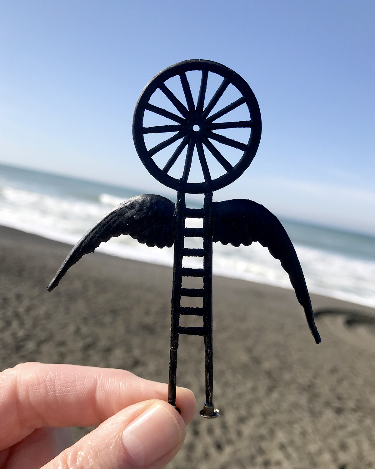
Here you can see my associate K-2SO inspecting the floss piping with his massively articulated fingers. (I love him, too.)

I find attaching tiny piping gracefully onto miniature upholstery to be a tedious task, so I’m putting it off until I feel more… um, articulated dextrous. And patient.

Sea House Leadlights design studio

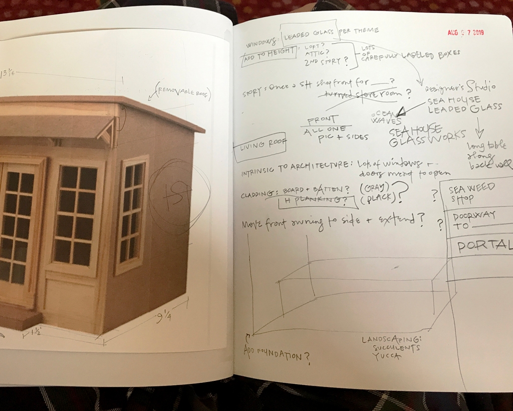
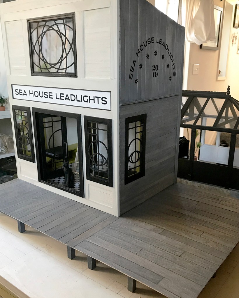
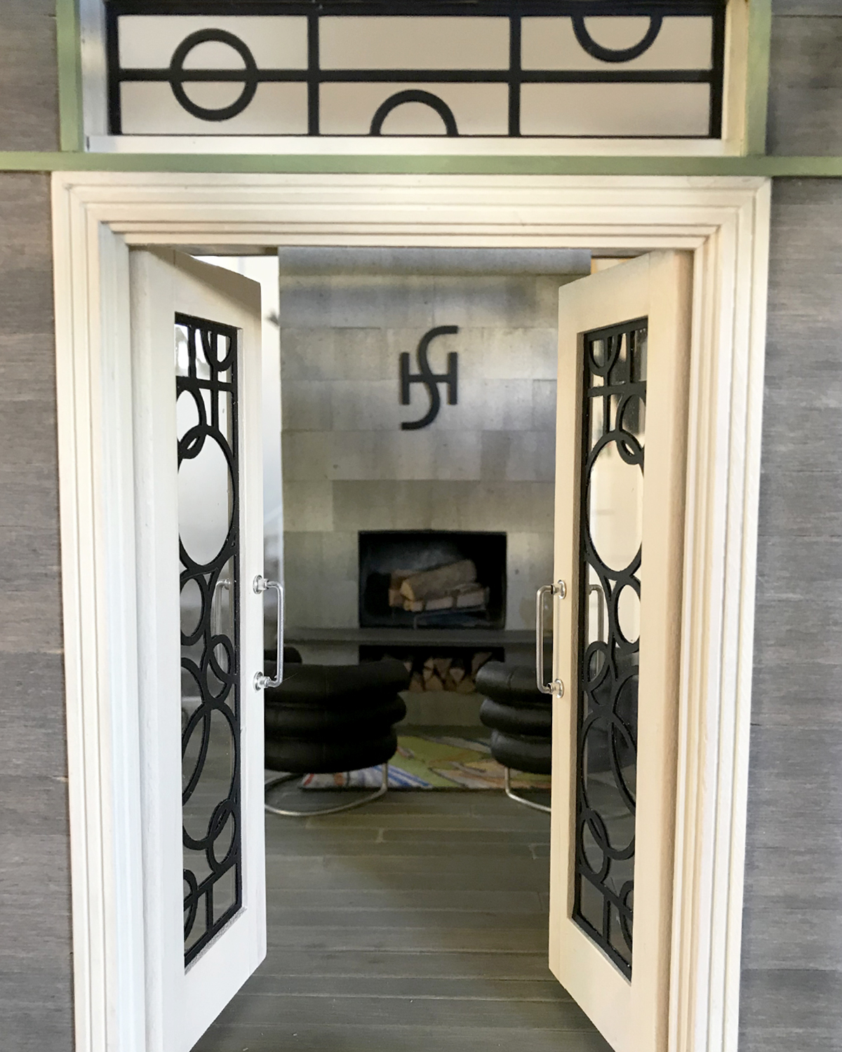
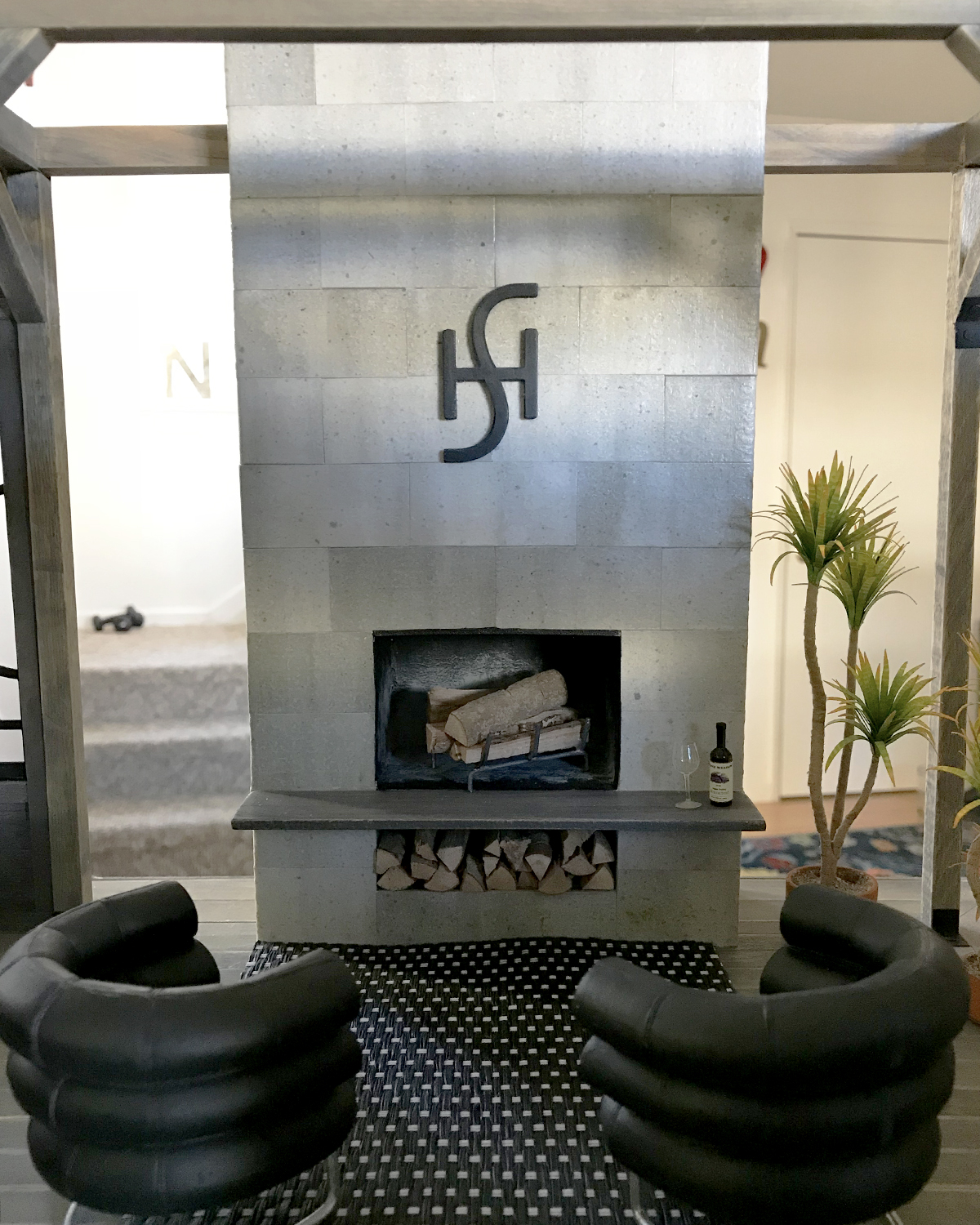
The Leadlights design studio also has a new chair. Makes it look way more office-y, don’t you think? I’m really pleased with the level of quality and detail in this chair. (Ack! This photo also reminds me I want to finish tricking out the desk accessories, and to trim that orange bookmark on the last-minute-made sketchbook!)

That brick rubble is glued down Scarlett. (Yes, she checked.)

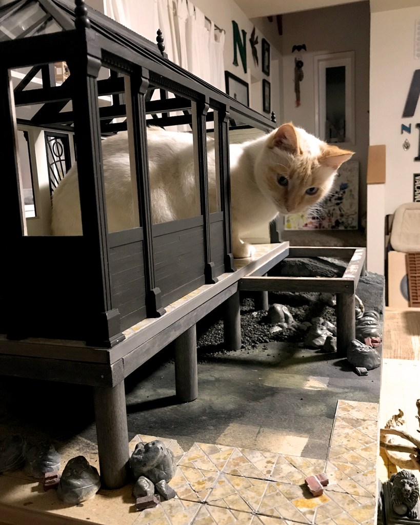
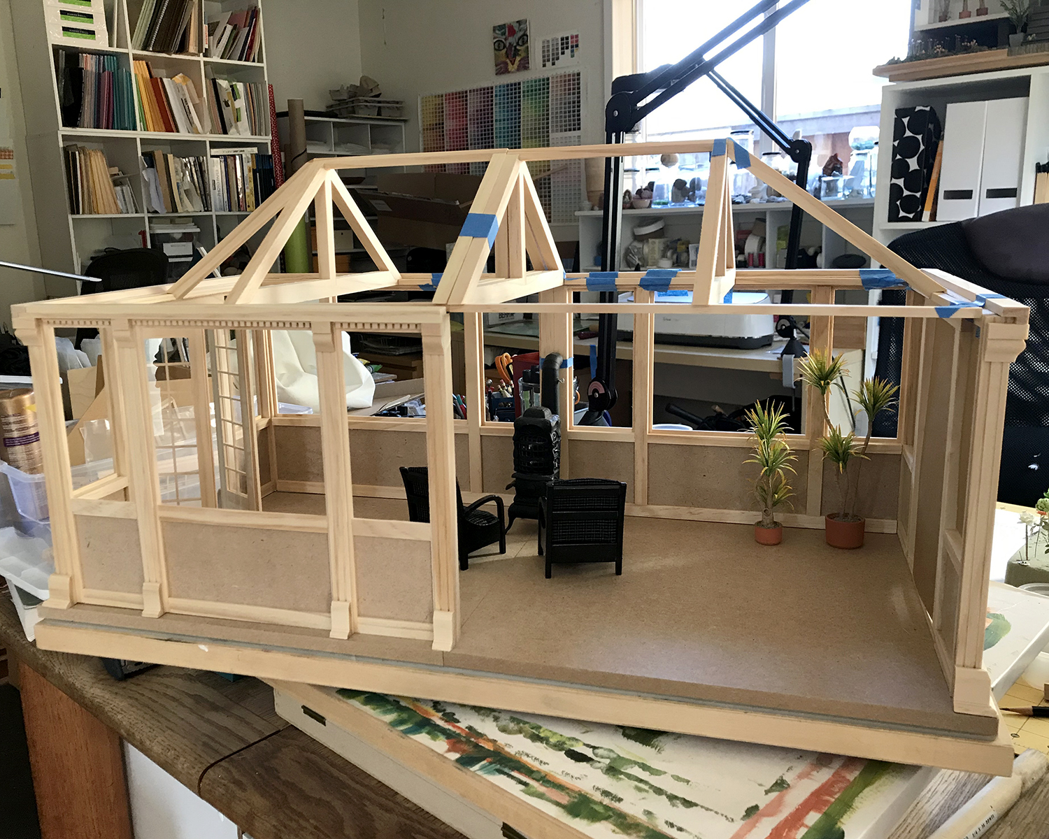
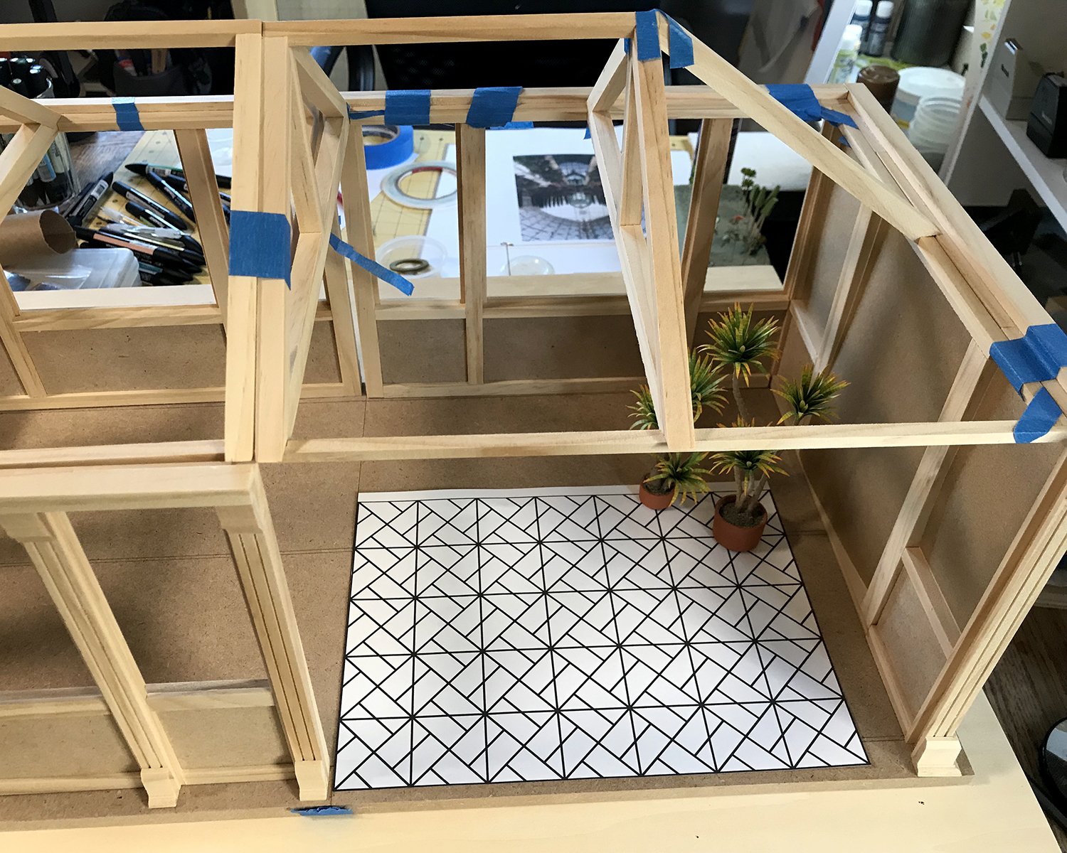
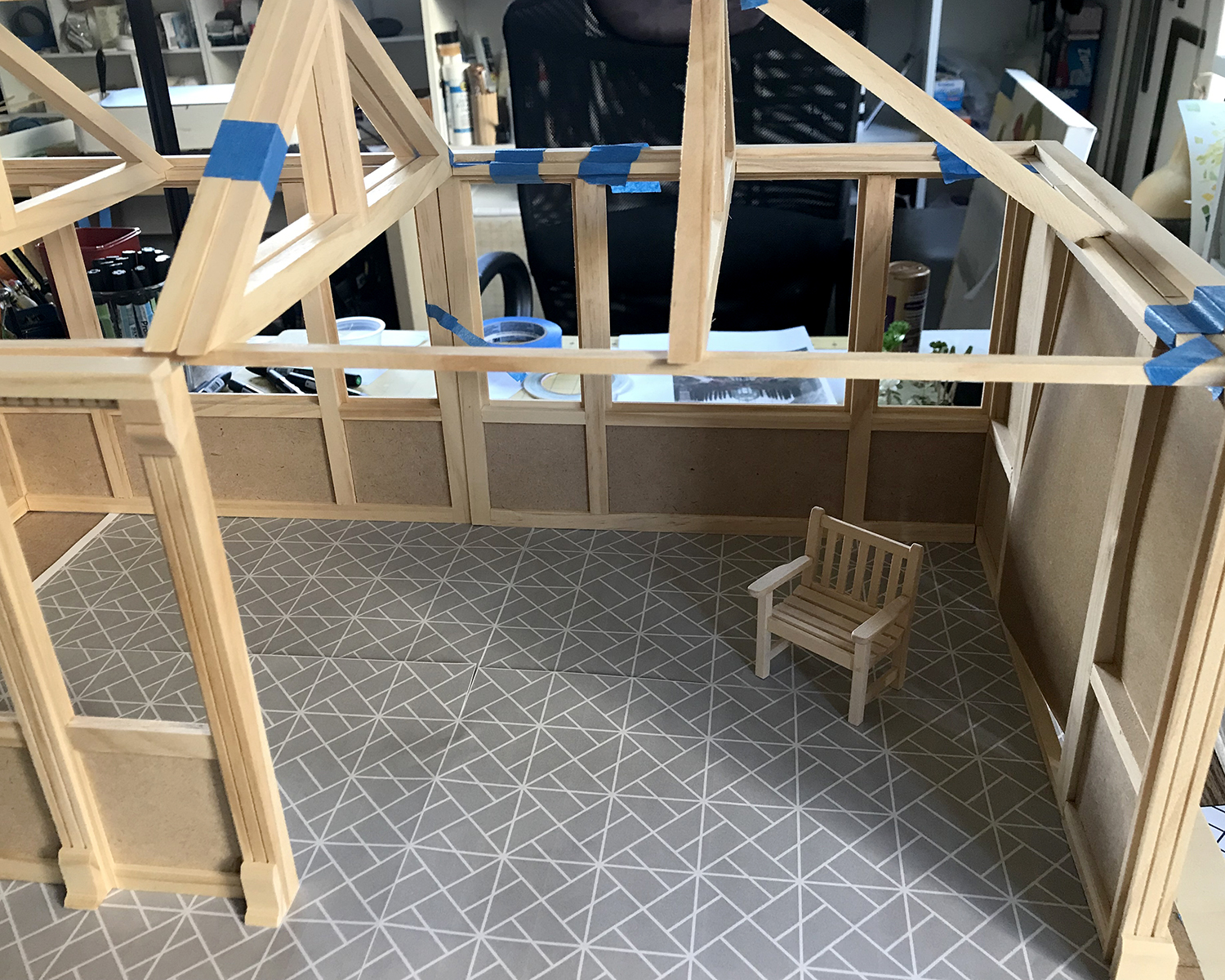
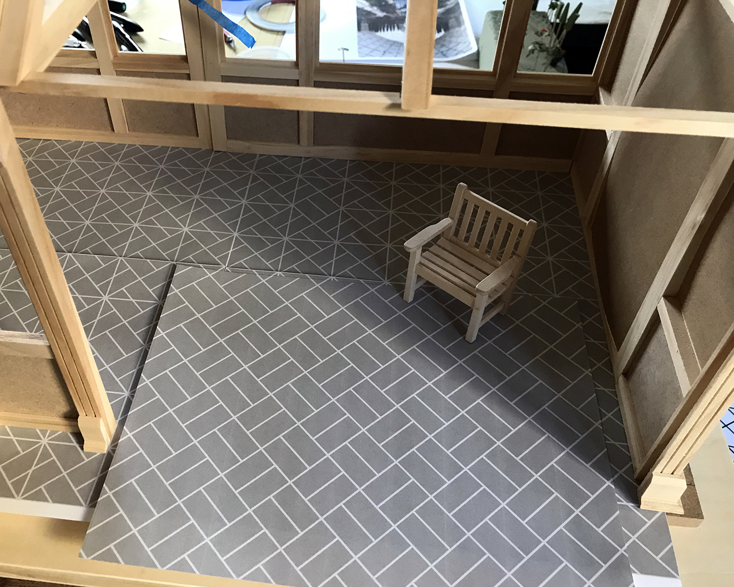
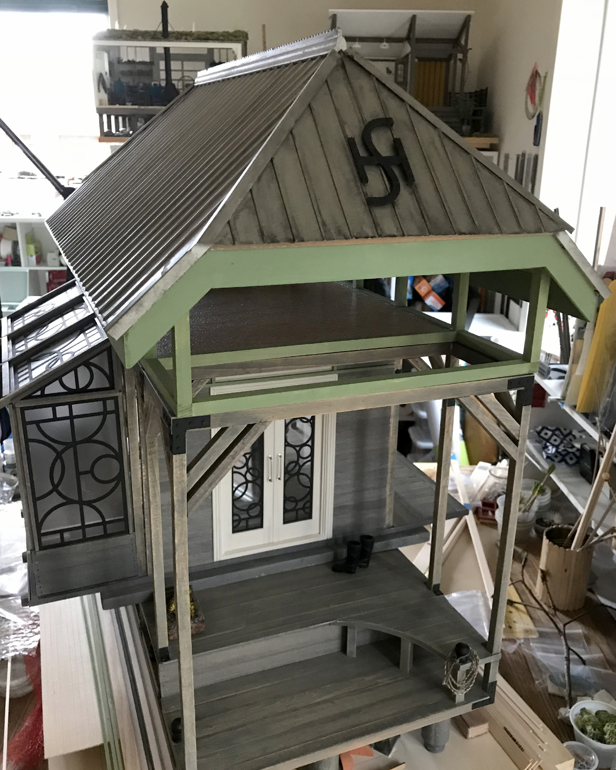
Work continues on the Sea House Conservatory build, with a sea level rise remediation support pier in place.

Model Magic air-dry clay rocks and boulders

Geologic rock and boulder construction is underway. My preferred material — think I’ve tried just about all of them — is Model Magic air dry clay, made by Crayola. It is lightweight, inexpensive, readily available, pleasant and responsive to sculpt, accepts all kinds of pigments well, and dries with virtually no shrinking.

Spatters and washes and sprays, oh my
Lots and lots of boulders and rocks
Granite-veined black rocks

With this last batch of rocks, I experimented with adding black acrylic paint or India ink to the white clay before sculpting. One batch had fine black gravel mixed in. The paint or ink initially made the compound stickier to work with, but it was nice to start with a pre-tinted base. These have green and gray washes spritzed on. When dry (takes a day or two depending on size and relative humidity) with a fine brush I painted the surf erosion holes and granite veins with white acrylic, diluted 1:1 with water.

As I was ordering new clay, I learned Model Magic also comes in black, gray, and “Earthtone, Bisque and Terra Cotta”. So stoked to use these colors on the next exploratory rock and boulder sets.

Closeup before the tide comes in

The finished rocks are slicked with a satin multi-purpose sealer, as they’re meant to look wet. The final Conservatory project base will have about an inch of water in tidal flow. (I’m excited about that, too, as I’ve never worked with a “water feature” before :)

Sea House Conservatory, in progress, February 2020

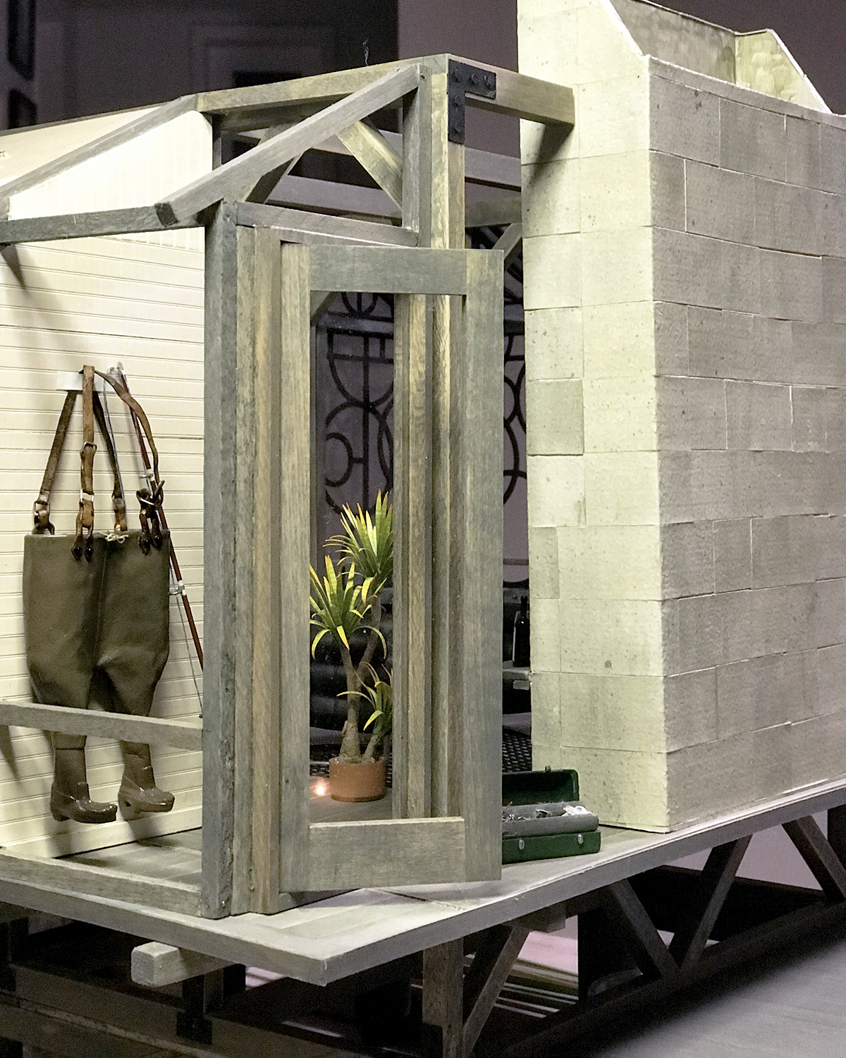
Deck planks are installed, and I’ve finally arrived at a stair design that makes sense and blends into the overall structure.

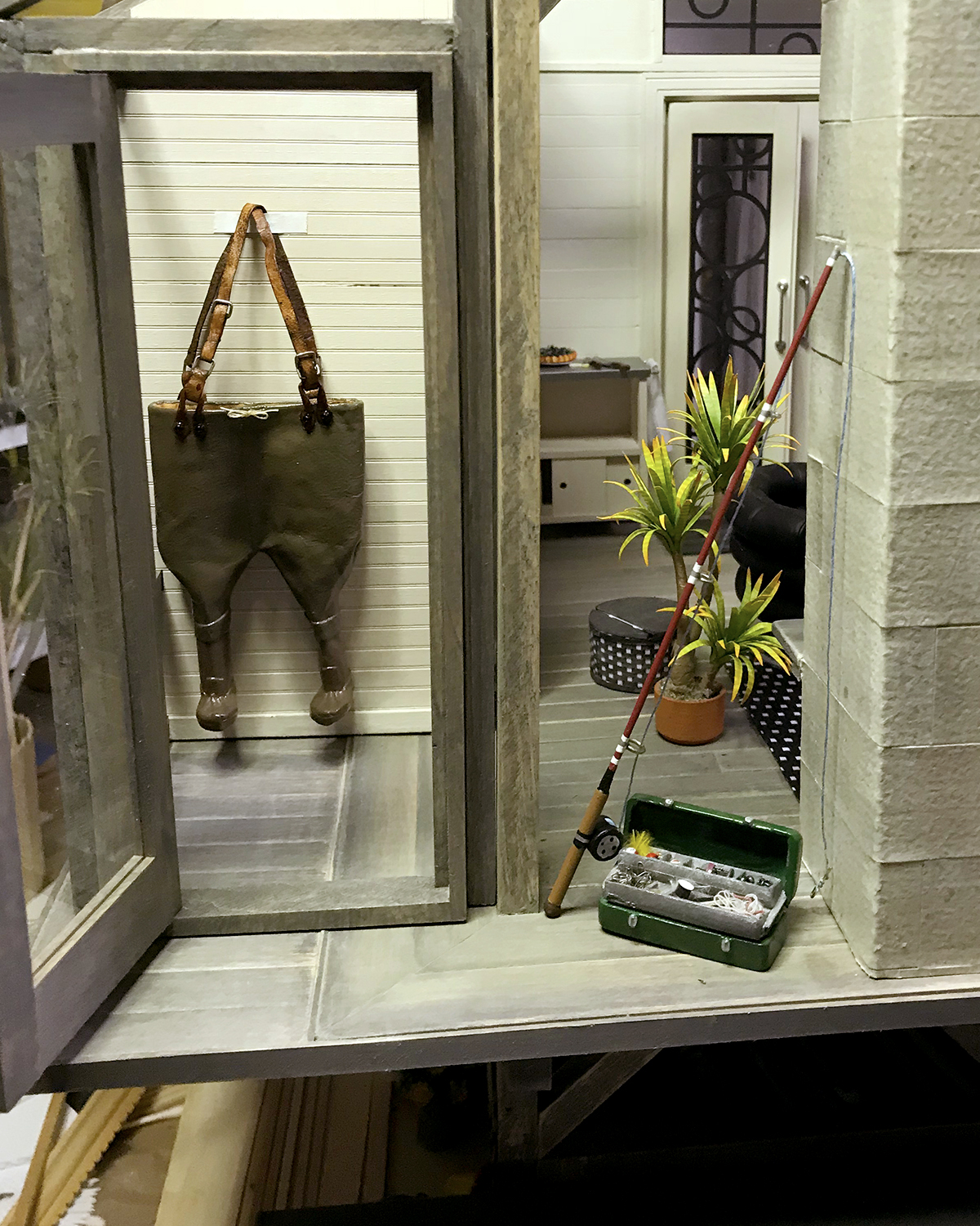
Yesterday I was at Chrissy Field in the Presidio, and took a bunch of pier photos for genuine detail ideas. It was a perfect winter’s day, cool, clear and sunny, with very little breeze.
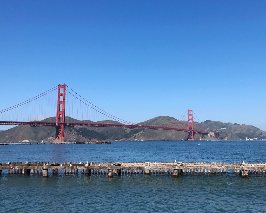
Looking north to the Golden Gate Bridge and Marin
Chrissy Field, Presidio. See the fog horse galloping over the City?

Glorious.

Retrospective: Sea House Leadlights

Albie oversees receipt of Serendipity Shed base kits, 16 August 2019

I thought it might be interesting to review building highlights of the Sea House Leadlights studio office, from start through submission. (Can’t really say “completion” because things never stay done ‘round here.) There are links back to original posts — if any were made — with more details. I wasn’t very bloggy :)

First ideas

I spend a lot of pages thinking, sketching, dreaming, considering and working out dimensions and story.

The starry floor in process

The first floor idea, though fun to design, paint and assemble, did not work well in the space. So it goes.

Two base kits mashed together

Height was added to the starter kit with parts from a second. I like to retain recognizable elements of the kit, so the roof angle and footprint, as well as door and lower window placement remained unchanged.

Loft wall detail

I glued cold press 140 lb. watercolor paper to the walls for texture before painting, and added a whitewashed aged brick back wall in the loft.

Adding siding to the new front
Half-loft installed, supported by faux beams

I opted to make the front façade removable as well as the roof… this makes it so much easier to photograph the interior.

Bench tops and bottoms

I cut the built-in benches from 1/16-inch basswood on the Cricut Maker. These were glued together and supported with 1/8-inch dividers.

Interior space begins to come together
Tree Frog green was the only possible finish color, with black leather cushions

I thought and sketched about the window designs for some time. The Pavilion is bubble-themed; the Conservatory celestial… for the Leadlights design studio I went Egyptian Deco. Mostly sort of.

Sea House Leadlights front doors and front/side windows
Sea House Leadlights upper window

The upper window is a stylized scarab. Very.

The “leading” designs for the windows are cut from lead black cardstock, glued front and back to the plexi, then framed in black on the exterior (and tree frog on the interior). I like to see wood grain, so I use a 1:1 ratio of acrylic paint and staining medium.

The scarab window at night

If one looks straight on, the window frames the bricked loft wall and the old Sea House logo. With sacred scarab wings.

Side building signage

I — or rather the Cricut Maker — cut the signage from matte black vinyl. The stars in the design are meant to resemble anchor plates used to reinforce old buildings. I love them.

In this backlit photo, the vinyl letters appear to float off the side of the building. It’s not quite so unnatural-looking in person, but knocking back the synthetic smoothness is on my eternal learn-to-do list, to find ways to tone down the material. (Transferring wee letters and figures is a fiddly, fussy business, especially onto an uneven surface, and I am not eager.)

Side sign
View from above

Here’s a roof’s-eye look at the progressing build. The holes are drilled for the LED light fixtures that will illuminate the work space below. (The wiring to be concealed beneath a custom rug and other stuff stored in the loft.) A narrow shelf beneath the scarab window on the removable front might support batteries if I ever add lighting to the front. Floor tiles gleam softly with scuff-resistant utility. Leather window seats beckon.

To be continued…

Carrying On, A Maker’s Dream

Practically like Stonehenge — I imagine — establishing where the deck posts might go.

After the interesting maths of determining (and re-determining) the height of the stair stringers, I cut the posts for the deck surround.

Surprisingly more complicated and variable.
I tipped over a pot of yucca before the glue was set.

Best of all, I received an email from a woman who’d purchased a couple of yucca tree kits from my Etsy shop. She posted a lovely video of her results and I could not be more impressed or surprised. Do check it out.

Peacock, Pacific, Sea House Conservatory

Maddie_peacock

There is much to appreciate in this drawing, presented to me by 5-year-old Maddie. No hand turkeys for that girl; a peacock is more compelling. This avian’s boisterous tail, for one, is a breakthrough in both interpretation and technique. Vibrant life radiates in the rich purple effortlessly confident strokes on wings and body. Its feet hold firmly to the bottom of the page. Not least is the pathos of the bright pink worm; its expression reminds us that outward beauty is not a sure sign of good will. Be inspired.

manor_bluff_112518

Had my first opportunity to walk outside today (!), along (what remains of) the paved Manor Bluff trail, and even on some hard-packed sand atop the bluff. It was breezy with rain-moist air, and felt so good. Another milestone in my recovery, almost eight weeks post-op. Yay go me, and she was.

working_on_bed

Still somewhat working from my bed top, but I have made progress in cleaning the various surfaces in the studio proper. Sad and ridiculous, I know, but just what is. It’s like I’m growing up all over again.

both_halves

The other half of the conservatory is in rickety dry fit, and I’ve decided on a layout and also that this might will be the new (former) home of the small local business, Modern Miniature S___ & Sundries, est. 1921.

MMSS_retro_uomo

It of course had a different logo (and maybe name) back then. Backstory, in media res.

floor_idea_00

I’ve given a great deal of thought and research to the floor, and have arrived at this pattern. Still undecided between watercolor paper or egg carton for the pavers.

floor_idea_01

A closer approximation to the tonal contrasts. The interior walls will be a warmish white, perhaps with Art Deco-y botanical stencils on the lower panels.

floor_idea_02

The floor pattern with the top grid removed. I’m torn between simplifying the amount of work it will be to cut and lay the more intricate pattern with the simpler design.

floor_idea_03

Current thinking is to break the rigidity of the more complex pattern with setting “whole block” units randomly into the design. The amount of work required is not appreciably less, but the overall effect is more pleasing to my eye.

As always, your input and reactions are welcome, for yay or nay or… other. Lively discussion encouraged! (I’m still not getting out enough :)


V: Vagary

V is for Vagary. Fluctuation, variation, quirk, peculiarity, oddity, eccentricity, unpredictability, caprice, foible, whim, whimsy, fancy.

I can’t think of a better word, or set of synonyms, to describe the new 1:12 scale echeveria kit available now over at MMS+S. There are no fewer than five leaf sizes and shapes that combine to make three sizes of a charming pointy-leaf echeveria. I’ve redesigned the build method, too, to start on a fine paper-wrapped stem wire (included in the kit), which is perfect for armatures (gnarly-armed structures) and general ease of shaping the plants.

Here is a bushel basket of prototypes, using both of the base colors — white or apple green — colored with alcohol-based markers. (If you want true reds and yellows — or blues and purples — order the white stock. If you’re good with more muted tones and want to spend less time coloring, choose the green :)

Possibilities of color combinations are endless (and fun).

This is a versatile kit, and a form to make a succulent wreath is available soon!

Let Scarlett’s tail and rabbit feet, seen here in complete repose, be your inspiration.

I recently re-found this unfinished Henri Rousseau-inspired collage panel, and glued it to the side back of the Modern Miniature Succulents + Sundries set.

The MMS+S set is in disarray, like many aspects of my life, but potentially still functional.

Zoom out now, please, to 1:1. The former owners of our house built this charming, funky wave-topped gate (seen here from the back). But, inexplicably, they painted the front of it the same dispirited brown as the rest of the decks, and completely ignored the back. For four years, it has *nagged* at me.

Yay go me. Here it is finished in four shades, by the light of the silvery security beacon.

Albie and I survey the change. You can just see that sad brown deck color peeking out under cat and mat.

This is the old hardware, atop the treacherous birdbath pedestel, for those of you/us interested in these things.

And finally. Keli and I have been challenging ourselves to … not let the bastards drag you down draw a random thing and post it on Instagram, until, for each of us, momentous events transpire. (For me, that’s undergoing replacement surgery of both hips, on 01 October, 2018.) I have chosen Crayola and ink as my drawing medium. We are #messy_k_enge and #curlymuenich, if you care to follow along (+also under our regular names @iseecerulean and @nancy_k_enge). We are expecting phat coffee table art book publishing contracts to swamp our respective agents.

How could they not?


B: Blade, Funk Protocols, Wheelie, Weavings!

B_blade

B is for BLADE: X-Acto X-Life No. 11, on an old silver-plated tea tray that lives outdoors atop my worm compost bin. Hmmm, maybe I should have saved this for X. Megan and over-achiever Keli, I’m looking at you.

Thank you for sharing your funk wisdom and protocols. I laughed, and cried a little, and felt deeply how truly kind you all are. It was helpful, and energizing. Some of my takeaways:

“Give it a little time and some sun; sun will break up a funk like nobody’s business.”
—Sheila

“Keep breathing through, keep walking, keep looking out and seeing that unexpected beauty, accepting that unasked for kindness.”
—Azteclady

“Having something to look forward to helps me to make the transition from funk to functional. Be kind to yourself.”
—Megan

“Punt.”
—Joyce

“Bring the Funk! (Dance!)”
—Jodi

“I know from experience that once in it, you just have to ride it out to the end… usually they’re just passing through.”
—Elizabeth S

“Every day is different, life is a wave, happily!”
—Ingi

“First I have to recognize The Funk. That always seems to take longer than it should.”
—Keli

“Hang in there, I have faith in you that we’ll see more wonderful creations. And get that cat out of your beautiful, tiny house!”
—Bennie

“… I also find doing a kit, following someone else’s instructions helps me to, at the least, get back a sense of accomplishment.”
—ShelleyB

“Take this time to pause and reflect, but trust your instincts.”
—Barbara W.

Wheelie_beach_012318

So Wheelie and I went to look at the waves and do salt air aromatherapy for a while, to “take it all in and savor the goodness”.

shelley_weaving

I returned home to find this brilliant rendition of the Toto2 picnic basket kit that ShelleyB was kind enough to share. This changes everything! and we’ve been pinging ideas back and forth. She says the proportions and shape of this basket makes good storage containers, with or without lids, and wondered if a kit of three might be made available. Maybe a taller version, too, as a laundry hamper? I can’t wait to get out some graph paper and chart monograms.

Also, I have not forgotten or given up on the protea flower kit. Really.

Marion’s Cape Town Proteas

Marion Russek kindly sent some protea family photos from her visit to the Kirstenbosch Botanical Gardens in Cape Town. Though the peak bloom season is from June to November there, she still got some sumptuous shots. I cropped them pretty tightly, and sampled some colors from the flowers for additional eye candy :)

cone_palette

peach_green_palette

red_green_palette

spiky_red_palette

spiky_yllow_palette

sunray_palette

Pulling swatches really helps me understand what colors are going on, and provides a natural starting palette. Many, many thanks, Marion, for sharing the warm sunlight of South Africa with us. Plus! I learned a new word: fynbos.

Color + Form Research

pink_01

Spent a drizzly hour+ marching around the South African garden at UCSC Arboretum, taking reference photos of proteas for the upcoming kit, inspired by Keli’s free-style flowering.

pink_black_00

So many other-hemisphere plants to see. Not all are in peak bloom, but I was more interested in surveying the range of protea forms, their structures and colors.

pink_green_00

I didn’t even concern myself with recording variety names, since I plan a sort of hybrid form for the kit. But the colors, the colors!

yellow_green_01

yellow_green_00

This one is a Leucadendron, “Inca Gold”. So luminous.

eucalyptus_blooming

In the transition zone between South Africa and succulent gardens, there were flowering eucalyptus. The scent was heavenly! There’s nothing quite like being in a deserted botanical garden on a rainy day, with only hopping bunnies and many small brown birds.

succulent_color_pattern

Look at the subtle coloration and bold pattern of this succulent.

succulent_color_spiral

Again, but with the spiral nature of growth (and decay).

succulent_red_green

These were quite a surprise. Smallish, leathery, spiky, but what?! If I had done these colors I would call it a mis-step, but now I am emboldened.

This field trip was a wonder. I’ve many more examples of natural plant colorations that will probably necessitate having to buy more markers.


A Surprise Mudroom, Keli’s Flowers

plans

The new year brings gifts of change, and gifts of gifts. I have scrapped the idea of a shower room in the Sea Rise Sea House Pavilion remodel, opting instead for a mudroom back entrance. Specifically, to act as a showroom for the gifts from Charlene’s legacy that Keli has bestowed.

mudroom_120718

A mudroom fits right in to the spirit of the build, and believe me, these pieces from Charlene’s collection are exquisitely detailed and realized.

mudroom_02_010718

I’ll show more detail on the actual pieces after I’m not so caught up in building the mudroom. Shown here are waders, completely handmade from very thin leather, paint and wire buckles. Tiny black seed beads for suspender fasteners. One of three (!) uh, two fishing poles, made of metal, wood, wire and magic. The tackle box will be the subject of its whole own post — there are tied lures with real feathers, and other stuff only fisherfolk know about.

keli_flowers_010718

These are flowers realized by Keli from the EC01 Echeveria kit at Modern Miniature Succulents + Sundries. Wow, wow, wow. She made the leaves and sepals, and arranged them in a vase with microbeads.

They reminded me of proteas, and so now I’m all researching and sketching for a new kit. Thank you, Keli, for sharing the rich wonder of Charlene’s legacy, *and* for sparking a brilliant idea for a wonderful, waterwise flowering plant that plays very well with succulents.

Wrought Iron Sign Salvage

SH_roof_122017

I wrought Sea House emblems for the landward and sea-facing sides of the pavilion roof. They’re meant to be salvage from the old Sea House Pleasure Pier and Estate. And so they are.

SH_logo_roof_122017.jpg

Sized to fit between the raised seams on the metal roof, I cut seven copies of the emblem from 65 lb. black cardstock and glued them together. After drying under weight, I sanded the edges even, and slightly beveled the top edges. I added fastening “bolts” then lightly stippled and dry brushed some wear and weathering. Not too much. The caretaker is diligent about her conservation duties.

front_122017

Then I had to make a smaller version to mount on the fireplace.

SH_fireplace_122017

It looks splendid, don’t you agree? (Well, except for the ripply rug. There’s always something.)

kitchen2_122017

I bashed out the support column in front of the kitchen, and felt much better about the space, even though it still looks like every other ELF kitchen ever made, ever. (Not that there’s anything wrong with that.) I’ll scrape away the brackets on the floor, patch where the post was, and it’ll be an intentional remodel artifact :) I found the LED pot lights I ordered, then lost, so next step will be the ceiling/roof, and then the exterior siding.

gh_122017.jpg

In the greenhouse, the hydroponics have been relocated to an anchored barge just off the rear utility deck.

lowercase_n_121817

Meanwhile, I got to open an early present, a vintage sign hollow aluminum lowercase n, about 12 tall by 3 inches deep. Feeling the love. Thank you, my B.